# load packages
library(tidyverse)
library(maps)
library(ggplot2)

NA.basin = read.csv("ibtracs.NA.list.v04r00.csv", stringsAsFactors = FALSE)
EP.basin = read.csv("ibtracs.EP.list.v04r00.csv", stringsAsFactors = FALSE)

# remove variable information
NA.basin = NA.basin[-1, ]
EP.basin = EP.basin[-1, ]

# formatting some columns
NA.basin$Season = as.numeric(NA.basin$SEASON)
NA.basin$Latitude = as.numeric(gsub("^ ", "", NA.basin$LAT))
NA.basin$Longitude = as.numeric(gsub("^ ", "", NA.basin$LON))
NA.basin$Wind.WMO. = as.numeric(gsub("^ ", "", NA.basin$WMO_WIND))

EP.basin$Season = as.numeric(EP.basin$SEASON)
EP.basin$Latitude = as.numeric(gsub("^ ", "", EP.basin$LAT))
EP.basin$Longitude = as.numeric(gsub("^ ", "", EP.basin$LON))
EP.basin$Wind.WMO. = as.numeric(gsub("^ ", "", EP.basin$WMO_WIND))

# extract month for dataset NA.basin
time.date = strsplit(NA.basin$ISO_TIME, " ")
iso.date = unlist(lapply(time.date, function(x) x[1]))
iso.month = substr(iso.date, 6, 7)
NA.basin$Month = factor(iso.month, labels = c(month.name))

# extract month for dataset EP.basin
time.date = strsplit(EP.basin$ISO_TIME, " ")
iso.date = unlist(lapply(time.date, function(x) x[1]))
iso.month = substr(iso.date, 6, 7)
#EP.basin$Month = factor(iso.month, labels = c(month.name)[-4])
EP.basin$Month = factor(iso.month, labels = c(month.name))

# join data frames
storms = rbind(NA.basin, EP.basin)’Visualizing Hurricane Paths
R
Visuals
2022
The Data
The data is freely available from the International Best Track Archive for Climate Stewardship (IBTrACS)[https://www.ncei.noaa.gov/products/international-best-track-archive] at the National Climatic Data Center website and can be downloaded in different formats.
Basins include: - NA - North Atlantic - EP - Eastern North Pacific - WP - Western North Pacific - NI - North Indian - SI - South Indian - SP - Southern Pacific - SA - South Atlantic
This project includes only North Atlantic and Eastern North Pacific.
Prepare the plot
Once we’ve cleaned and processed the data, the next step is to prepare the ingredients for plotting a map. For this example, I’m selecting hurricanes from 1999 to 2010, and removing unnamed storms:
# world map
wm = map_data("world")

# select storms between 2000 and 2021

substorms <- storms %>% filter(Season %in% c(2000:2021) & NAME != "NOT_NAMED")

# add and ID with name and season
substorms$ID = as.factor(paste(substorms$NAME, substorms$SEASON, sep = "."))

# storm name as factor
substorms$NAME = as.factor(substorms$NAME)
Overall Hurricanes
Let’s plot the data with all the selected storms
map1 = ggplot(substorms, aes(x = Longitude, y = Latitude, group = ID)) +
  geom_polygon(data = map_data("world"), aes(x = long, y = lat, group = group),
               fill = "gray25", color = "gray10", size = 0.2) +
  geom_path(data = substorms, aes(group = ID, color = Wind.WMO.), alpha = 0.5, size = 0.8) +
  xlim(-138, -20) + ylim(3, 55) +
  labs(x = "", y = "", color = "Wind \n(knots)") +
  theme(panel.background = element_rect(fill = "gray10", color = "gray30"), axis.text = element_blank()) +
  ggtitle("Hurricane Trajectories 2000 - 2021")

# show me the map
map1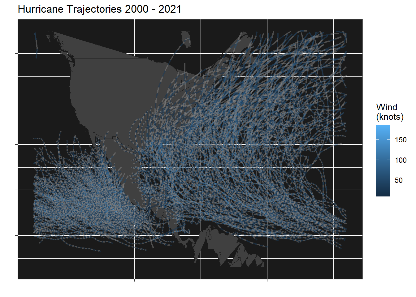
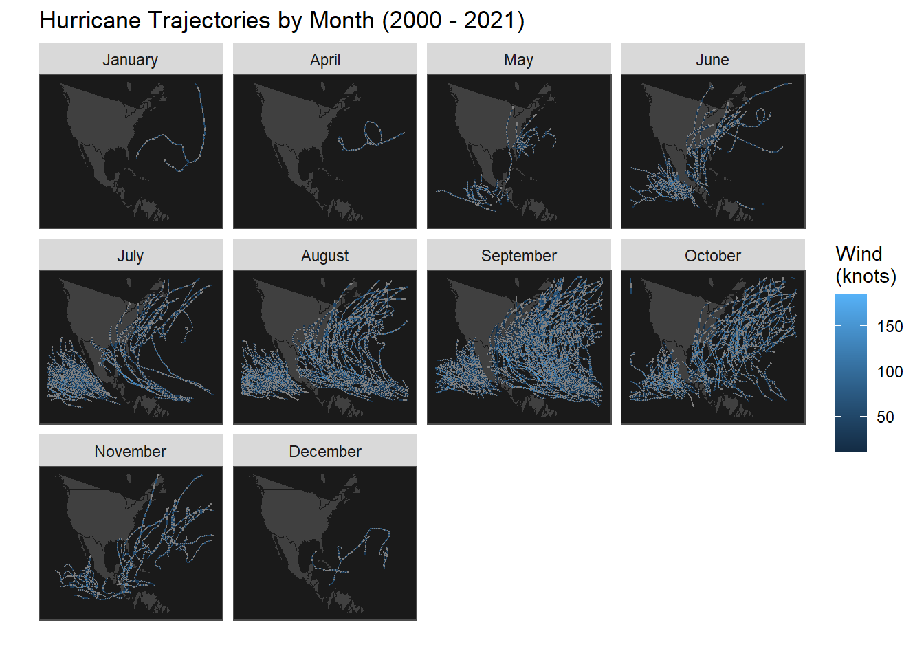
Hurricanes by month
Let’s get a more interesting visualization by months
# with facet-wrap by Month
map2 = ggplot(substorms, aes(x = Longitude, y = Latitude, group = ID)) +
  geom_polygon(data = map_data("world"), aes(x = long, y = lat, group = group), fill = "gray25", color = "gray10", size = 0.2) +
  geom_path(data = substorms, aes(group = ID, color = Wind.WMO.), size = 0.5) +
  xlim(-138, -20) + ylim(3, 55) +
  labs(x = "", y = "", color = "Wind \n(knots)") +
  facet_wrap(~Month) +
  # opts(title = "Hurricane Trajectories by Month (1999 - 2010)",
  #      panel.background = element_rect(fill = "gray10", color = "gray30"),
  #      axis.text.x = element_blank(), axis.text.y = element_blank(),
  #      axis.ticks = element_blank(), panel.grid.major = element_blank(), panel.grid.minor = element_blank())

  theme(panel.background = element_rect(fill = "gray10", color = "gray30"), axis.text = element_blank(),
        axis.text.y = element_blank(), axis.ticks = element_blank(), panel.grid.major = element_blank(),
        panel.grid.minor = element_blank()) +
  ggtitle("Hurricane Trajectories by Month (2000 - 2021)")

map2