Code
#!pip install joypy pywaffle calmap scipy squarify scikit-learn statsmodels seaborn
# !pip install ipkernelBelow is a compendium of visualizations created in Python. While I continue to much prefer using R for visualizations. It is simpler and probably a bit better than what you can do in Python. This is changing somewhat as Python works to match the capabilites if ggplot.
Recently, Posit has released a Python Module great_tables that attempts to reproduce the capabilities in R’s gt package.
Below plots and tables are illlustrated. I did this primarily to learn everythnig I could to create effective visualizations in Python. While I am glad to have done this, I think I’ll be sticking with R for some time to come. There is just no good reason to leave R. It still holds an edge in capabilites. And for me, R is far easier to sue and requires signicantly fewer lines of code compared to Python.
#!pip install joypy pywaffle calmap scipy squarify scikit-learn statsmodels seaborn
# !pip install ipkernelimport joypy
from pywaffle import Waffle
import calmap
import random
import os
import numpy as np
import pandas as pd
from pandas.plotting import andrews_curves
from pandas.plotting import parallel_coordinates
from sklearn.cluster import AgglomerativeClustering
import seaborn as sns
#from great_tables import GT
import great_tables
from great_tables import GT, loc, style
import matplotlib
import matplotlib.pyplot as plt
from matplotlib.path import Path
from matplotlib.patches import PathPatch
from matplotlib.patches import Patch
import matplotlib.patches as patches
from scipy.spatial import ConvexHull
from scipy.signal import find_peaks
from scipy.stats import sem
import scipy.cluster.hierarchy as shc
import squarify
from statsmodels.graphics.tsaplots import plot_acf, plot_pacf
import statsmodels.tsa.stattools as stattools
from statsmodels.tsa.seasonal import seasonal_decompose
from dateutil.parser import parse
from IPython.display import Imagedef truncate_long_text(text: str, max_length: int = 80) -> str:
"""
Truncate text to a maximum length, adding ellipsis if truncated.
Args:
text (str): Input text to potentially truncate
max_length (int): Maximum allowed length
Returns:
str: Truncated text with ellipsis if longer than max_length
"""
# Only truncate if text is a string and longer than max_length
if isinstance(text, str) and len(text) > max_length:
return text[:max_length] + '...'
return text
def truncate_long_columns(df: pd.DataFrame, max_length: int = 80) -> pd.DataFrame:
"""
Truncate text in columns that have strings longer than max_length.
Args:
df (pd.DataFrame): Input DataFrame
max_length (int): Maximum allowed character length
Returns:
pd.DataFrame: DataFrame with long text truncated
"""
# Create a copy of the DataFrame to avoid modifying the original
truncated_df = df.copy()
# Iterate through all columns
for col in truncated_df.columns:
# Check if column contains string-like data
if truncated_df[col].dtype == 'object':
truncated_df[col] = truncated_df[col].apply(lambda x: truncate_long_text(x, max_length))
return truncated_dfdef process_csv_from_data_folder(file_name: str, dataframe: pd.DataFrame = None):
"""
Processes a CSV file or DataFrame by selecting 10 random records,
limiting the GT table to 10 columns, appending the file name to the title,
and adding a footnote if there are extra columns.
Args:
file_name (str): The name of the CSV file in the 'data' folder, or name for DataFrame.
dataframe (pd.DataFrame, optional): DataFrame to process instead of CSV file.
Returns:
tuple: A tuple containing the file name and a styled GT table.
"""
# Check if a DataFrame is provided
if dataframe is not None:
df = dataframe
else:
# Define the path to the 'data' folder
data_folder = "data"
file_path = os.path.join(data_folder, file_name)
# Check if the file exists
if not os.path.isfile(file_path):
raise FileNotFoundError(f"File '{file_name}' not found in the 'data' folder.")
# Load the CSV file into a DataFrame
try:
df = pd.read_csv(file_path)
except Exception as e:
raise ValueError(f"Error reading the CSV file: {e}")
# Select 10 random records
if len(df) < 10:
random_sample = df # Use entire dataframe if less than 10 records
else:
random_sample = df.sample(n=10, random_state=42)
# Limit to 10 columns or fewer
all_columns = df.columns.tolist()
displayed_columns = all_columns[:10]
extra_columns = all_columns[10:]
# Create a copy for formatting
limited_sample = random_sample[displayed_columns].copy()
# Format numeric columns for better readability
formatted_sample = limited_sample.copy()
for col in formatted_sample.select_dtypes(include=['float', 'int']).columns:
formatted_sample[col] = formatted_sample[col].map(lambda x: f"{x:,.2f}")
# Truncate text in columns longer than 80 characters
formatted_sample = truncate_long_columns(formatted_sample)
# Create the GT table using the formatted data
gt_table = GT(data=formatted_sample)
# Enhanced styling for better engagement
gt_table = (gt_table
# Title and subtitle with more dynamic styling
.tab_header(
title=f"Random Sample of 10 Records from '{file_name}'",
subtitle="Exploring Data"
)
# Column-specific styling
.cols_label(
# Optional: Rename columns to be more user-friendly
**{col: col.replace('_', ' ').title() for col in displayed_columns}
)
# Header styling with a modern, clean look
.opt_stylize(style=6, color='blue')
)
# Conditionally add numeric formatting
numeric_columns = formatted_sample.select_dtypes(include=['float', 'int']).columns
if len(numeric_columns) > 0:
gt_table = gt_table.fmt_number(columns=numeric_columns)
# Add a footnote if there are extra columns
if extra_columns:
gt_table = gt_table.tab_source_note(
source_note=f"💡 Additional columns not displayed: {', '.join(extra_columns)}"
)
# Optional: Add source information
gt_table = gt_table.tab_source_note(
source_note=f"🔍 Data Exploration: {file_name} | Sample Size: 10 Records"
)
return gt_table
# Example usage:
# process_csv_from_data_folder("My Test DF", dataframe = df)A scatter plot (aka scatter chart, scatter graph) uses dots to represent values for two different numeric variables. The position of each dot on the horizontal and vertical axis indicates values for an individual data point. Scatter plots are used to observe relationships between variables.
This dataset contains demographic and socioeconomic information for counties in Illinois. Key characteristics include:
Geographic Information - County names and state (Illinois) - Area (likely in square miles) - Metropolitan status (inmetro) Population Statistics - Total population (poptotal) - Population density (popdensity) - Racial composition (popwhite, popblack, popamerindian, popasian, popother) - Percentage of each racial group Socioeconomic Indicators - Adult population (popadults) - Education levels (perchsd, percollege, percprof) - Poverty statistics (percbelowpoverty, percchildbelowpovert, percadultpoverty, percelderlypoverty) Additional Features - Unique identifier for each county (PID) - Categorical classification (category) - Dot size (possibly for visualization purposes)
The data provides a comprehensive overview of Illinois counties, allowing for analysis of population distribution, racial demographics, education levels, and poverty rates across different regions of the state.
df = pd.read_csv('data\midwest_filter.csv')
process_csv_from_data_folder("Plot Data Raw", dataframe = df)| Random Sample of 10 Records from 'Plot Data Raw' | |||||||||
|---|---|---|---|---|---|---|---|---|---|
| Exploring Data | |||||||||
| Pid | County | State | Area | Poptotal | Popdensity | Popwhite | Popblack | Popamerindian | Popasian |
| 589.00 | FULTON | IL | 0.05 | 38,080.00 | 732.31 | 37,117.00 | 668.00 | 83.00 | 105.00 |
| 3,033.00 | RICHLAND | WI | 0.03 | 17,521.00 | 515.32 | 17,411.00 | 12.00 | 34.00 | 38.00 |
| 649.00 | STEPHENSON | IL | 0.03 | 48,052.00 | 1,456.12 | 44,524.00 | 3,081.00 | 58.00 | 304.00 |
| 1,244.00 | LUCE | MI | 0.06 | 5,763.00 | 104.78 | 5,418.00 | 2.00 | 331.00 | 6.00 |
| 629.00 | MORGAN | IL | 0.03 | 36,397.00 | 1,102.94 | 34,561.00 | 1,510.00 | 48.00 | 130.00 |
| 1,206.00 | BENZIE | MI | 0.02 | 12,200.00 | 610.00 | 11,863.00 | 30.00 | 237.00 | 35.00 |
| 2,986.00 | BUFFALO | WI | 0.04 | 13,584.00 | 339.60 | 13,521.00 | 5.00 | 22.00 | 29.00 |
| 1,224.00 | GRAND TRAVERSE | MI | 0.03 | 64,273.00 | 2,142.43 | 63,019.00 | 259.00 | 555.00 | 318.00 |
| 1,264.00 | OSCODA | MI | 0.03 | 7,842.00 | 237.64 | 7,781.00 | 2.00 | 41.00 | 5.00 |
| 1,247.00 | MANISTEE | MI | 0.03 | 21,265.00 | 664.53 | 20,851.00 | 54.00 | 189.00 | 54.00 |
| 💡 Additional columns not displayed: popother, percwhite, percblack, percamerindan, percasian, percother, popadults, perchsd, percollege, percprof, poppovertyknown, percpovertyknown, percbelowpoverty, percchildbelowpovert, percadultpoverty, percelderlypoverty, inmetro, category, dot_size | |||||||||
| 🔍 Data Exploration: Plot Data Raw | Sample Size: 10 Records | |||||||||
# Select the specified columns
df = df[['county', 'state', 'area' ,'poptotal', 'popwhite', 'popblack', 'popamerindian', 'popasian', 'category']]
process_csv_from_data_folder("Plot Data Selected", dataframe = df)| Random Sample of 10 Records from 'Plot Data Selected' | ||||||||
|---|---|---|---|---|---|---|---|---|
| Exploring Data | ||||||||
| County | State | Area | Poptotal | Popwhite | Popblack | Popamerindian | Popasian | Category |
| FULTON | IL | 0.05 | 38,080.00 | 37,117.00 | 668.00 | 83.00 | 105.00 | AAR |
| RICHLAND | WI | 0.03 | 17,521.00 | 17,411.00 | 12.00 | 34.00 | 38.00 | AAR |
| STEPHENSON | IL | 0.03 | 48,052.00 | 44,524.00 | 3,081.00 | 58.00 | 304.00 | AAR |
| LUCE | MI | 0.06 | 5,763.00 | 5,418.00 | 2.00 | 331.00 | 6.00 | AHR |
| MORGAN | IL | 0.03 | 36,397.00 | 34,561.00 | 1,510.00 | 48.00 | 130.00 | AAR |
| BENZIE | MI | 0.02 | 12,200.00 | 11,863.00 | 30.00 | 237.00 | 35.00 | AAR |
| BUFFALO | WI | 0.04 | 13,584.00 | 13,521.00 | 5.00 | 22.00 | 29.00 | AAR |
| GRAND TRAVERSE | MI | 0.03 | 64,273.00 | 63,019.00 | 259.00 | 555.00 | 318.00 | HAR |
| OSCODA | MI | 0.03 | 7,842.00 | 7,781.00 | 2.00 | 41.00 | 5.00 | LHR |
| MANISTEE | MI | 0.03 | 21,265.00 | 20,851.00 | 54.00 | 189.00 | 54.00 | AAR |
| 🔍 Data Exploration: Plot Data Selected | Sample Size: 10 Records | ||||||||
fig = plt.figure(figsize = (12, 6))
ax = fig.add_subplot(1,1,1,)

# iterate over each state
for cat in sorted(list(df["state"].unique())):
    # filter x and the y for each category
    ar = df[df["state"] == cat]["area"]
    pop = df[df["state"] == cat]["poptotal"]
    wht = df[df["state"] == cat]["popwhite"]

    # plot the data poptoal vs area colored by popwhite
    ax.scatter(ar, pop, label = cat, s = wht/200)


ax.spines["top"].set_color("None")
ax.spines["right"].set_color("None")

# set a specific label for each axis
ax.set_xlabel("Area")
ax.set_ylabel("Population")

ax.set_xlim(-0.01)
ax.set_title("Scatter plot of population vs area: Symbols size = White population")
ax.legend(loc = "upper left", fontsize = 10);
plt.grid()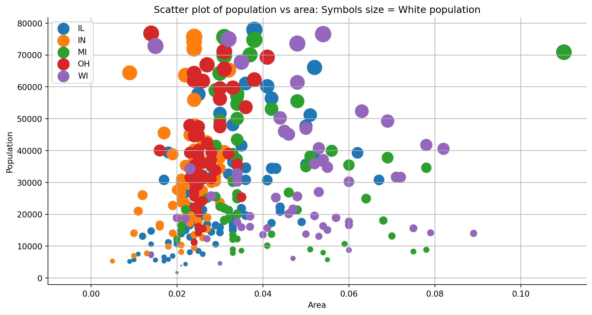
fig = plt.figure(figsize = (12, 6))
ax = fig.add_subplot(1,1,1,)

# prepare the data for plotting
size_total = df["poptotal"].sum()
# we want every group to have a different marker
markers = [".", ",", "o", "v", "^", "<", ">", "1", "2", "3", "4", "8", "s", "p", "P", "*", "h", "H", "+", "x", "X", "D", "d"]

# iterate over each category and plot the data.
for cat, marker in zip(sorted(list(df["category"].unique())), markers):
    # filter x and the y for each category
    ar = df[df["category"] == cat]["area"]
    pop = df[df["category"] == cat]["poptotal"]

    # this will allow us to set a specific size for each group.
    size = pop/size_total

    # plot the data
    ax.scatter(ar, pop, label = cat, s = size*10000, marker = marker)

# ----------------------------------------------------------------------------------------------------
# create an encircle
# based on this solution
# https://stackoverflow.com/questions/44575681/how-do-i-encircle-different-data-sets-in-scatter-plot

# steps to take:

# filter a specific group selecting state OH
encircle_data = df[df["state"] == "OH"]

# separete x and y
encircle_x = encircle_data["area"]
encircle_y = encircle_data["poptotal"]

p = np.c_[encircle_x,encircle_y]

# uing ConvexHull (we imported it before) to calculate the limits of the polygon
hull = ConvexHull(p)

# create the polygon with a specific color based on the vertices of our data/hull
poly = plt.Polygon(p[hull.vertices,:], ec = "orange", fc = "none")

# add the patch to the axes/plot)
ax.add_patch(poly)


ax.spines["top"].set_color("None")
ax.spines["right"].set_color("None")

# set a specific label for each axis
ax.set_xlabel("Area")
ax.set_ylabel("Population")


ax.set_xlim(-0.01)
ax.set_title("Bubble plot with encircling")
ax.legend(loc = "upper left", fontsize = 10);
plt.grid()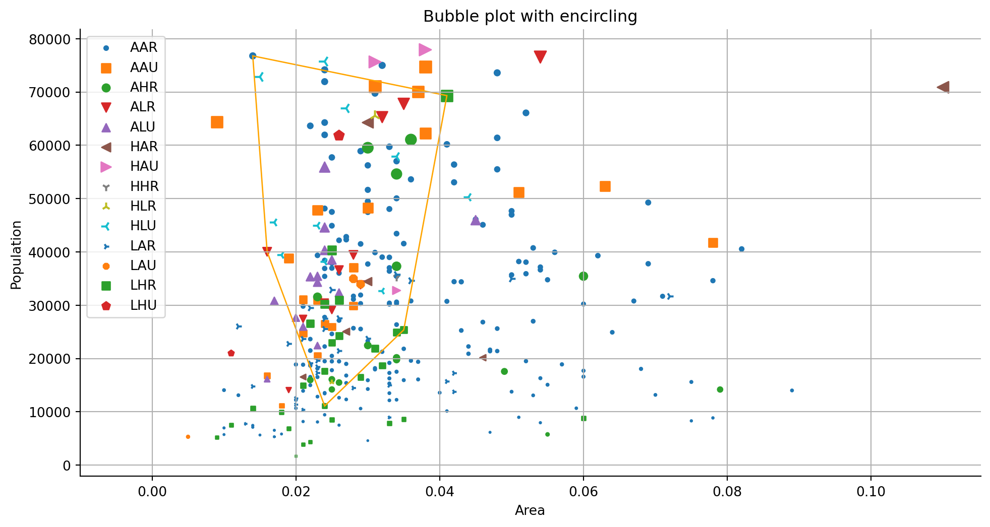
process_csv_from_data_folder("mpg_ggplot2.csv")| Random Sample of 10 Records from 'mpg_ggplot2.csv' | |||||||||
|---|---|---|---|---|---|---|---|---|---|
| Exploring Data | |||||||||
| Manufacturer | Model | Displ | Year | Cyl | Trans | Drv | Cty | Hwy | Fl |
| dodge | ram 1500 pickup 4wd | 4.70 | 2,008.00 | 8.00 | manual(m6) | 4 | 9.00 | 12.00 | e |
| toyota | toyota tacoma 4wd | 4.00 | 2,008.00 | 6.00 | auto(l5) | 4 | 16.00 | 20.00 | r |
| toyota | camry | 2.20 | 1,999.00 | 4.00 | auto(l4) | f | 21.00 | 27.00 | r |
| audi | a4 quattro | 2.00 | 2,008.00 | 4.00 | manual(m6) | 4 | 20.00 | 28.00 | p |
| jeep | grand cherokee 4wd | 4.70 | 2,008.00 | 8.00 | auto(l5) | 4 | 14.00 | 19.00 | r |
| hyundai | sonata | 2.40 | 1,999.00 | 4.00 | manual(m5) | f | 18.00 | 27.00 | r |
| toyota | corolla | 1.80 | 2,008.00 | 4.00 | manual(m5) | f | 28.00 | 37.00 | r |
| ford | mustang | 4.00 | 2,008.00 | 6.00 | auto(l5) | r | 16.00 | 24.00 | r |
| volkswagen | jetta | 2.00 | 1,999.00 | 4.00 | manual(m5) | f | 21.00 | 29.00 | r |
| audi | a6 quattro | 2.80 | 1,999.00 | 6.00 | auto(l5) | 4 | 15.00 | 24.00 | p |
| 💡 Additional columns not displayed: class | |||||||||
| 🔍 Data Exploration: mpg_ggplot2.csv | Sample Size: 10 Records | |||||||||
There are two functions in seaborn to create a scatter plot with a regression line: regplot and lmplot. Note that this function requires the data argument with a pandas data frame as input.
# get the data
df = pd.read_csv('data/mpg_ggplot2.csv')
process_csv_from_data_folder("Plot Data Raw", dataframe=df)| Random Sample of 10 Records from 'Plot Data Raw' | |||||||||
|---|---|---|---|---|---|---|---|---|---|
| Exploring Data | |||||||||
| Manufacturer | Model | Displ | Year | Cyl | Trans | Drv | Cty | Hwy | Fl |
| dodge | ram 1500 pickup 4wd | 4.70 | 2,008.00 | 8.00 | manual(m6) | 4 | 9.00 | 12.00 | e |
| toyota | toyota tacoma 4wd | 4.00 | 2,008.00 | 6.00 | auto(l5) | 4 | 16.00 | 20.00 | r |
| toyota | camry | 2.20 | 1,999.00 | 4.00 | auto(l4) | f | 21.00 | 27.00 | r |
| audi | a4 quattro | 2.00 | 2,008.00 | 4.00 | manual(m6) | 4 | 20.00 | 28.00 | p |
| jeep | grand cherokee 4wd | 4.70 | 2,008.00 | 8.00 | auto(l5) | 4 | 14.00 | 19.00 | r |
| hyundai | sonata | 2.40 | 1,999.00 | 4.00 | manual(m5) | f | 18.00 | 27.00 | r |
| toyota | corolla | 1.80 | 2,008.00 | 4.00 | manual(m5) | f | 28.00 | 37.00 | r |
| ford | mustang | 4.00 | 2,008.00 | 6.00 | auto(l5) | r | 16.00 | 24.00 | r |
| volkswagen | jetta | 2.00 | 1,999.00 | 4.00 | manual(m5) | f | 21.00 | 29.00 | r |
| audi | a6 quattro | 2.80 | 1,999.00 | 6.00 | auto(l5) | 4 | 15.00 | 24.00 | p |
| 💡 Additional columns not displayed: class | |||||||||
| 🔍 Data Exploration: Plot Data Raw | Sample Size: 10 Records | |||||||||
# filter only 2 clases
df = df[df["cyl"].isin([4,8])]

# plot the data using seaborn

sns.lmplot(x ='displ', y ='hwy', data = df,hue = "cyl")
plt.grid()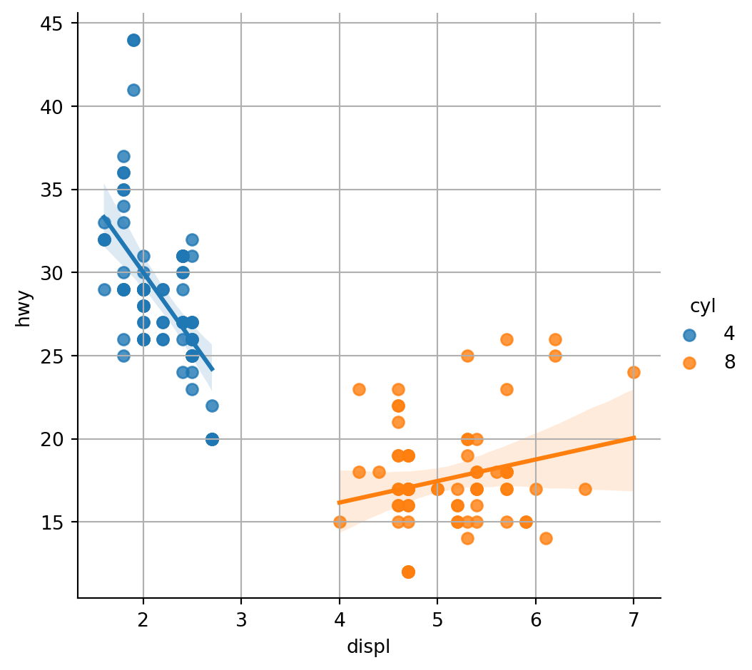
The seaborn.stripplot draws a categorical scatterplot using jitter to reduce overplotting. A jitter plot is a variant of the strip plot with a better view of overlapping data points, used to visualize the distribution of many individual 1D values.
Using the same data from the previous plot.
sns.stripplot(data=df, x="cty", y="hwy")
plt.grid(True)
plt.show()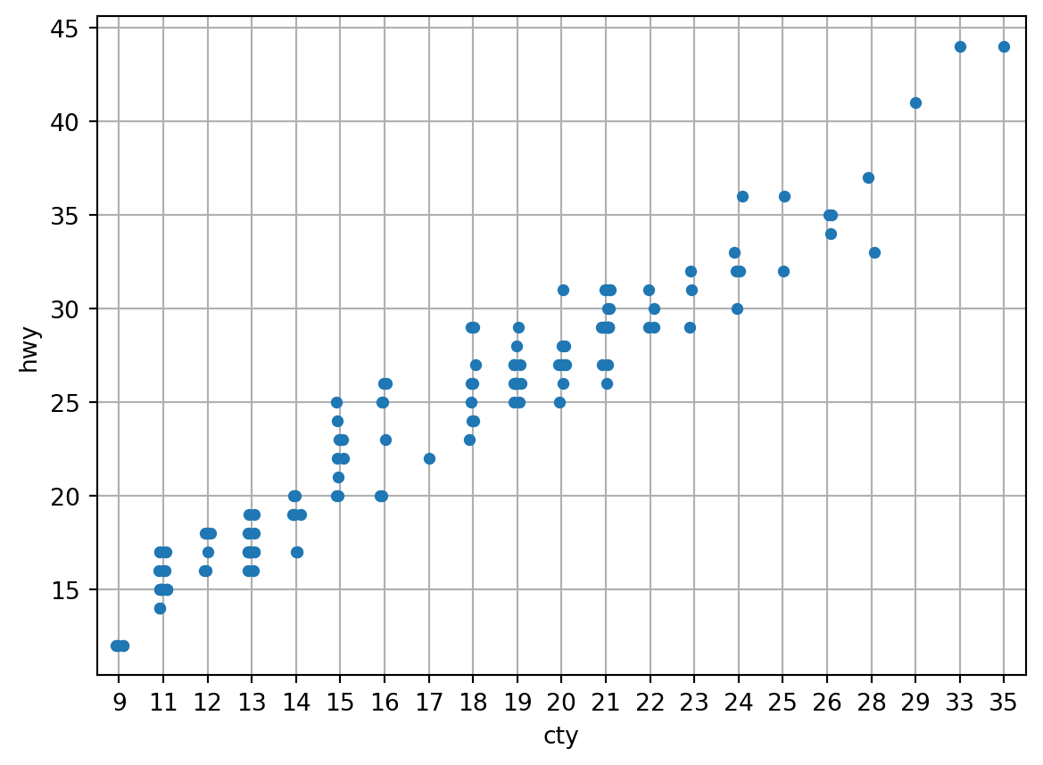
A counts plot is a variant of the strip plot with a better view of overlapping data points, used to visualize the distribution of many individual 1D values.
Using the same raw data from the previous plot.
gb_df = df.groupby(["cty", "hwy"]).size().reset_index(name = "counts")

# sort the values
gb_df.sort_values(["cty", "hwy", "counts"], ascending = True, inplace = True)

# create a color for each group.

colors = {i:np.random.random(3,) for i in sorted(list(gb_df["cty"].unique()))}

fig = plt.figure(figsize = (10, 5))
ax = fig.add_subplot()

# ----------------------------------------------------------------------------------------------------
# iterate over each category and plot the data. This way, every group has it's own color and sizwe.
for x in sorted(list(gb_df["cty"].unique())):

    # get x and y values for each group
    x_values = gb_df[gb_df["cty"] == x]["cty"]
    y_values = gb_df[gb_df["cty"] == x]["hwy"]

    # extract the size of each group to plot
    size = gb_df[gb_df["cty"] == x]["counts"]

    # extract the color for each group and covert it from rgb to hex
    color = matplotlib.colors.rgb2hex(colors[x])

    # plot the data
    ax.scatter(x_values, y_values, s = size*10, c = color)


ax.set_title("Counts plot");
plt.grid()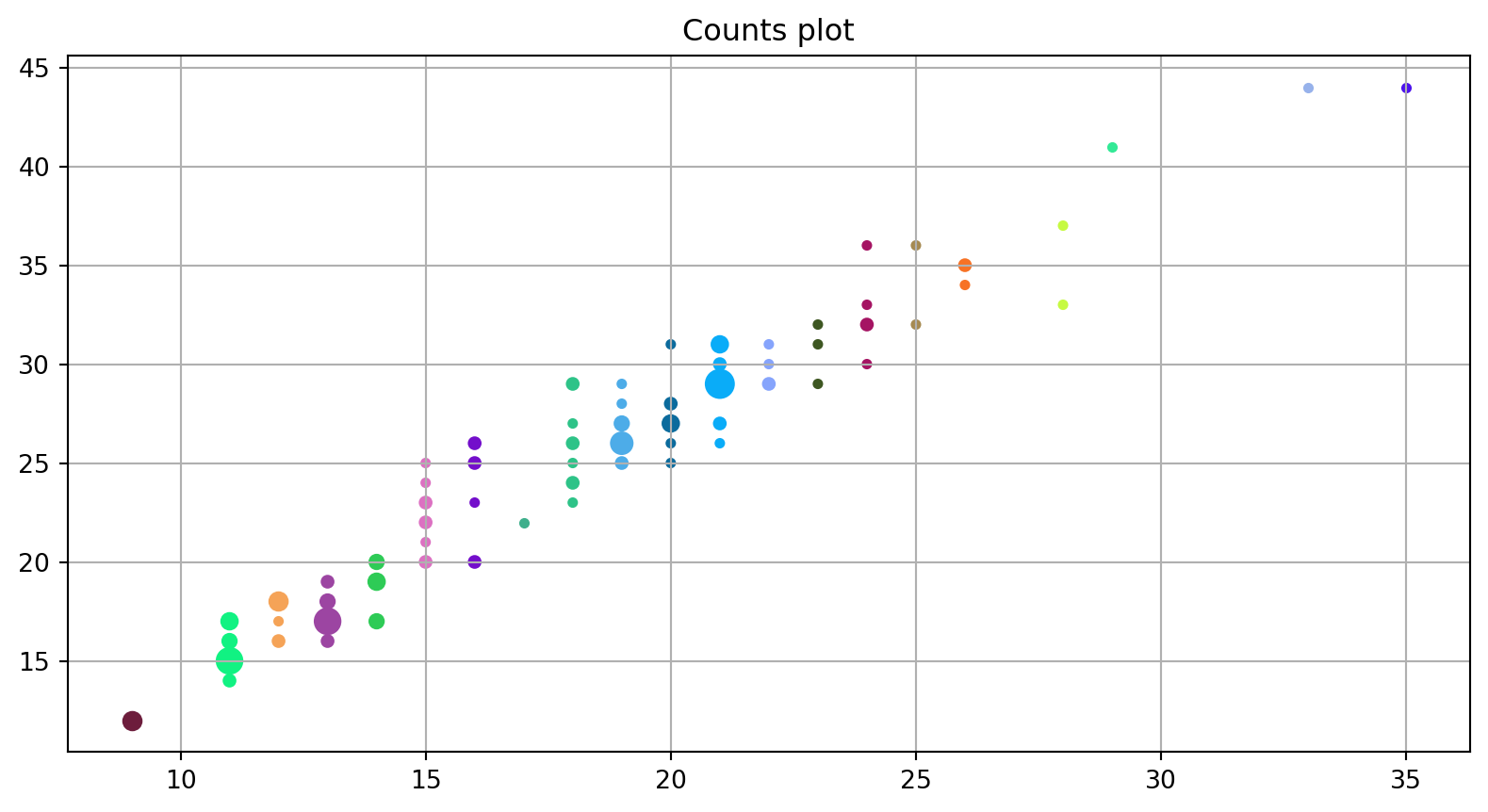
gb_df = df.groupby(["cty", "hwy"]).size().reset_index(name = "counts")

# sort the values
gb_df.sort_values(["cty", "hwy", "counts"], ascending = True, inplace = True)

# create a color for each group.

colors = {i:np.random.random(3,) for i in sorted(list(gb_df["cty"].unique()))}

fig = plt.figure(figsize = (10, 5))
ax = fig.add_subplot()

# ----------------------------------------------------------------------------------------------------
# iterate over each category and plot the data. This way, every group has it's own color and size.
for x in sorted(list(gb_df["cty"].unique())):

    # get x and y values for each group
    x_values = gb_df[gb_df["cty"] == x]["cty"]
    y_values = gb_df[gb_df["cty"] == x]["hwy"]

    # extract the size of each group to plot
    size = gb_df[gb_df["cty"] == x]["counts"]

    # extract the color for each group and covert it from rgb to hex
    color = matplotlib.colors.rgb2hex(colors[x])

    # plot the data
    ax.scatter(x_values, y_values, s = size*10, c = color)


ax.set_title("Counts plot");
plt.grid()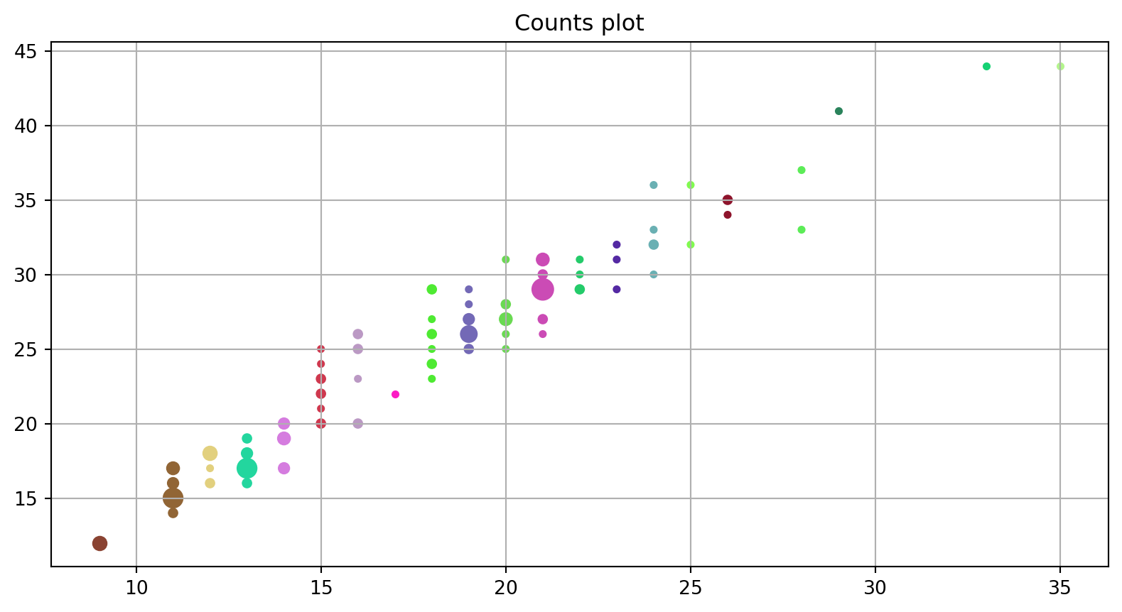
Marginal histograms are histograms added to the margin of each axis of a scatter plot for analyzing the distribution of each measure. Creating the following scatter plot with marginal histograms.
Using the same data from the previous plot.
# separate x and y
x = df["displ"]
y = df["hwy"]

fig = plt.figure(figsize = (10, 5))
# in this case we use gridspec.
# check the basics section of this kernel if you need help.
gs = fig.add_gridspec(5, 5)
ax1 = fig.add_subplot(gs[:4, :-1])

# main axis: scatter plot
# this line is very nice c = df.manufacturer.astype('category').cat.codes
# since it basically generate a color for each category
ax1.scatter(x, y, c = df.manufacturer.astype('category').cat.codes)

# set the labels for x and y
ax1.set_xlabel("Dist")
ax1.set_ylabel("Hwy")

# set the title for the main plot
ax1.set_title("Scatter plot with marginal histograms")

ax1.spines["right"].set_color("None")
ax1.spines["top"].set_color("None")

ax2 = fig.add_subplot(gs[4:, :-1])
ax2.hist(x, 40, orientation = 'vertical', color = "pink")

ax2.invert_yaxis()

ax2.set_xticks([])
ax2.set_yticks([])

ax2.axison = False

ax3 = fig.add_subplot(gs[:4, -1])
ax3.hist(y, 40, orientation = "horizontal", color = "pink")

ax3.set_xticks([])
ax3.set_yticks([])

ax3.axison = False

fig.tight_layout()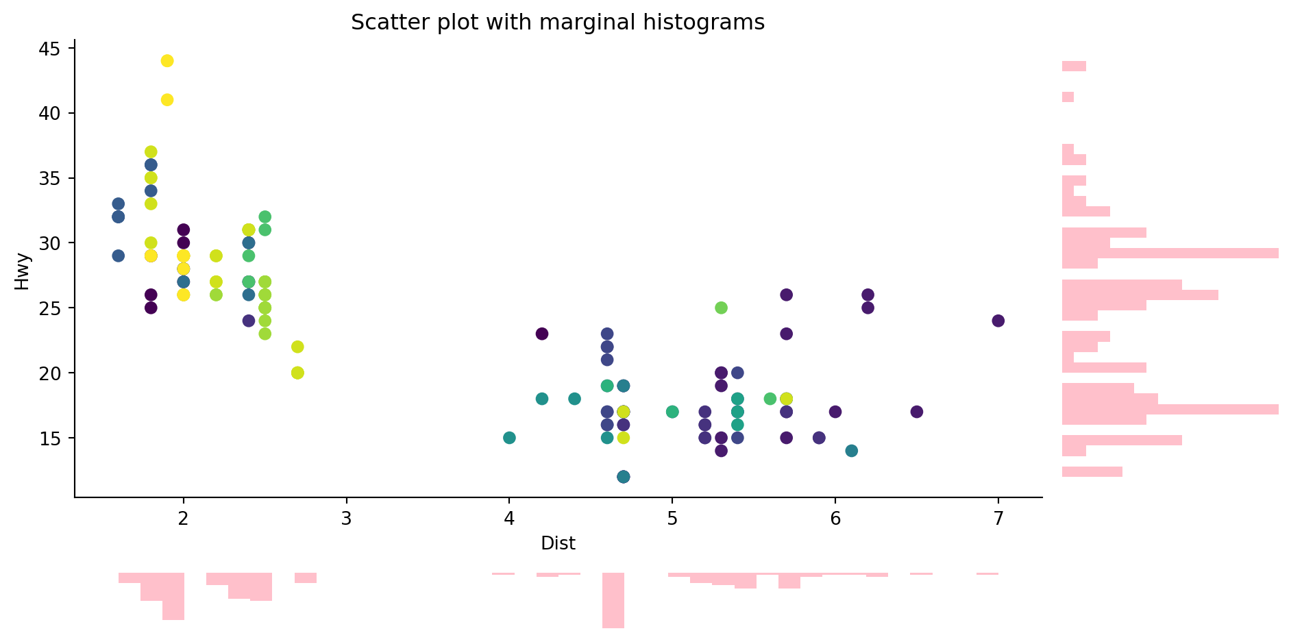
Marginal boxplot serves a similar purpose as marginal histogram. However, the boxplot helps to pinpoint the median, 25th and 75th percentiles of the X and the Y.
Using the same raw data from the previous plot.
x = df["displ"]
y = df["hwy"]

# in this plot we create the colors separatly
colors = df["manufacturer"].astype("category").cat.codes

fig = plt.figure(figsize = (10, 5))

gs = fig.add_gridspec(6, 6)
ax1 = fig.add_subplot(gs[:4, :-1])

# main axis: scatter plot

ax1.scatter(x, y, c = df.manufacturer.astype('category').cat.codes)

# set the labels for x and y
ax1.set_xlabel("Dist")
ax1.set_ylabel("Hwy")

# set the title for the main plot
ax1.set_title("Scatter plot with marginal boxplots")

ax1.spines["right"].set_color("None")
ax1.spines["top"].set_color("None")


ax2 = fig.add_subplot(gs[4:, :-1])
ax2.boxplot(x, vert = False,
            whis = 0.75 # make the boxplot lines shorter
           )

ax2.set_xticks([])
ax2.set_yticks([])

# left plot
ax3 = fig.add_subplot(gs[:4, -1])
ax3.boxplot(y,  whis = 0.75 )

ax3.set_xticks([])
ax3.set_yticks([])

fig.tight_layout()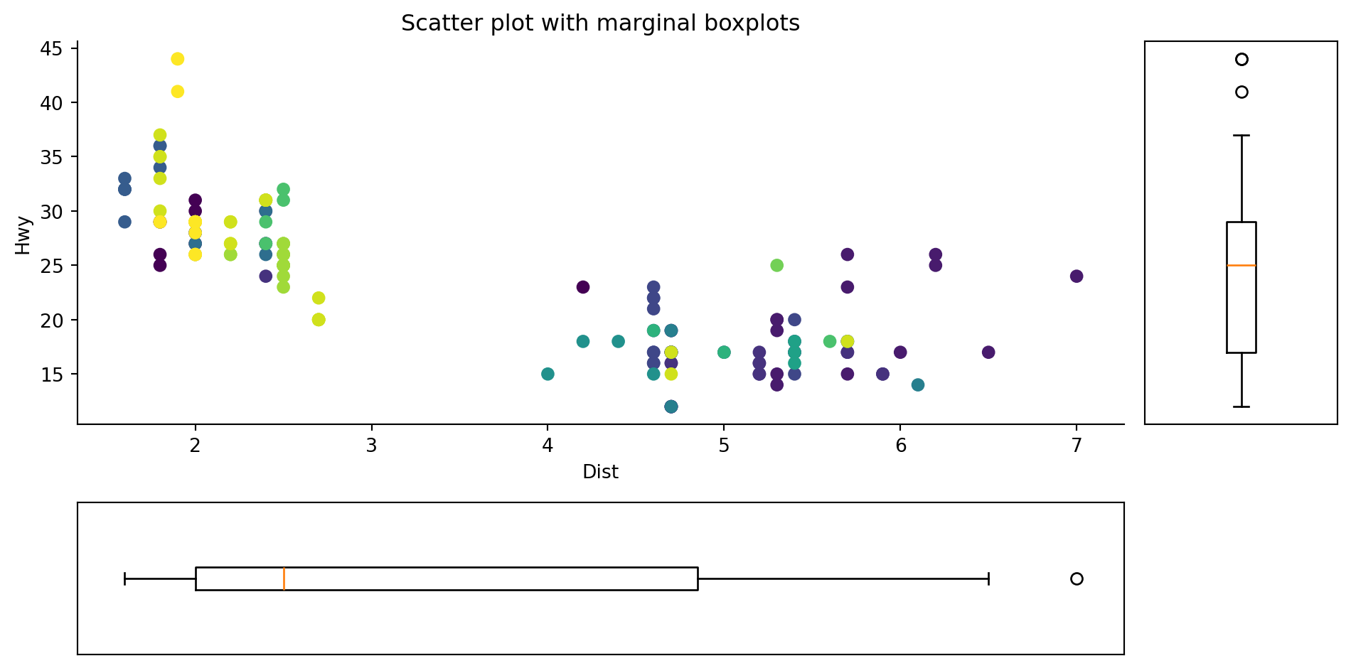
Seaborn offers simple utilities for creating correlation heatmaps. The heatmap displays a matrix with colors that indicate the degree of correlation between the variables.
df = pd.read_csv('data/mtcars.csv')
process_csv_from_data_folder("Plot Data Raw", dataframe=df)| Random Sample of 10 Records from 'Plot Data Raw' | |||||||||
|---|---|---|---|---|---|---|---|---|---|
| Exploring Data | |||||||||
| Model | Mpg | Cyl | Disp | Hp | Drat | Wt | Qsec | Vs | Am |
| Ferrari Dino | 19.70 | 6.00 | 145.00 | 175.00 | 3.62 | 2.77 | 15.50 | 0.00 | 1.00 |
| Lincoln Continental | 10.40 | 8.00 | 460.00 | 215.00 | 3.00 | 5.42 | 17.82 | 0.00 | 0.00 |
| Pontiac Firebird | 19.20 | 8.00 | 400.00 | 175.00 | 3.08 | 3.85 | 17.05 | 0.00 | 0.00 |
| Fiat 128 | 32.40 | 4.00 | 78.70 | 66.00 | 4.08 | 2.20 | 19.47 | 1.00 | 1.00 |
| Merc 230 | 22.80 | 4.00 | 140.80 | 95.00 | 3.92 | 3.15 | 22.90 | 1.00 | 0.00 |
| Merc 280 | 19.20 | 6.00 | 167.60 | 123.00 | 3.92 | 3.44 | 18.30 | 1.00 | 0.00 |
| Maserati Bora | 15.00 | 8.00 | 301.00 | 335.00 | 3.54 | 3.57 | 14.60 | 0.00 | 1.00 |
| Fiat X1-9 | 27.30 | 4.00 | 79.00 | 66.00 | 4.08 | 1.94 | 18.90 | 1.00 | 1.00 |
| Merc 450SL | 17.30 | 8.00 | 275.80 | 180.00 | 3.07 | 3.73 | 17.60 | 0.00 | 0.00 |
| Mazda RX4 | 21.00 | 6.00 | 160.00 | 110.00 | 3.90 | 2.62 | 16.46 | 0.00 | 1.00 |
| 💡 Additional columns not displayed: gear, carb | |||||||||
| 🔍 Data Exploration: Plot Data Raw | Sample Size: 10 Records | |||||||||
df1=df[['mpg','cyl','disp','hp','drat','wt','qsec']]
process_csv_from_data_folder("Plot Data Selected", dataframe=df1)| Random Sample of 10 Records from 'Plot Data Selected' | ||||||
|---|---|---|---|---|---|---|
| Exploring Data | ||||||
| Mpg | Cyl | Disp | Hp | Drat | Wt | Qsec |
| 19.70 | 6.00 | 145.00 | 175.00 | 3.62 | 2.77 | 15.50 |
| 10.40 | 8.00 | 460.00 | 215.00 | 3.00 | 5.42 | 17.82 |
| 19.20 | 8.00 | 400.00 | 175.00 | 3.08 | 3.85 | 17.05 |
| 32.40 | 4.00 | 78.70 | 66.00 | 4.08 | 2.20 | 19.47 |
| 22.80 | 4.00 | 140.80 | 95.00 | 3.92 | 3.15 | 22.90 |
| 19.20 | 6.00 | 167.60 | 123.00 | 3.92 | 3.44 | 18.30 |
| 15.00 | 8.00 | 301.00 | 335.00 | 3.54 | 3.57 | 14.60 |
| 27.30 | 4.00 | 79.00 | 66.00 | 4.08 | 1.94 | 18.90 |
| 17.30 | 8.00 | 275.80 | 180.00 | 3.07 | 3.73 | 17.60 |
| 21.00 | 6.00 | 160.00 | 110.00 | 3.90 | 2.62 | 16.46 |
| 🔍 Data Exploration: Plot Data Selected | Sample Size: 10 Records | ||||||
# calculate the correlation between all variables
corr = df1.corr()

mask = np.zeros_like(corr)
mask[np.triu_indices_from(mask)] = True

fig = plt.figure(figsize = (10, 5))

# plot the data using seaborn
ax = sns.heatmap(corr,
                 mask = mask,
                 vmax = 0.3,
                 square = True,
                 cmap = "viridis")
# set the title for the figure
ax.set_title("Heatmap using seaborn");
plt.grid()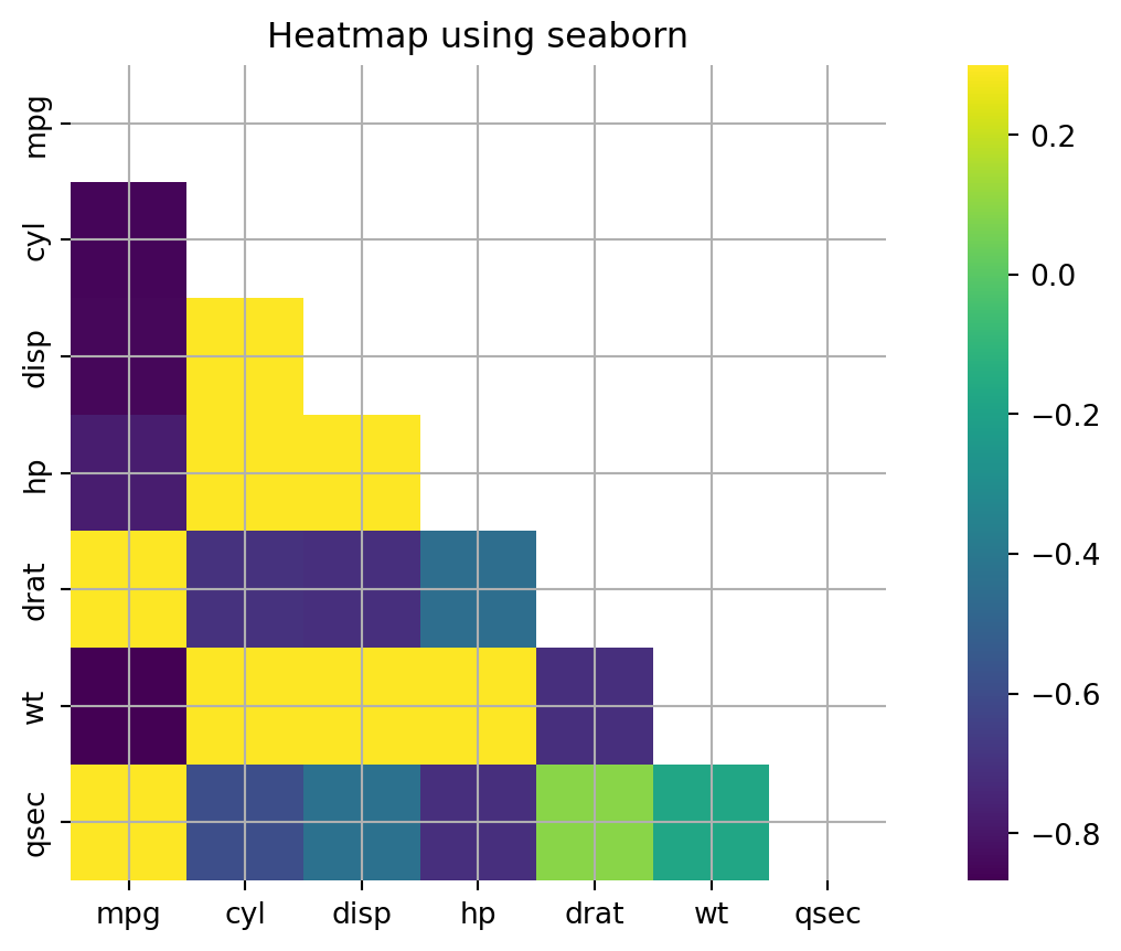
If you want to see how the items are varying based on a single metric and visualize the order and amount of this variance, the diverging bars is a great tool.
Diverging Bar Charts are used to ease the comparison of multiple groups. Its design allows us to compare numerical values in various groups. It also helps us to quickly visualize the favorable and unfavorable or positive and negative responses.
Using the same raw data as previous plot.
df = pd.read_csv('data/mtcars.csv')
process_csv_from_data_folder("Plot Data Raw", dataframe=df)| Random Sample of 10 Records from 'Plot Data Raw' | |||||||||
|---|---|---|---|---|---|---|---|---|---|
| Exploring Data | |||||||||
| Model | Mpg | Cyl | Disp | Hp | Drat | Wt | Qsec | Vs | Am |
| Ferrari Dino | 19.70 | 6.00 | 145.00 | 175.00 | 3.62 | 2.77 | 15.50 | 0.00 | 1.00 |
| Lincoln Continental | 10.40 | 8.00 | 460.00 | 215.00 | 3.00 | 5.42 | 17.82 | 0.00 | 0.00 |
| Pontiac Firebird | 19.20 | 8.00 | 400.00 | 175.00 | 3.08 | 3.85 | 17.05 | 0.00 | 0.00 |
| Fiat 128 | 32.40 | 4.00 | 78.70 | 66.00 | 4.08 | 2.20 | 19.47 | 1.00 | 1.00 |
| Merc 230 | 22.80 | 4.00 | 140.80 | 95.00 | 3.92 | 3.15 | 22.90 | 1.00 | 0.00 |
| Merc 280 | 19.20 | 6.00 | 167.60 | 123.00 | 3.92 | 3.44 | 18.30 | 1.00 | 0.00 |
| Maserati Bora | 15.00 | 8.00 | 301.00 | 335.00 | 3.54 | 3.57 | 14.60 | 0.00 | 1.00 |
| Fiat X1-9 | 27.30 | 4.00 | 79.00 | 66.00 | 4.08 | 1.94 | 18.90 | 1.00 | 1.00 |
| Merc 450SL | 17.30 | 8.00 | 275.80 | 180.00 | 3.07 | 3.73 | 17.60 | 0.00 | 0.00 |
| Mazda RX4 | 21.00 | 6.00 | 160.00 | 110.00 | 3.90 | 2.62 | 16.46 | 0.00 | 1.00 |
| 💡 Additional columns not displayed: gear, carb | |||||||||
| 🔍 Data Exploration: Plot Data Raw | Sample Size: 10 Records | |||||||||
df["x_plot"] = (df["mpg"] - df["mpg"].mean())/df["mpg"].std()

df.sort_values("x_plot", inplace = True)
df.reset_index(inplace = True)

colors = ["red" if x < 0 else "green" for x in df["x_plot"]]

fig = plt.figure(figsize = (10, 8))
ax = fig.add_subplot()
# plot using horizontal lines and make it look like a column by changing the linewidth
ax.hlines(y = df.index, xmin = 0 , xmax = df["x_plot"],  color = colors, linewidth = 5)

ax.set_xlabel("Mileage")
ax.set_ylabel("Car Name")

# set a title
ax.set_title("Diverging plot in matplotlib")

ax.grid(linestyle='--', alpha=0.5)

ax.set_yticks(df.index)
ax.set_yticklabels(df.model);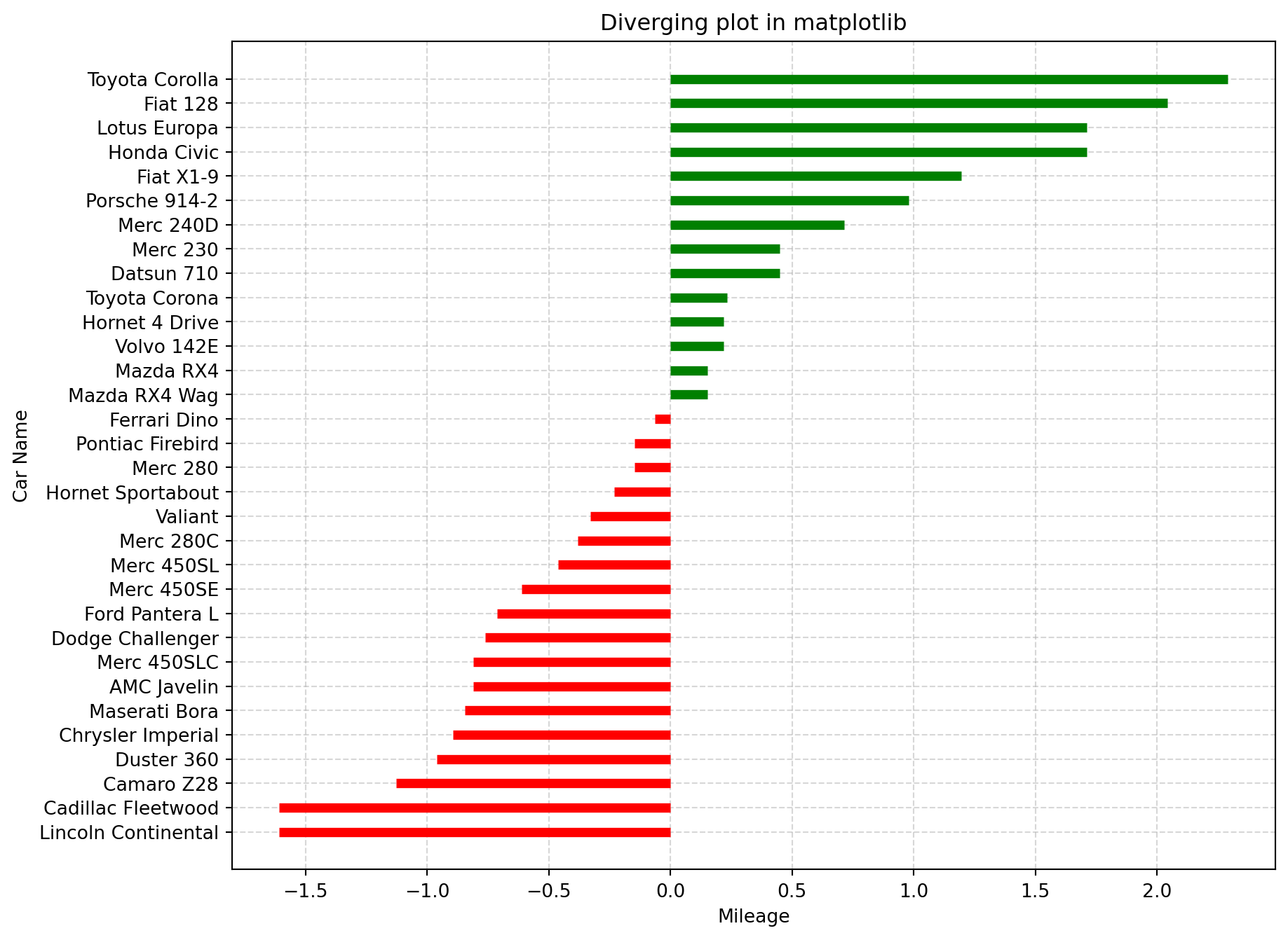
Divergent lines refer to a set of lines that originate from a common point and gradually spread or move apart from each other as they extend further. Using the same data as the previous plot.
# https://statisticsbyjim.com/glossary/standardization/
df["x_plot"] = (df["mpg"] - df["mpg"].mean())/df["mpg"].std()

# sort value and reset the index
df.sort_values("x_plot", inplace = True)
df.reset_index(inplace=True)

# create a color list, where if value is above > 0 it's green otherwise red
colors = ["red" if x < 0 else "green" for x in df["x_plot"]]

fig = plt.figure(figsize = (10, 8))
ax = fig.add_subplot()

ax.hlines(y = df.index, xmin = 0 , color = colors,  xmax = df["x_plot"], linewidth = 1)

# iterate over x and y
for x, y in zip(df["x_plot"], df.index):
    # annotate text
    ax.text(x - 0.1 if x < 0 else x + 0.1,
             y,
             round(x, 2),
             color = "red" if x < 0 else "green",
             horizontalalignment='right' if x < 0 else 'left',
             size = 10)

    ax.scatter(x,
                y,
                color = "red" if x < 0 else "green",
                alpha = 0.5)

# set title
ax.set_title("Diverging plot in matplotlib")
# change x lim
ax.set_xlim(-3, 3)

# set labels
ax.set_xlabel("Mileage")
ax.set_ylabel("Car Name")

ax.grid(linestyle='--', alpha=0.5)
ax.set_yticks(df.index)
ax.set_yticklabels(df.model)
ax.spines["top"].set_color("None")
ax.spines["left"].set_color("None")
ax.spines['right'].set_position(('data',0))
ax.spines['right'].set_color('black')
A diverging dot plot is useful in plotting variance.
Same raw data as the previous plot.
# https://statisticsbyjim.com/glossary/standardization/
df["x_plot"] = (df["mpg"] - df["mpg"].mean())/df["mpg"].std()

# sort value and reset the index
df.sort_values("x_plot", inplace = True)
df.reset_index(drop=True, inplace=True)

# create a color list, where if value is above > 0 it's green otherwise red
colors = ["red" if x < 0 else "green" for x in df["x_plot"]]


fig = plt.figure(figsize = (10, 8))
ax = fig.add_subplot()

# iterate over x and y and annotate text and plot the data
for x, y in zip(df["x_plot"], df.index):

    # make a horizontal line from the y till the x value
    # this doesn't appear in the original 50 plot challenge
    ax.hlines(y = y,
               xmin = -3,
               xmax = x,
               linewidth = 0.5,
               alpha = 0.3,
               color = "red" if x < 0 else "green")

    # annotate text
    ax.text(x,
             y,
             round(x, 2),
             color = "black",
             horizontalalignment='center',
             verticalalignment='center',
             size = 8)

    # plot the points
    ax.scatter(x,
                y,
                color = "red" if x < 0 else "green",
                s = 300,
                alpha = 0.5)
# set title
ax.set_title("Diverging plot in matplotlib")

# change x lim
ax.set_xlim(-3, 3)

# set labels
ax.set_xlabel("Mileage")
ax.set_ylabel("Car Name")

ax.set_yticks(df.index)
ax.set_yticklabels(df.model)

ax.spines["top"].set_color("None")
ax.spines["left"].set_color("None")

ax.spines['right'].set_position(('data',0))
ax.spines['right'].set_color('grey')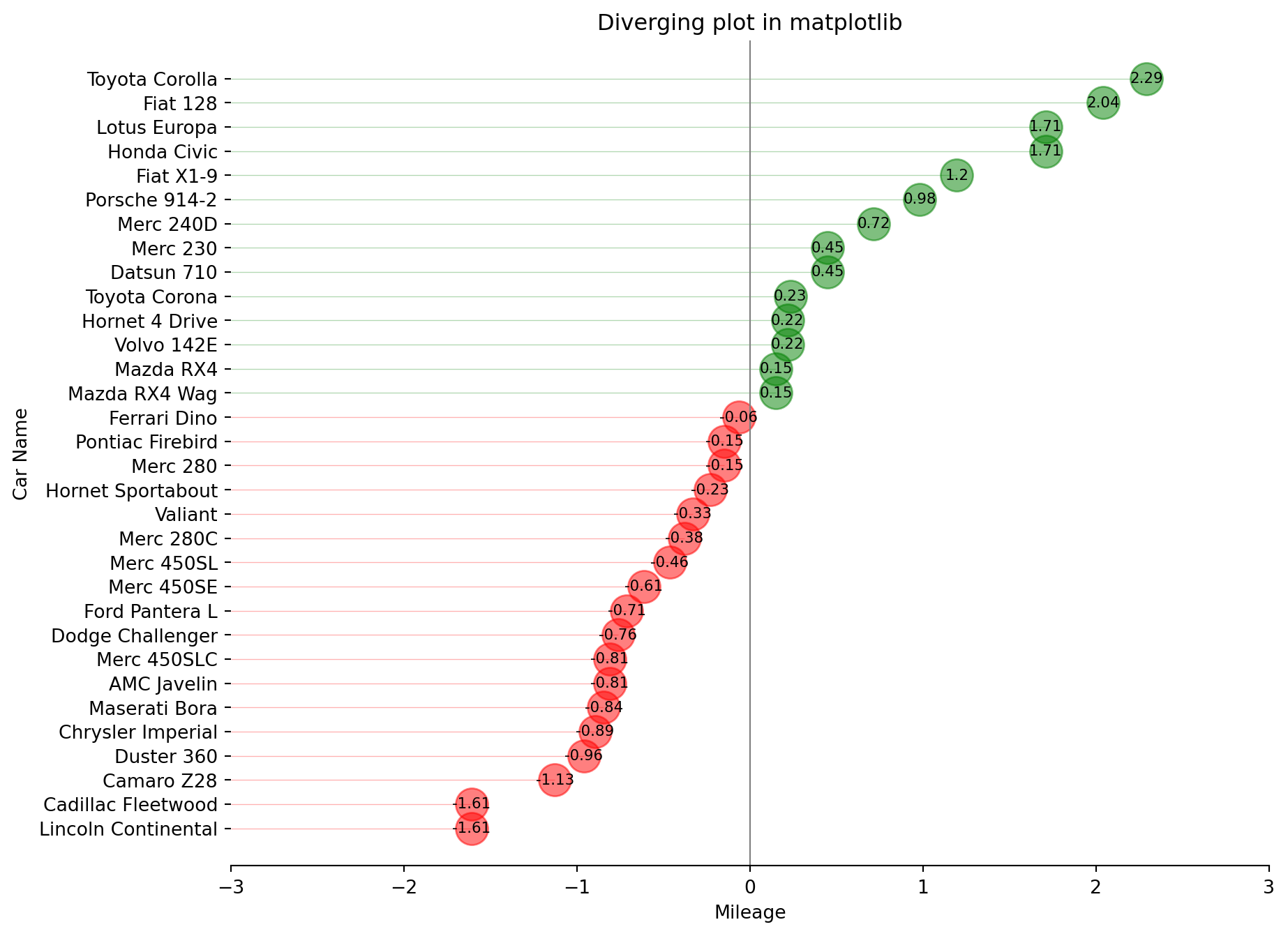
A diverging lollipop chart is a useful tool for comparing data that falls into two categories, usually indicated by different colors.
Using the same raw data as previous plot.
# https://statisticsbyjim.com/glossary/standardization/
df["x_plot"] = (df["mpg"] - df["mpg"].mean())/df["mpg"].std()

# sort value and reset the index
df.sort_values("x_plot", inplace = True)
df.reset_index(drop=True, inplace = True)

df["color"] = df["model"].apply(lambda car_name: "orange" if car_name == "Fiat X1-9" else "black")

fig = plt.figure(figsize = (8, 12))
ax = fig.add_subplot()

ax.hlines(y = df.index,
          xmin = 0,
          xmax = df["x_plot"],
          color = df["color"],
          alpha = 0.6)

# plot the dots
ax.scatter(x = df["x_plot"],
          y = df.index,
          s = 100,
          color = df["color"],
          alpha = 0.6)

def add_patch(verts, ax, color):
    '''
    Takes the vertices and the axes as argument and adds the patch to our plot.
    '''
    codes = [
        Path.MOVETO,
        Path.LINETO,
        Path.LINETO,
        Path.LINETO,
        Path.CLOSEPOLY,
    ]

    path = Path(verts, codes)
    pathpatch = PathPatch(path, facecolor = color, lw = 2, alpha = 0.3)
    ax.add_patch(pathpatch)

# coordinates for the bottom shape
verts_bottom = [
   (-2.5, -0.5),  # left, bottom
   (-2.5, 2),  # left, top
   (-1.5, 2),  # right, top
   (-1.5, -0.5),  # right, bottom
   (0., 0.),  # ignored
]

# coordinates for the upper shape
verts_upper = [
   (1.5, 27),  # left, bottom
   (1.5, 33),  # left, top
   (2.5, 33),  # right, top
   (2.5, 27),  # right, bottom
   (0., 0.),  # ignored
]

# use the function to add them to the existing plot
add_patch(verts_bottom, ax, color = "red")
add_patch(verts_upper, ax, color = "green")

# annotate text
ax.annotate('Mercedes Models',
            xy = (0.0, 11.0),
            xytext = (1.5, 11),
            xycoords = 'data',
            fontsize = 10,
            ha = 'center',
            va = 'center',
            bbox = dict(boxstyle = 'square', fc = 'blue', alpha = 0.1),
            arrowprops = dict(arrowstyle = '-[, widthB=2.0, lengthB=1.5', lw = 2.0, color = 'grey'), color = 'black')

# set title
ax.set_title("Diverging Lollipop of Car Mileage")

# autoscale
ax.autoscale_view()

# change x lim
ax.set_xlim(-3, 3)

# set labels
ax.set_xlabel("Mileage")
ax.set_ylabel("Car Name")

ax.set_yticks(df.index)
ax.set_yticklabels(df.model)

ax.spines["right"].set_color("None")
ax.spines["top"].set_color("None")

ax.grid(linestyle='--', alpha=0.5);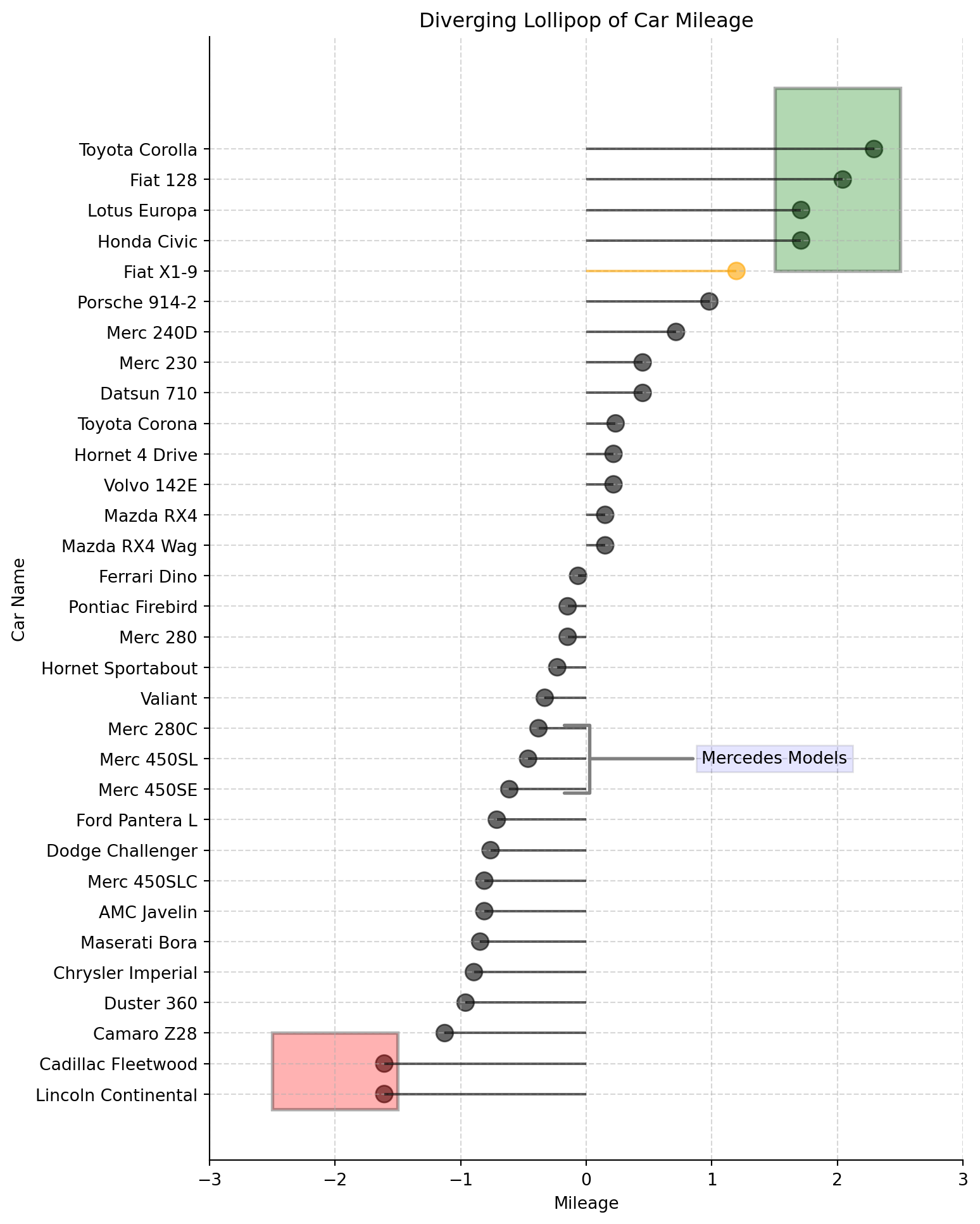
seaborn.pairplot(): To plot multiple pairwise bivariate distributions in a dataset, you can use the .pairplot() function. The diagonal plots are the univariate plots, and this displays the relationship for the (n, 2) combination of variables in a DataFrame as a matrix of plots.
df = sns.load_dataset('iris')
process_csv_from_data_folder("Plot Data Raw", dataframe=df)| Random Sample of 10 Records from 'Plot Data Raw' | ||||
|---|---|---|---|---|
| Exploring Data | ||||
| Sepal Length | Sepal Width | Petal Length | Petal Width | Species |
| 6.10 | 2.80 | 4.70 | 1.20 | versicolor |
| 5.70 | 3.80 | 1.70 | 0.30 | setosa |
| 7.70 | 2.60 | 6.90 | 2.30 | virginica |
| 6.00 | 2.90 | 4.50 | 1.50 | versicolor |
| 6.80 | 2.80 | 4.80 | 1.40 | versicolor |
| 5.40 | 3.40 | 1.50 | 0.40 | setosa |
| 5.60 | 2.90 | 3.60 | 1.30 | versicolor |
| 6.90 | 3.10 | 5.10 | 2.30 | virginica |
| 6.20 | 2.20 | 4.50 | 1.50 | versicolor |
| 5.80 | 2.70 | 3.90 | 1.20 | versicolor |
| 🔍 Data Exploration: Plot Data Raw | Sample Size: 10 Records | ||||
# plot the data using seaborn
sns.pairplot(df, hue = "species" );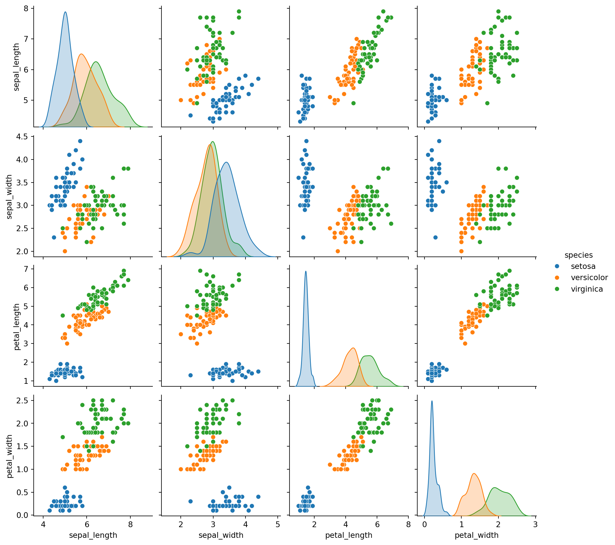
An area chart is really similar to a line chart, except that the area between the x axis and the line is filled in with color or shading. It represents the evolution of a numeric variable.
df = pd.DataFrame({
    'sales': [6, 4, 9, 7, 13, 10],
    'signups': [9,13, 15, 12, 20, 26],
    'visits': [20, 42, 28, 62, 81, 50],
}, index=pd.date_range(start='2024/05/01', end='2024/11/01',
                       freq='ME'))

ax = df.plot.area()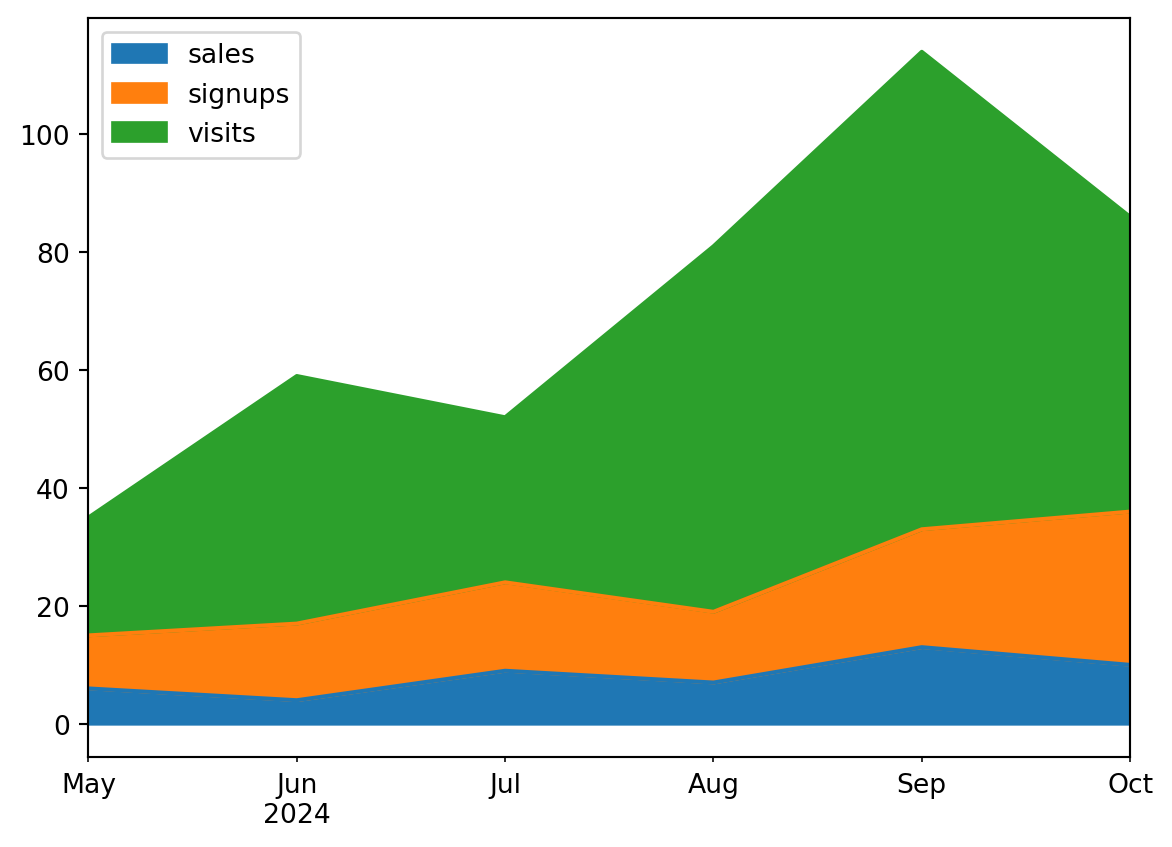
A more complex area chart provided below using timeseries data.
df = pd.read_csv('data\economics.csv')
process_csv_from_data_folder("econimics.csv", dataframe=df)| Random Sample of 10 Records from 'econimics.csv' | |||||
|---|---|---|---|---|---|
| Exploring Data | |||||
| Date | Pce | Pop | Psavert | Uempmed | Unemploy |
| 2010-05-01 | 10,140.20 | 309,376.00 | 6.00 | 22.30 | 14,849.00 |
| 1973-05-01 | 843.10 | 211,577.00 | 12.80 | 4.90 | 4,329.00 |
| 1978-06-01 | 1,429.80 | 222,379.00 | 9.50 | 6.00 | 6,028.00 |
| 2002-09-01 | 7,426.10 | 288,618.00 | 4.90 | 9.50 | 8,251.00 |
| 2012-12-01 | 11,245.20 | 315,532.00 | 10.50 | 17.60 | 12,272.00 |
| 1994-04-01 | 4,690.70 | 262,631.00 | 5.80 | 9.10 | 8,331.00 |
| 1983-03-01 | 2,208.60 | 233,613.00 | 10.00 | 10.40 | 11,408.00 |
| 1969-12-01 | 623.70 | 203,675.00 | 11.70 | 4.60 | 2,884.00 |
| 1974-04-01 | 912.70 | 213,361.00 | 12.70 | 5.00 | 4,618.00 |
| 1993-05-01 | 4,441.30 | 259,680.00 | 7.70 | 8.10 | 9,149.00 |
| 🔍 Data Exploration: econimics.csv | Sample Size: 10 Records | |||||
df["pce_monthly_change"] = (df["psavert"] - df["psavert"].shift(1))/df["psavert"].shift(1)

# convert todatetime
df["date_converted"] = pd.to_datetime(df["date"])

# filter our df for a specific date
df = df[df["date_converted"] < np.datetime64("1975-01-01")]

# separate x and y
x = df["date_converted"]
y = df["pce_monthly_change"]

# calculate the max values to annotate on the plot
y_max = y.max()

# find the index of the max value
x_ind = np.where(y == y_max)

# find the x based on the index of max
x_max = x.iloc[x_ind]

fig = plt.figure(figsize = (15, 10))
ax = fig.add_subplot()

ax.plot(x, y, color = "black")
ax.scatter(x_max, y_max, s = 300, color = "green", alpha = 0.3)

# annotate the text of the Max value
ax.annotate(r'Max value',
             xy = (x_max, y_max),
             xytext = (-90, -50),
             textcoords = 'offset points',
             fontsize = 16,
             arrowprops = dict(arrowstyle = "->", connectionstyle = "arc3,rad=.2")
           )

ax.fill_between(x, 0, y, where = 0 > y, facecolor='red', interpolate = True, alpha = 0.3)
ax.fill_between(x, 0, y, where = 0 <= y, facecolor='green', interpolate = True, alpha = 0.3)

ax.set_ylim(y.min() * 1.1, y.max() * 1.1)

xtickvals = [str(m)[:3].upper() + "-" + str(y) for y,m in zip(df.date_converted.dt.year, df.date_converted.dt.month_name())]

# this way we can set the ticks to be every 6 months.
ax.set_xticks(x[::6])

ax.set_xticklabels(xtickvals[::6], rotation=45, fontdict={'horizontalalignment': 'center', 'verticalalignment': 'center_baseline'})

# add a grid
ax.grid(alpha = 0.3)

# set the title
ax.set_title("Monthly variation return %");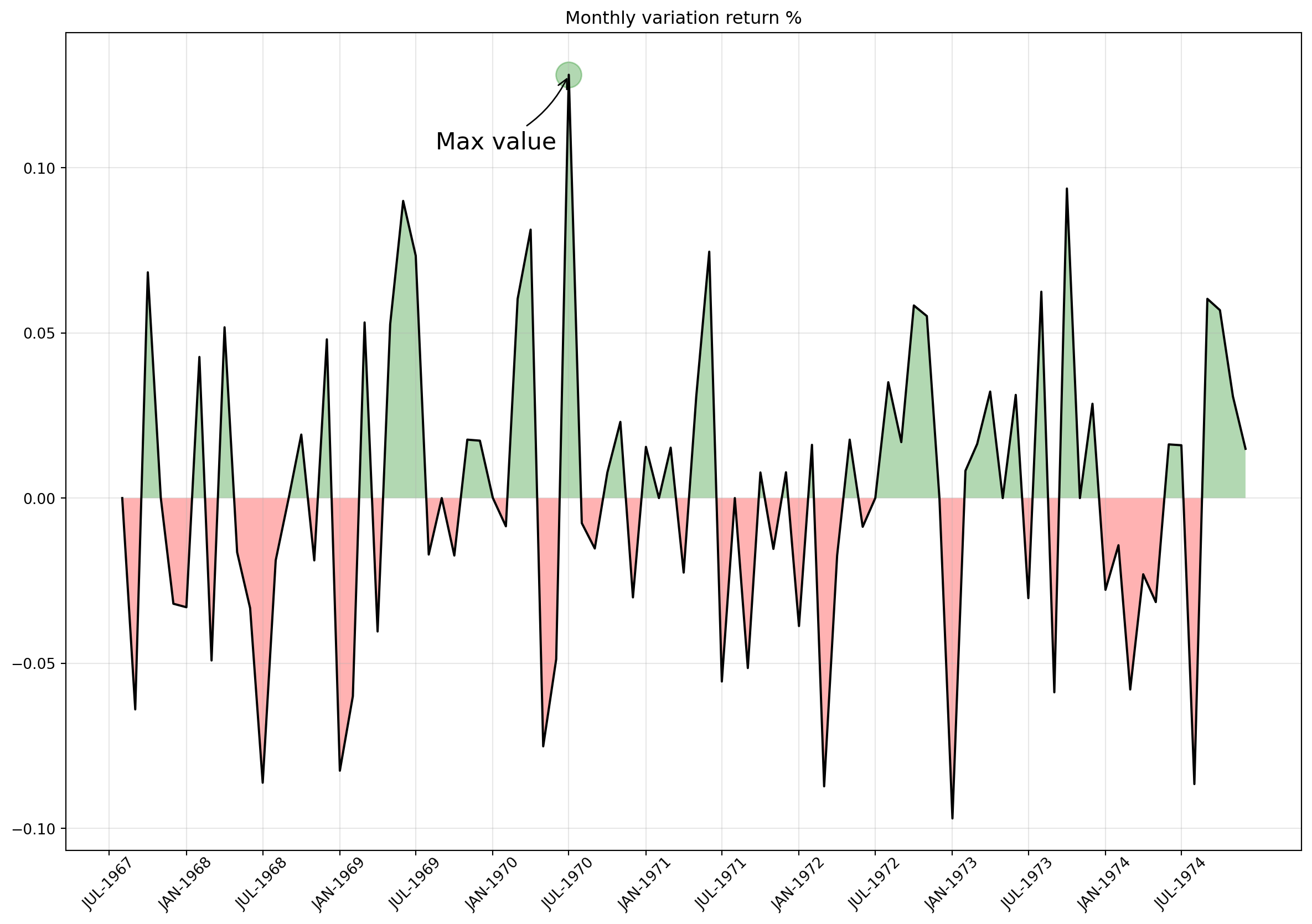
Sort bars in increasing/decreasing order in a bar chart in Matplotlib. Create the ordered bar chart to show comparisons among discrete categories.
Reusing data that we have seen before.
df = pd.read_csv('data\mpg_ggplot2.csv')
process_csv_from_data_folder("mpg_ggplot2.csv", dataframe=df)| Random Sample of 10 Records from 'mpg_ggplot2.csv' | |||||||||
|---|---|---|---|---|---|---|---|---|---|
| Exploring Data | |||||||||
| Manufacturer | Model | Displ | Year | Cyl | Trans | Drv | Cty | Hwy | Fl |
| dodge | ram 1500 pickup 4wd | 4.70 | 2,008.00 | 8.00 | manual(m6) | 4 | 9.00 | 12.00 | e |
| toyota | toyota tacoma 4wd | 4.00 | 2,008.00 | 6.00 | auto(l5) | 4 | 16.00 | 20.00 | r |
| toyota | camry | 2.20 | 1,999.00 | 4.00 | auto(l4) | f | 21.00 | 27.00 | r |
| audi | a4 quattro | 2.00 | 2,008.00 | 4.00 | manual(m6) | 4 | 20.00 | 28.00 | p |
| jeep | grand cherokee 4wd | 4.70 | 2,008.00 | 8.00 | auto(l5) | 4 | 14.00 | 19.00 | r |
| hyundai | sonata | 2.40 | 1,999.00 | 4.00 | manual(m5) | f | 18.00 | 27.00 | r |
| toyota | corolla | 1.80 | 2,008.00 | 4.00 | manual(m5) | f | 28.00 | 37.00 | r |
| ford | mustang | 4.00 | 2,008.00 | 6.00 | auto(l5) | r | 16.00 | 24.00 | r |
| volkswagen | jetta | 2.00 | 1,999.00 | 4.00 | manual(m5) | f | 21.00 | 29.00 | r |
| audi | a6 quattro | 2.80 | 1,999.00 | 6.00 | auto(l5) | 4 | 15.00 | 24.00 | p |
| 💡 Additional columns not displayed: class | |||||||||
| 🔍 Data Exploration: mpg_ggplot2.csv | Sample Size: 10 Records | |||||||||
# groupby and create the target x and y
gb_df = df.groupby(["manufacturer"])[["cyl", "displ", "cty"]].mean()
gb_df.sort_values("cty", inplace = True)

x = gb_df.index
y = gb_df["cty"]

fig = plt.figure(figsize = (10, 8))
ax = fig.add_subplot()

for x_, y_ in zip(x, y):
    # this is very cool, since we can pass a function to matplotlib
    # and it will plot the color based on the result of the evaluation
    ax.bar(x_, y_, color = "red" if y_ < y.mean() else "green", alpha = 0.3)

     # add some text
    ax.text(x_, y_ + 0.3, round(y_, 1), horizontalalignment = 'center')

p2 = patches.Rectangle((.124, -0.005), width = .360, height = .13, alpha = .1, facecolor = 'red', transform = fig.transFigure)
fig.add_artist(p2)

# green one
p1 = patches.Rectangle((.124 + .360, -0.005), width = .42, height = .13, alpha = .1, facecolor = 'green', transform = fig.transFigure)
fig.add_artist(p1)

# rotate the x ticks 90 degrees
# Before setting tick labels, set the tick locations
ax.set_xticks(range(len(x)))  # Use range of x-axis length
ax.set_xticklabels(x, rotation=90)

# add an y label
ax.set_ylabel("Average Miles per Gallon by Manufacturer")

# set a title
ax.set_title("Bar Chart for Highway Mileage");
plt.grid()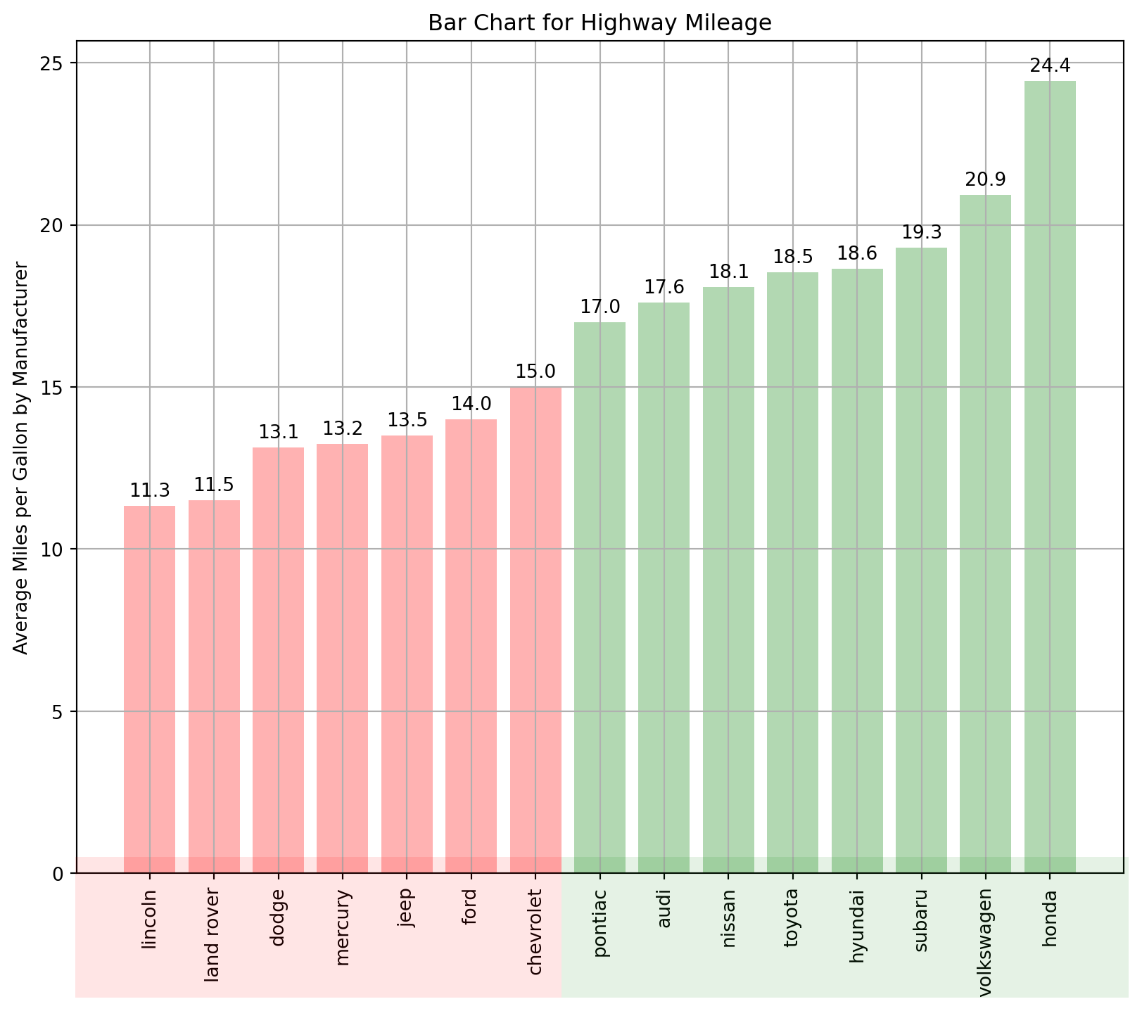
Lollipop Charts are nothing but a variation of the bar chart in which the thick bar is replaced with just a line and a dot-like “o” (o-shaped) at the end.
Same data as previous plot.
gb_df = df.groupby(["manufacturer"])[["cyl", "displ", "cty"]].mean()
gb_df.sort_values("cty", inplace = True)

x = gb_df.index
y = gb_df["cty"]

fig = plt.figure(figsize = (10, 8))
ax = fig.add_subplot()

for x_, y_ in zip(x, y):
    # make a scatter plot
    ax.scatter(x_, y_, color = "red" if y_ < y.mean() else "green", alpha = 0.3, s = 100)


    ax.vlines(x_, ymin = 0, ymax = y_, color = "red" if y_ < y.mean() else "green", alpha = 0.3)

    # add text with the data
    ax.text(x_, y_ + 0.5, round(y_, 1), horizontalalignment='center')

ax.set_ylim(0, 30)

# rotate the x ticks 90 degrees
# Before setting tick labels, set the tick locations
ax.set_xticks(range(len(x)))  # Use range of x-axis length
ax.set_xticklabels(x, rotation=90)

ax.set_ylabel("Average Miles per Gallon by Manufacturer")

# set a title
ax.set_title("Lollipop Chart for Highway Mileage");
plt.grid()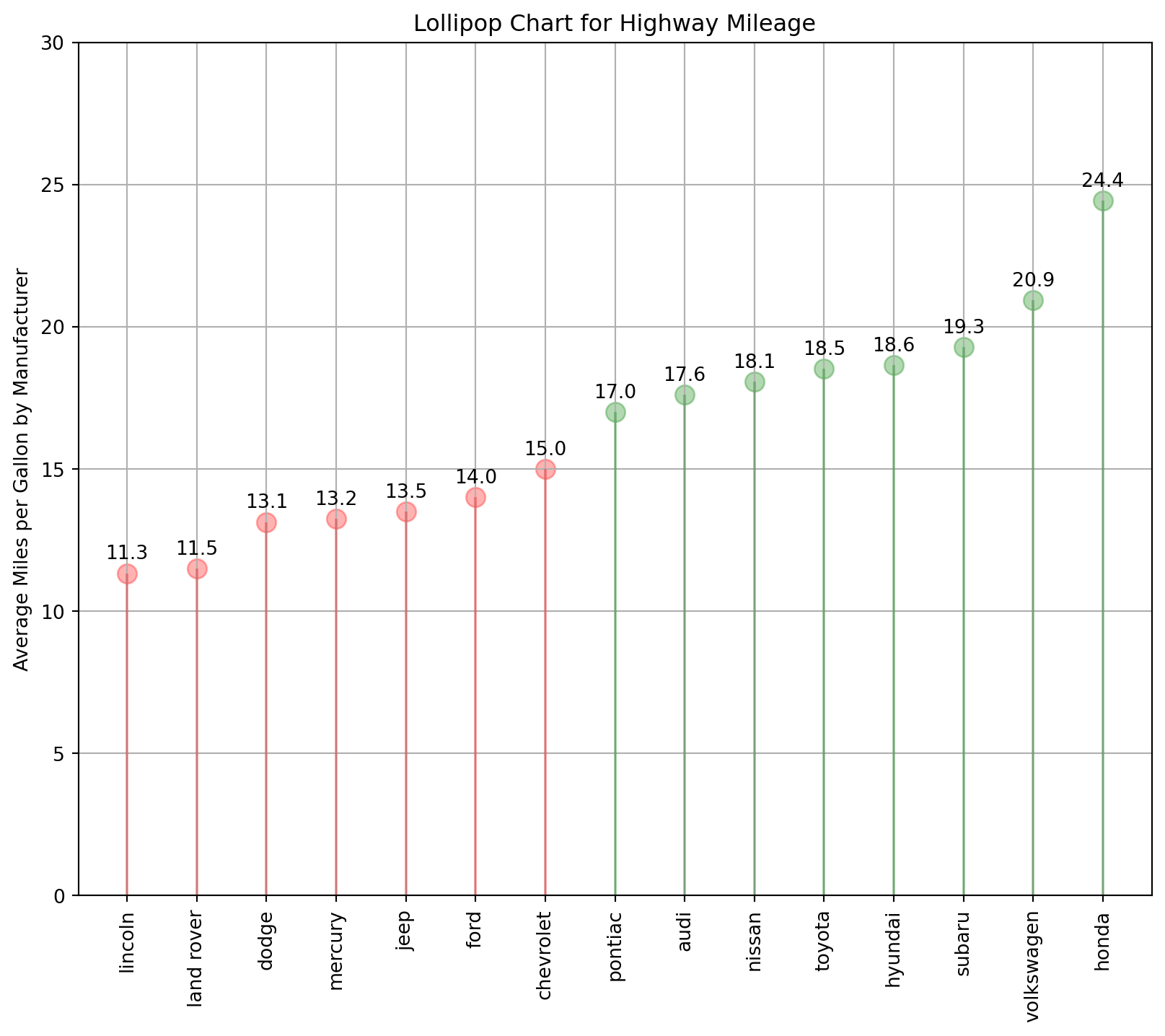
The dot plot conveys the rank order of the items. This is a simple graph that uses solid circles, or dots, to show the frequency of each unique data value.
Same data used as in the plot above.
gb_df = df.groupby(["manufacturer"])[["cyl", "displ", "cty"]].mean()
gb_df.sort_values("cty", inplace = True)

x = gb_df.index
y = gb_df["cty"]

fig = plt.figure(figsize = (10, 8))
ax = fig.add_subplot()

for x_, y_ in zip(x, y):
    ax.scatter(y_, x_, color = "red" if y_ < y.mean() else "green", alpha = 0.3, s = 100)

ax.set_xlim(8, 27)

ax.set_xlabel("Average Miles per Gallon by Manufacturer")

# set the title
ax.set_title("Dot Plot for Highway Mileage")

ax.grid(which = 'major', axis = 'y', linestyle = '--');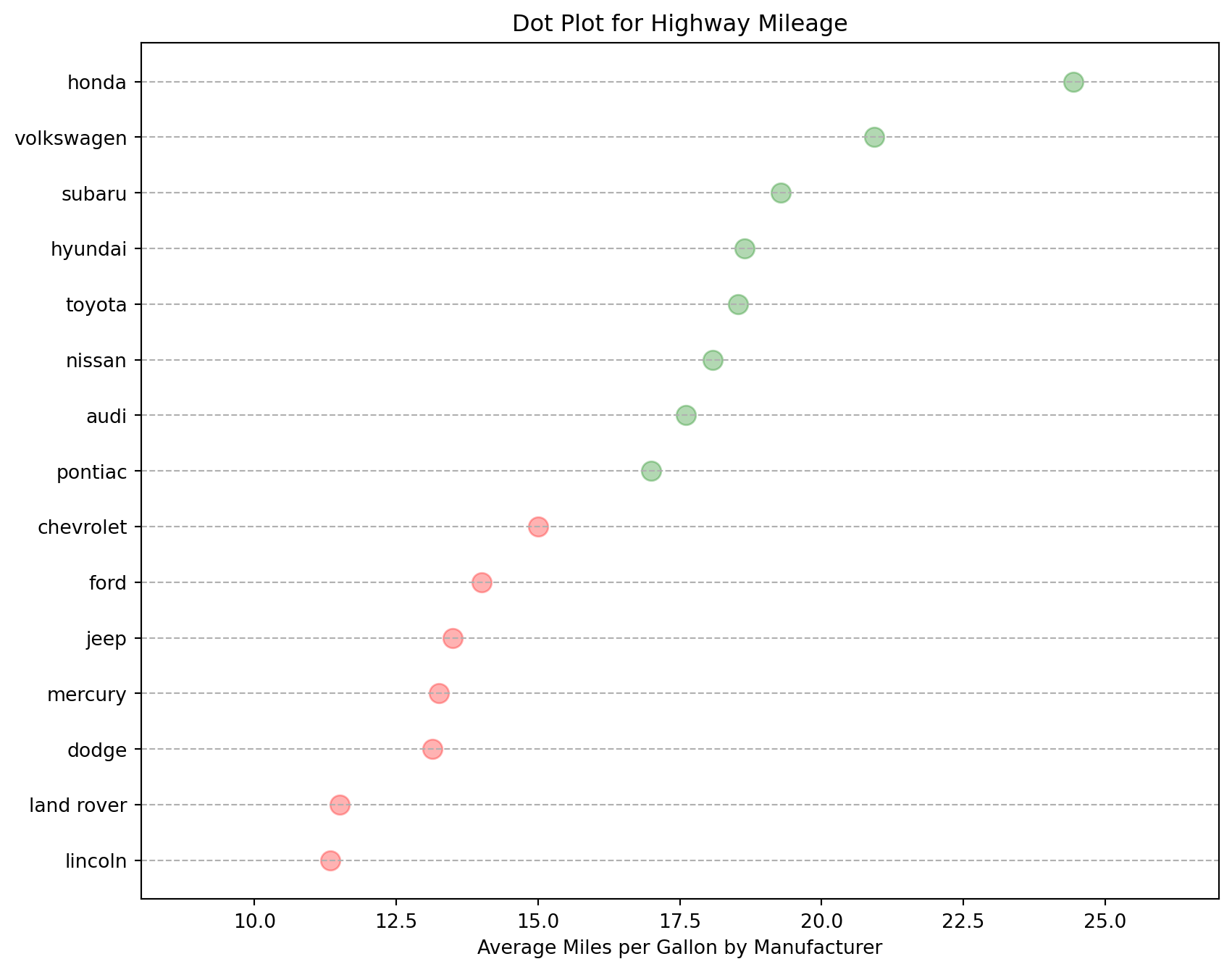
A slope chart is a graphical representation used to display changes in values between two or more data points or categories.
df = pd.read_csv('data\gdppercap.csv')
process_csv_from_data_folder("gdppercap.csv", dataframe=df)| Random Sample of 10 Records from 'gdppercap.csv' | ||
|---|---|---|
| Exploring Data | ||
| Continent | 1952 | 1957 |
| Africa | 1,252.57 | 1,385.24 |
| Americas | 4,079.06 | 4,616.04 |
| Asia | 5,195.48 | 4,003.13 |
| Europe | 5,661.06 | 6,963.01 |
| Oceania | 10,298.09 | 11,598.52 |
| 🔍 Data Exploration: gdppercap.csv | Sample Size: 10 Records | ||
df["color"] = df.apply(lambda row: "green" if row["1957"] >= row["1952"] else "red", axis = 1)
fig = plt.figure(figsize = (8, 12))
ax = fig.add_subplot()
for cont in df["continent"]:

    # prepare the data for plotting
    # extract each point and the color
    x_start = df.columns[1]
    x_finish = df.columns[2]
    y_start = df[df["continent"] == cont]["1952"]
    y_finish = df[df["continent"] == cont]["1957"]
    color = df[df["continent"] == cont]["color"]


    ax.scatter(x_start, y_start, color = color, s = 200)
    ax.scatter(x_finish, y_finish, color = color, s = 200*(y_finish/y_start))


    ax.plot([x_start, x_finish], [float(y_start.iloc[0]), float(y_finish.iloc[0])], linestyle = "-", color = color.values[0])

    # annotate the value for each continent
    ax.text(ax.get_xlim()[0] - 0.05, y_start.iloc[0], r'{}:{}k'.format(cont, int(y_start.iloc[0])/1000), \
            horizontalalignment = 'right', verticalalignment = 'center', fontdict = {'size':8})
    ax.text(ax.get_xlim()[1] + 0.05, y_finish.iloc[0], r'{}:{}k'.format(cont, int(y_finish.iloc[0])/1000), \
            horizontalalignment = 'left', verticalalignment = 'center', fontdict = {'size':8})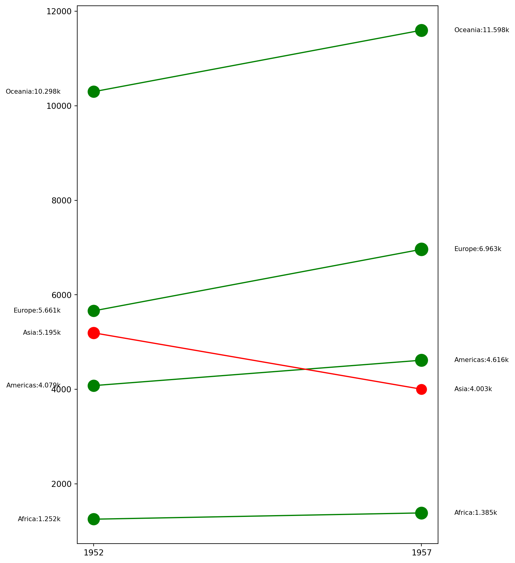
The dumbbell plot (aka connected dot plot) is great for displaying changes between two points in time, two conditions or differences between two groups.
df = pd.read_csv('data\health.csv')
process_csv_from_data_folder("health.csv", dataframe=df)| Random Sample of 10 Records from 'health.csv' | ||
|---|---|---|
| Exploring Data | ||
| Area | Pct 2014 | Pct 2013 |
| Phoenix | 0.13 | 0.17 |
| Portland | 0.09 | 0.13 |
| Houston | 0.19 | 0.22 |
| Minneapolis | 0.06 | 0.08 |
| All Metro Areas | 0.11 | 0.14 |
| Charlotte | 0.13 | 0.15 |
| New York | 0.10 | 0.12 |
| Miami | 0.19 | 0.24 |
| Pittsburgh | 0.06 | 0.07 |
| Los Angeles | 0.14 | 0.20 |
| 🔍 Data Exploration: health.csv | Sample Size: 10 Records | ||
fig = plt.figure(figsize = (8, 8))
ax = fig.add_subplot()
for i, area in zip(df.index, df["Area"]):
    start_data = df[df["Area"] == area]["pct_2013"].values[0]
    finish_data = df[df["Area"] == area]["pct_2014"].values[0]

    ax.scatter(start_data, i, c = "blue", alpha = .8)
    ax.scatter(finish_data, i, c = "blue", alpha = .2)

    ax.hlines(i, start_data, finish_data, color = "blue", alpha = .2)

# set x and y label
ax.set_xlabel("Pct change")
ax.set_ylabel("Area")
# set the title
ax.set_title("Dumbell Chart: Pct Change - 2013 vs 2014")
ax.grid(axis = "x")
x_lim = ax.get_xlim()
ax.set_xlim(x_lim[0]*.5, x_lim[1]*1.1)
x_ticks = ax.get_xticks()

# Add this line to set ticks before setting labels
ax.set_xticks(x_ticks)

ax.set_xticklabels(["{:.0f}%".format(round(tick*100, 0)) for tick in x_ticks])
ax.set_yticks(df.index)
plt.grid()

# More info:
# https://www.amcharts.com/demos/dumbbell-plot/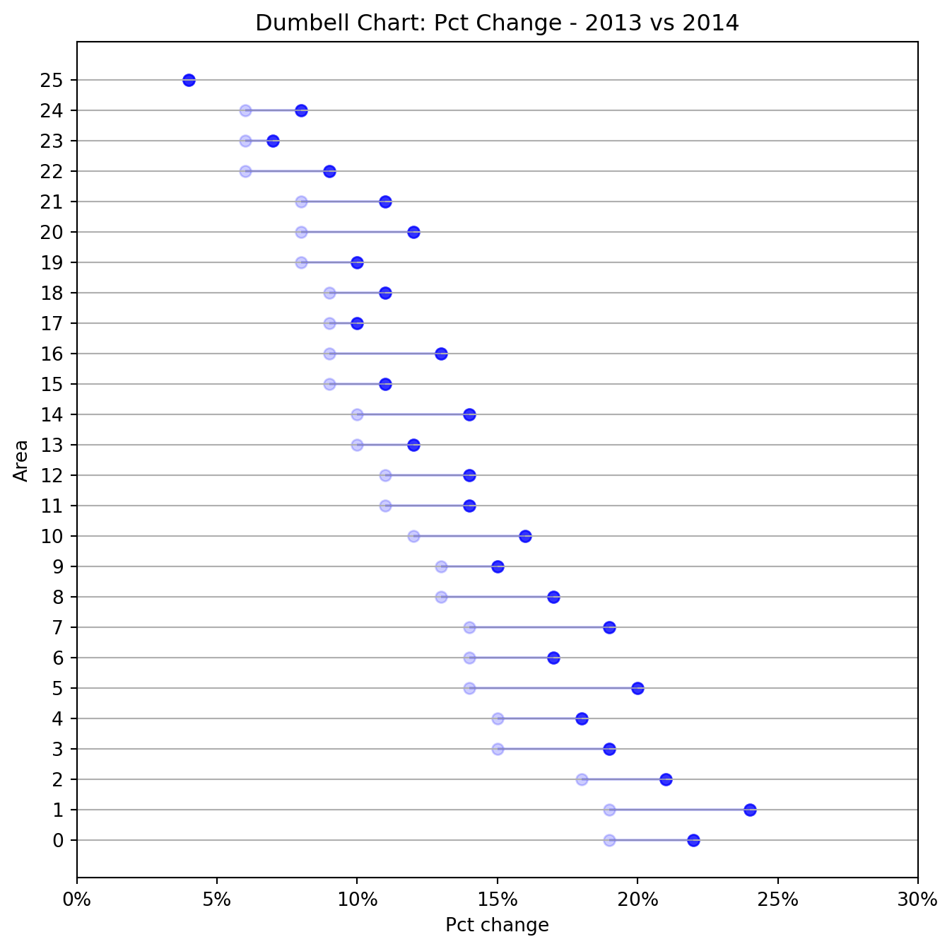
The histogram is one of the most useful graphical tools for understanding the distribution of a continuous variable. A stacked histogram is two or more histograms displayed on the same scale and used to compare variables.
Reusing the mpg_ggplot2.csv data.
df = pd.read_csv('data\mpg_ggplot2.csv')
process_csv_from_data_folder("mpg_ggplot2.csv", dataframe=df)| Random Sample of 10 Records from 'mpg_ggplot2.csv' | |||||||||
|---|---|---|---|---|---|---|---|---|---|
| Exploring Data | |||||||||
| Manufacturer | Model | Displ | Year | Cyl | Trans | Drv | Cty | Hwy | Fl |
| dodge | ram 1500 pickup 4wd | 4.70 | 2,008.00 | 8.00 | manual(m6) | 4 | 9.00 | 12.00 | e |
| toyota | toyota tacoma 4wd | 4.00 | 2,008.00 | 6.00 | auto(l5) | 4 | 16.00 | 20.00 | r |
| toyota | camry | 2.20 | 1,999.00 | 4.00 | auto(l4) | f | 21.00 | 27.00 | r |
| audi | a4 quattro | 2.00 | 2,008.00 | 4.00 | manual(m6) | 4 | 20.00 | 28.00 | p |
| jeep | grand cherokee 4wd | 4.70 | 2,008.00 | 8.00 | auto(l5) | 4 | 14.00 | 19.00 | r |
| hyundai | sonata | 2.40 | 1,999.00 | 4.00 | manual(m5) | f | 18.00 | 27.00 | r |
| toyota | corolla | 1.80 | 2,008.00 | 4.00 | manual(m5) | f | 28.00 | 37.00 | r |
| ford | mustang | 4.00 | 2,008.00 | 6.00 | auto(l5) | r | 16.00 | 24.00 | r |
| volkswagen | jetta | 2.00 | 1,999.00 | 4.00 | manual(m5) | f | 21.00 | 29.00 | r |
| audi | a6 quattro | 2.80 | 1,999.00 | 6.00 | auto(l5) | 4 | 15.00 | 24.00 | p |
| 💡 Additional columns not displayed: class | |||||||||
| 🔍 Data Exploration: mpg_ggplot2.csv | Sample Size: 10 Records | |||||||||
gb_df = df[["class", "displ"]].groupby("class")
lx = []
ln = []

colors = ["#543005", "#8c510a", "#bf812d", "#80cdc1", "#35978f", "#01665e", "#003c30"]

for _, df_ in gb_df:
    lx.append(df_["displ"].values.tolist())
    ln.append(list(set(df_["class"].values.tolist()))[0])

fig = plt.figure(figsize = (8, 8))
ax = fig.add_subplot()

n, bins, patches = ax.hist(lx, bins = 30, stacked = True, density = False, color = colors)

# change x lim
ax.set_ylim(0, 25)
# set the xticks to reflect every third value
ax.set_xticks(bins[::3])

# set a title
ax.set_title("Stacked Histogram of displ colored by class")

ax.legend({class_:color for class_, color in zip(ln, colors)})

# set the y label
ax.set_ylabel("Frequency");
plt.grid()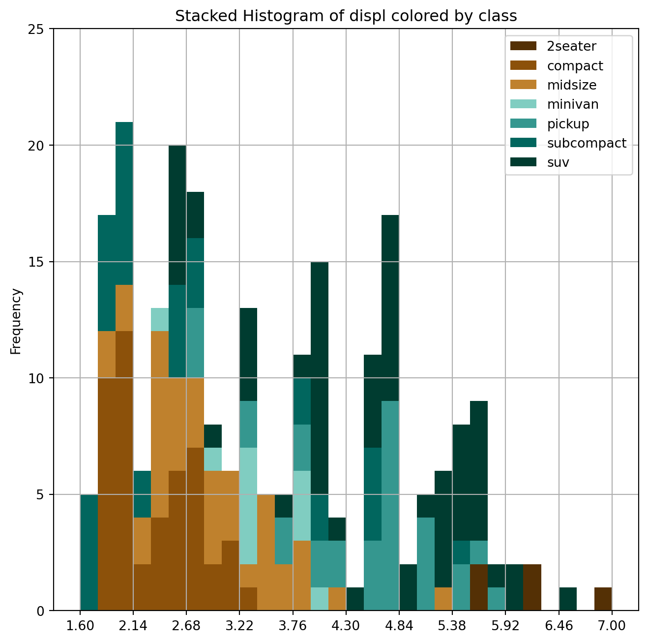
The stacked histogram of categorical variables compares frequency distributions of these variables as a grouped and stacked bar plot.
Using the same data as the plot above.
gb_df = df[["class", "manufacturer"]].groupby("class")
lx = []
ln = []

colors = ["#543005", "#8c510a", "#bf812d", "#80cdc1", "#35978f", "#01665e", "#003c30"]

for _, df_ in gb_df:
    lx.append(df_["manufacturer"].values.tolist())
    ln.append(list(set(df_["class"].values.tolist()))[0])

fig = plt.figure(figsize = (8, 8))
ax = fig.add_subplot()

n, bins, patches = ax.hist(lx, bins = 30, stacked = True, density = False, color = colors)

ax.tick_params(axis = 'x', labelrotation = 90)

ax.legend({class_:color for class_, color in zip(ln, colors)})

# add a title
ax.set_title("Stacked histogram of manufacturer colored by class")

# set an y label
ax.set_ylabel("Frequency");
plt.grid()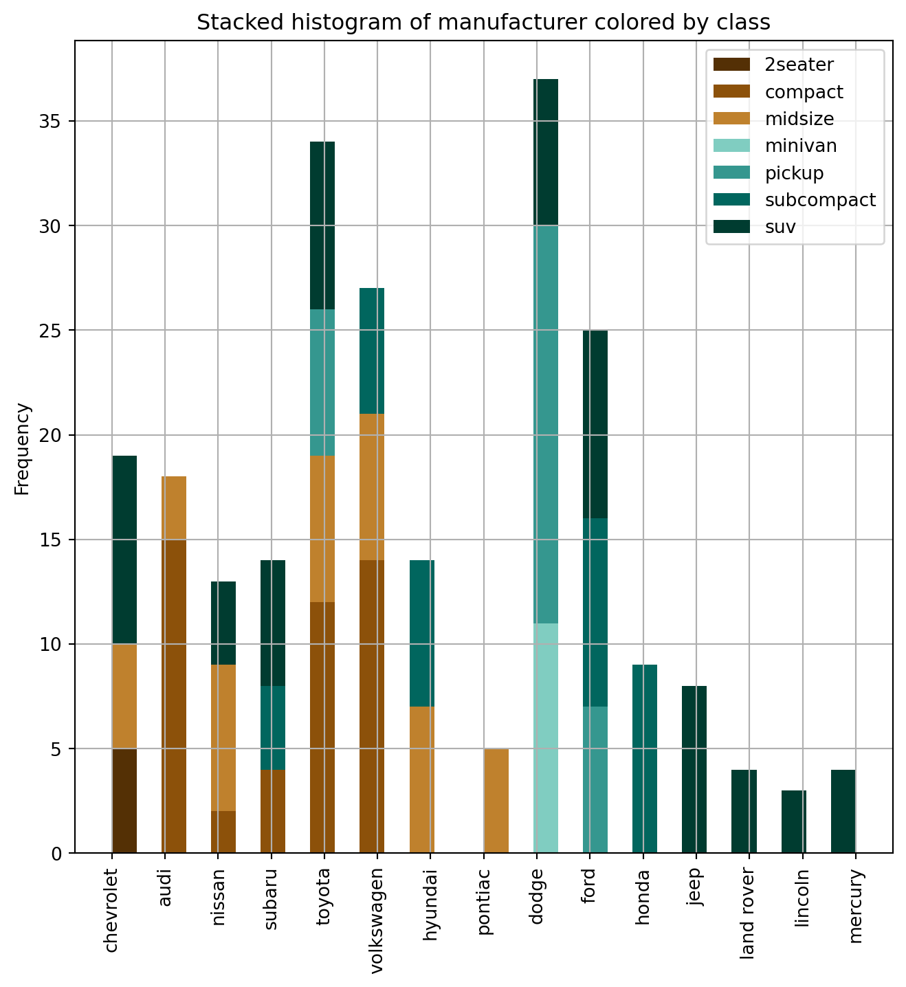
A density plot is a representation of the distribution of a numeric variable. It uses a kernel density estimate to show the probability density function of the variable.
Using the same data as the plot above.
fig = plt.figure(figsize = (10, 8))

for cyl_ in df["cyl"].unique():
    # extract the data
    x = df[df["cyl"] == cyl_]["cty"]
    # plot the data using seaborn
    sns.kdeplot(x, fill=True, label = "{} cyl".format(cyl_))

# set the title of the plot
plt.title("Density Plot of City Mileage by n_cilinders");
plt.grid()

# More info:
# https://www.data-to-viz.com/graph/density.html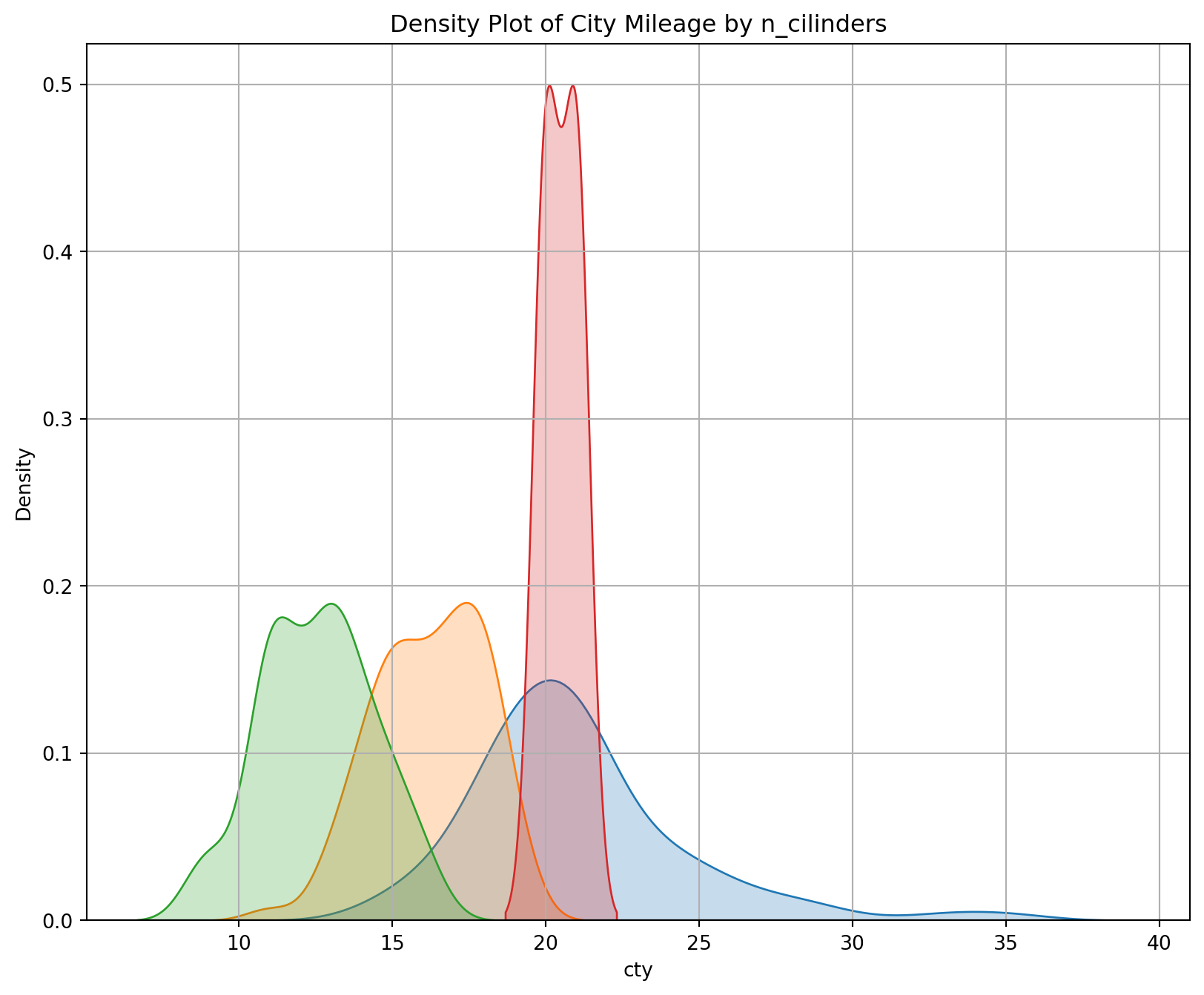
Add a density curve to a histogram by creating the histogram with a density scale, creating the curve data in a separate data frame, and adding the curve as another layer.
Using the same data as above.
fig = plt.figure(figsize = (10, 8))
for class_ in ["compact", "suv", "minivan"]:
    # extract the data
    x = df[df["class"] == class_]["cty"]
    # plot the data using seaborn
    sns.histplot(x, kde=True, label="{} class".format(class_))

# set the title of the plot
plt.title("Density Plot of City Mileage by vehicle type")
plt.legend()
plt.grid()

# More info:
# https://www.data-to-viz.com/graph/density.html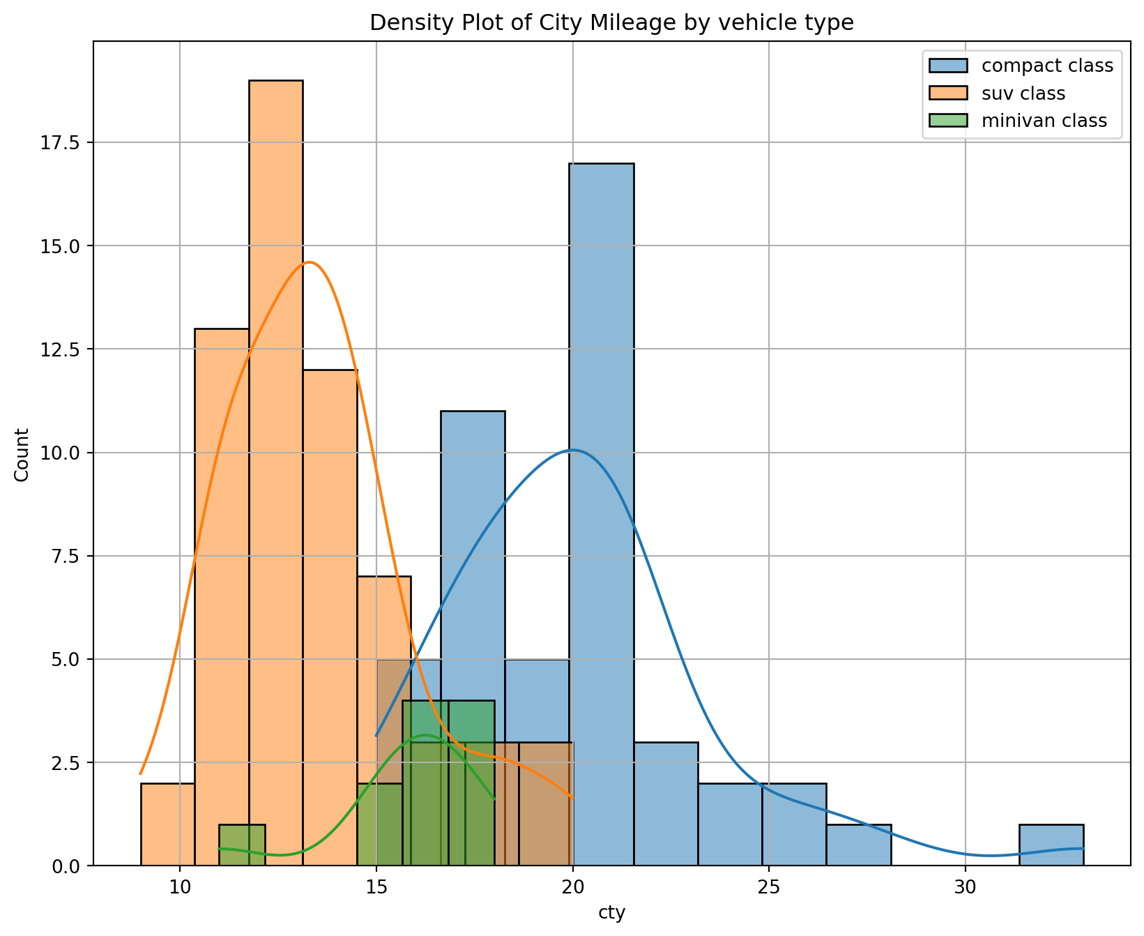
Joyplots are stacked, partially overlapping density plots. The code for JoyPy borrows from the code for KDEs in pandas.plotting, and uses a couple of utility functions.
Reusing the same data as the plot above.
plt.figure(figsize = (14,10), dpi = 80)
# plot the data using joypy
fig, axes = joypy.joyplot(df,
                          column = ['hwy', 'cty'], # colums to be plotted.
                          by = "model", # separate the data by this value. Creates a separate distribution for each one.
                          ylim = 'own',
                          figsize = (14,10)
                         )
# add a title
plt.title('Joy Plot of City and Highway Mileage by Model', fontsize = 18);
plt.grid()
<Figure size 1120x800 with 0 Axes>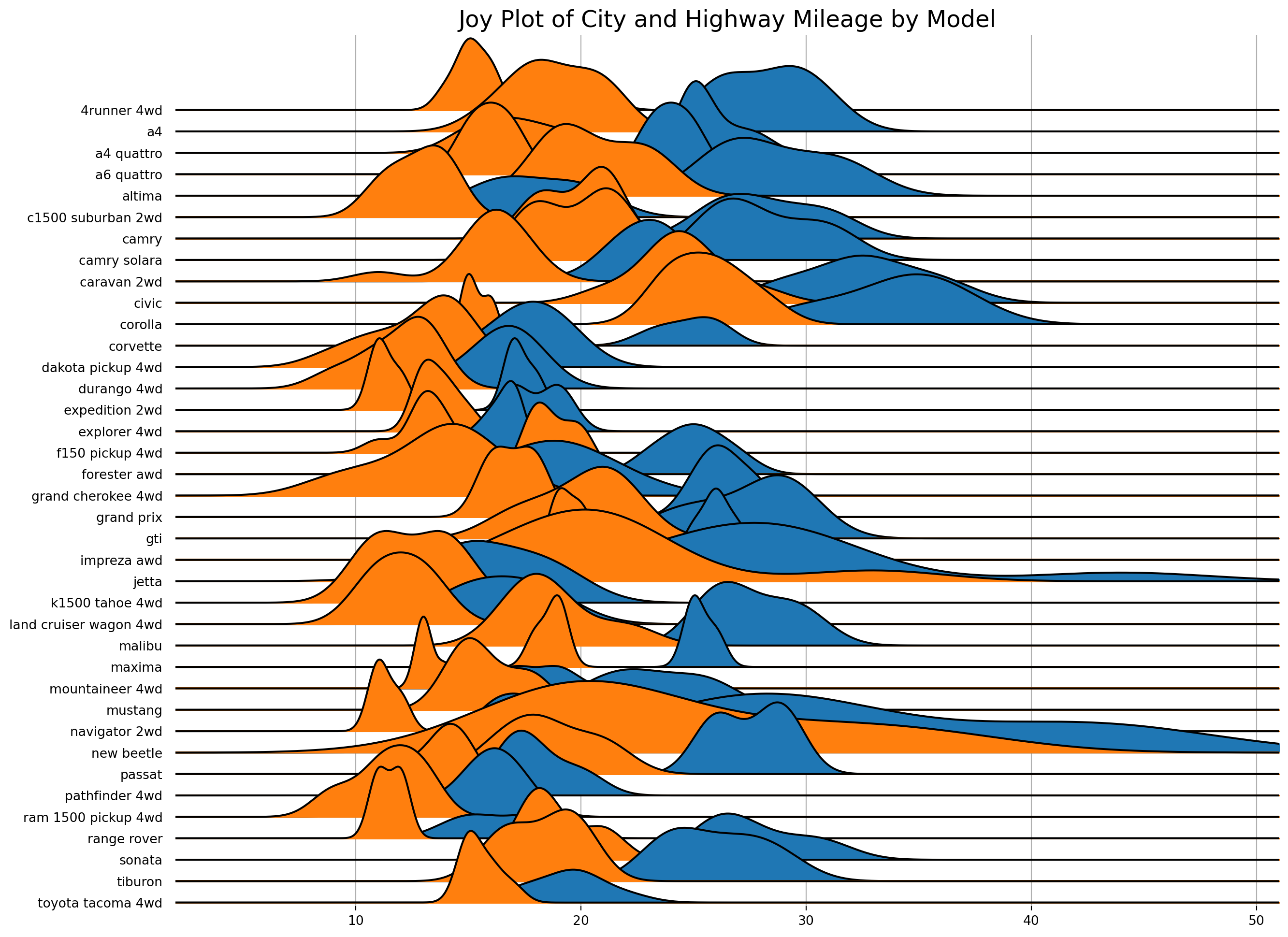
This is a type of flow diagram that visualizes the transfer of quantities between different stages or categories.
import urllib.request
import json
import plotly.graph_objects as go

# Load data
url = 'https://raw.githubusercontent.com/plotly/plotly.js/master/test/image/mocks/sankey_energy.json'
response = urllib.request.urlopen(url)
data = json.loads(response.read())

# Create df from json data to present gt table

# Extract the sankey data
sankey_data = data['data'][0]

# Separate node and link data
node_data = sankey_data['node']
link_data = sankey_data['link']

# Create a DataFrame from link data
df = pd.DataFrame({
    'source_index': link_data['source'],
    'target_index': link_data['target'],
    'value': link_data['value'],
    'link_label': link_data['label'],
    'link_color': link_data['color']
})

# Add corresponding labels and colors for source and target from node_data
df['source_label'] = [node_data['label'][idx] for idx in df['source_index']]
df['target_label'] = [node_data['label'][idx] for idx in df['target_index']]
df['source_color'] = [node_data['color'][idx] for idx in df['source_index']]
df['target_color'] = [node_data['color'][idx] for idx in df['target_index']]

process_csv_from_data_folder("Plotly Data", dataframe=df)| Random Sample of 10 Records from 'Plotly Data' | ||||||||
|---|---|---|---|---|---|---|---|---|
| Exploring Data | ||||||||
| Source Index | Target Index | Value | Link Label | Link Color | Source Label | Target Label | Source Color | Target Color |
| 15.00 | 21.00 | 90.01 | rgba(0,0,96,0.2) | Electricity grid | Lighting & appliances - commercial | rgba(140, 86, 75, 0.8) | rgba(255, 127, 14, 0.8) | |
| 0.00 | 1.00 | 124.73 | stream 1 | rgba(0,0,96,0.2) | Agricultural 'waste' | Bio-conversion | rgba(31, 119, 180, 0.8) | rgba(255, 127, 14, 0.8) |
| 38.00 | 37.00 | 107.70 | rgba(0,0,96,0.2) | Oil reserves | Oil | rgba(188, 189, 34, 0.8) | rgba(127, 127, 127, 0.8) | |
| 1.00 | 5.00 | 81.14 | stream 1 | rgba(0,0,96,0.2) | Bio-conversion | Gas | rgba(255, 127, 14, 0.8) | rgba(140, 86, 75, 0.8) |
| 41.00 | 15.00 | 59.90 | rgba(0,0,96,0.2) | Solar PV | Electricity grid | rgba(255, 127, 14, 0.8) | rgba(140, 86, 75, 0.8) | |
| 15.00 | 19.00 | 4.41 | rgba(0,0,96,0.2) | Electricity grid | Agriculture | rgba(140, 86, 75, 0.8) | rgba(23, 190, 207, 0.8) | |
| 11.00 | 12.00 | 10.64 | rgba(0,0,96,0.2) | District heating | Industry | rgba(255, 127, 14, 0.8) | rgba(44, 160, 44, 0.8) | |
| 17.00 | 3.00 | 6.24 | rgba(0,0,96,0.2) | H2 conversion | Losses | rgba(127, 127, 127, 0.8) | rgba(214, 39, 40, 0.8) | |
| 35.00 | 26.00 | 500.00 | Old generation plant (made-up) | rgba(33,102,172,0.35) | Nuclear | Thermal generation | magenta | rgba(227, 119, 194, 0.8) |
| 11.00 | 14.00 | 46.18 | rgba(0,0,96,0.2) | District heating | Heating and cooling - homes | rgba(255, 127, 14, 0.8) | rgba(148, 103, 189, 0.8) | |
| 🔍 Data Exploration: Plotly Data | Sample Size: 10 Records | ||||||||
# Extract node/link data for convenience
sankey_data = data['data'][0]
node_data = sankey_data['node']
link_data = sankey_data['link']

# Replace "magenta" with RGBA and apply opacity
node_data['color'] = [
    'rgba(255,0,255,0.8)' if c == "magenta" else c
    for c in node_data['color']
]

# Use node source colors for links with lower opacity
link_data['color'] = [
    node_data['color'][src].replace("0.8", "0.4")
    for src in link_data['source']
]

fig = go.Figure(data=[go.Sankey(
    valueformat=".0f",
    valuesuffix="TWh",
    node=dict(
        pad=15,
        thickness=15,
        line=dict(color="black", width=0.5),
        label=node_data['label'],
        color=node_data['color']
    ),
    link=dict(
        source=link_data['source'],
        target=link_data['target'],
        value=link_data['value'],
        label=link_data['label'],
        color=link_data['color']
    )
)])

fig.update_layout(
    title_text=(
        "Energy forecast for 2050<br>"
        "Source: Department of Energy & Climate Change, Tom Counsell via "
        "<a href='https://bost.ocks.org/mike/sankey/'>Mike Bostock</a>"
    ),
    font_size=12,
    autosize=False,
    width=1000,
    height=800
)

fig.show()A Dot Distribution Plot visualizes the data distribution across multiple categories by plotting dots along an axis. Each dot can represent a single data point or a count.
Reusing data that has been used before.
df = pd.read_csv('data\mpg_ggplot2.csv')
process_csv_from_data_folder("mpg_ggplot2.csv", dataframe=df)| Random Sample of 10 Records from 'mpg_ggplot2.csv' | |||||||||
|---|---|---|---|---|---|---|---|---|---|
| Exploring Data | |||||||||
| Manufacturer | Model | Displ | Year | Cyl | Trans | Drv | Cty | Hwy | Fl |
| dodge | ram 1500 pickup 4wd | 4.70 | 2,008.00 | 8.00 | manual(m6) | 4 | 9.00 | 12.00 | e |
| toyota | toyota tacoma 4wd | 4.00 | 2,008.00 | 6.00 | auto(l5) | 4 | 16.00 | 20.00 | r |
| toyota | camry | 2.20 | 1,999.00 | 4.00 | auto(l4) | f | 21.00 | 27.00 | r |
| audi | a4 quattro | 2.00 | 2,008.00 | 4.00 | manual(m6) | 4 | 20.00 | 28.00 | p |
| jeep | grand cherokee 4wd | 4.70 | 2,008.00 | 8.00 | auto(l5) | 4 | 14.00 | 19.00 | r |
| hyundai | sonata | 2.40 | 1,999.00 | 4.00 | manual(m5) | f | 18.00 | 27.00 | r |
| toyota | corolla | 1.80 | 2,008.00 | 4.00 | manual(m5) | f | 28.00 | 37.00 | r |
| ford | mustang | 4.00 | 2,008.00 | 6.00 | auto(l5) | r | 16.00 | 24.00 | r |
| volkswagen | jetta | 2.00 | 1,999.00 | 4.00 | manual(m5) | f | 21.00 | 29.00 | r |
| audi | a6 quattro | 2.80 | 1,999.00 | 6.00 | auto(l5) | 4 | 15.00 | 24.00 | p |
| 💡 Additional columns not displayed: class | |||||||||
| 🔍 Data Exploration: mpg_ggplot2.csv | Sample Size: 10 Records | |||||||||
df.sort_values(["model", "cty"], inplace = True)
lc = []

fig = plt.figure(figsize = (12, 12))
ax = fig.add_subplot()

# iterate over each car manufacturer
for i, car in enumerate(df["model"].unique()):
    # prepare the data for plotting
    # get x and y
    x = df[df["model"] == car]["cty"]
    y = [car for i_ in range(len(x))]

    # calculate the median value
    x_median = np.median(x)

    # plot the data
    ax.scatter(x, y, c = "white", edgecolor = "black", s = 30)
    ax.scatter(x_median, i, c = "red",  edgecolor = "black", s = 80)

    ax.hlines(i, 0, 40, linewidth = .1)

    lc.append(car)

ax.set_xlim(5, 40)
ax.set_ylim(-2, 38)

ax.tick_params(axis = "y", labelsize = 12)

# set a title
ax.set_title("Distribution of City Mileage by Model", fontsize = 16)

red_patch = plt.plot([],[], marker = "o", ms = 10, ls = "", mec = None, color = 'firebrick', label = "Median")

plt.legend(handles = red_patch, loc = 7, fontsize = 12)

ax.spines["right"].set_color("None")
ax.spines["left"].set_color("None")
ax.spines["top"].set_color("None");

# More info:
# https://www.statisticshowto.com/what-is-a-dot-plot/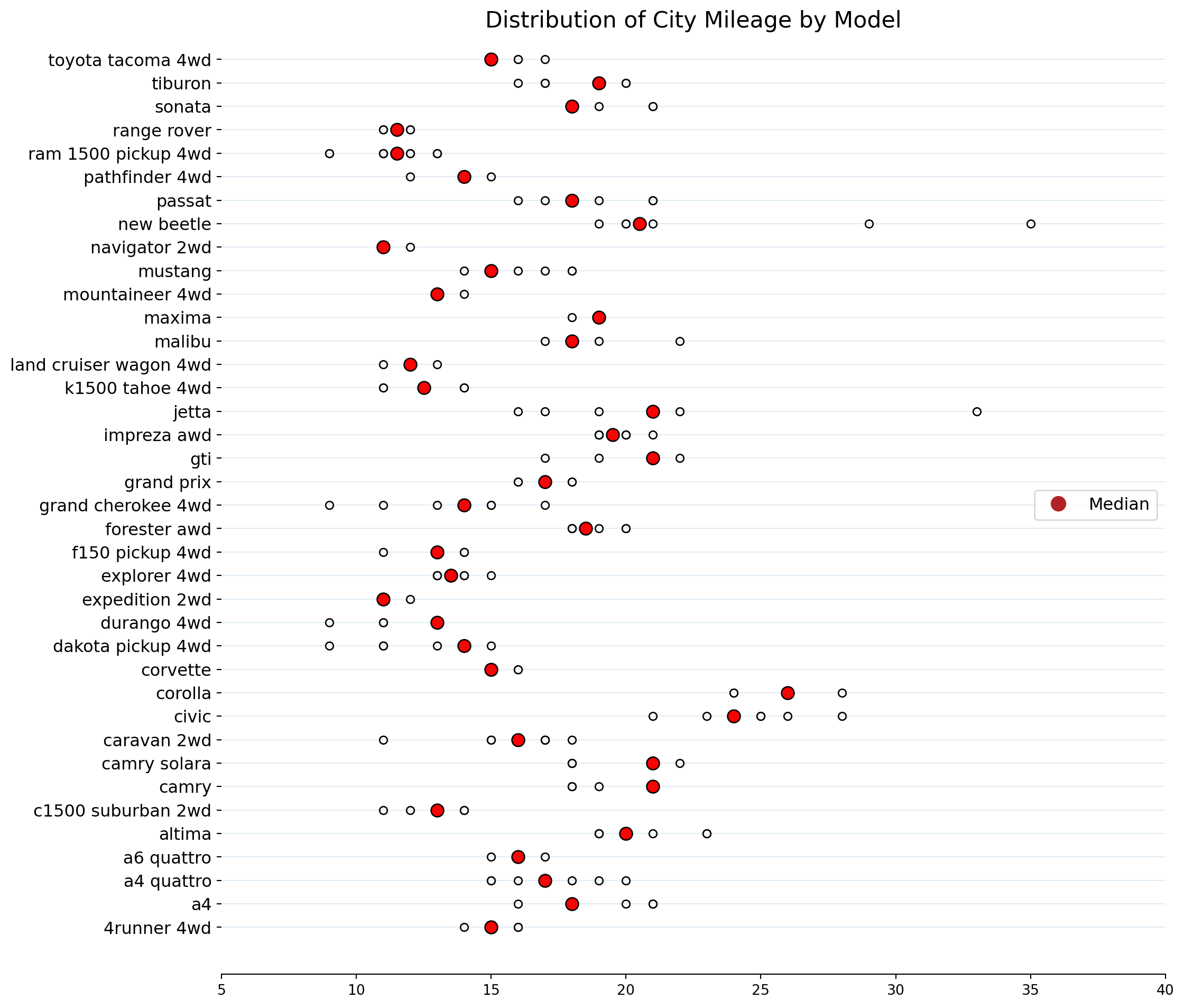
A boxplot is a standardized way of displaying the Interquartile Range (IQR) of a data set based on its five-number summary of data points: the “minimum,” first quartile, median, third quartile, and maximum. Boxplots are used to show distributions of numeric data values, especially when you want to compare them between multiple groups.
Reusing the same data as the plot above.
plt.figure(figsize = (12, 10), dpi = 80)

ax = sns.boxplot(x = "manufacturer", y = "cty", data = df)

ax.tick_params(axis = 'x', labelrotation = 90, labelsize = 12)
ax.tick_params(axis = 'y', labelsize = 12)

# set and x and y label
ax.set_xlabel("Manufacturer", fontsize = 14)
ax.set_ylabel("CTY", fontsize = 14)

# set a title
ax.set_title("Boxplot CTY vs Manufacturer", fontsize = 14);
plt.grid()

# More info:
# https://en.wikipedia.org/wiki/Box_plot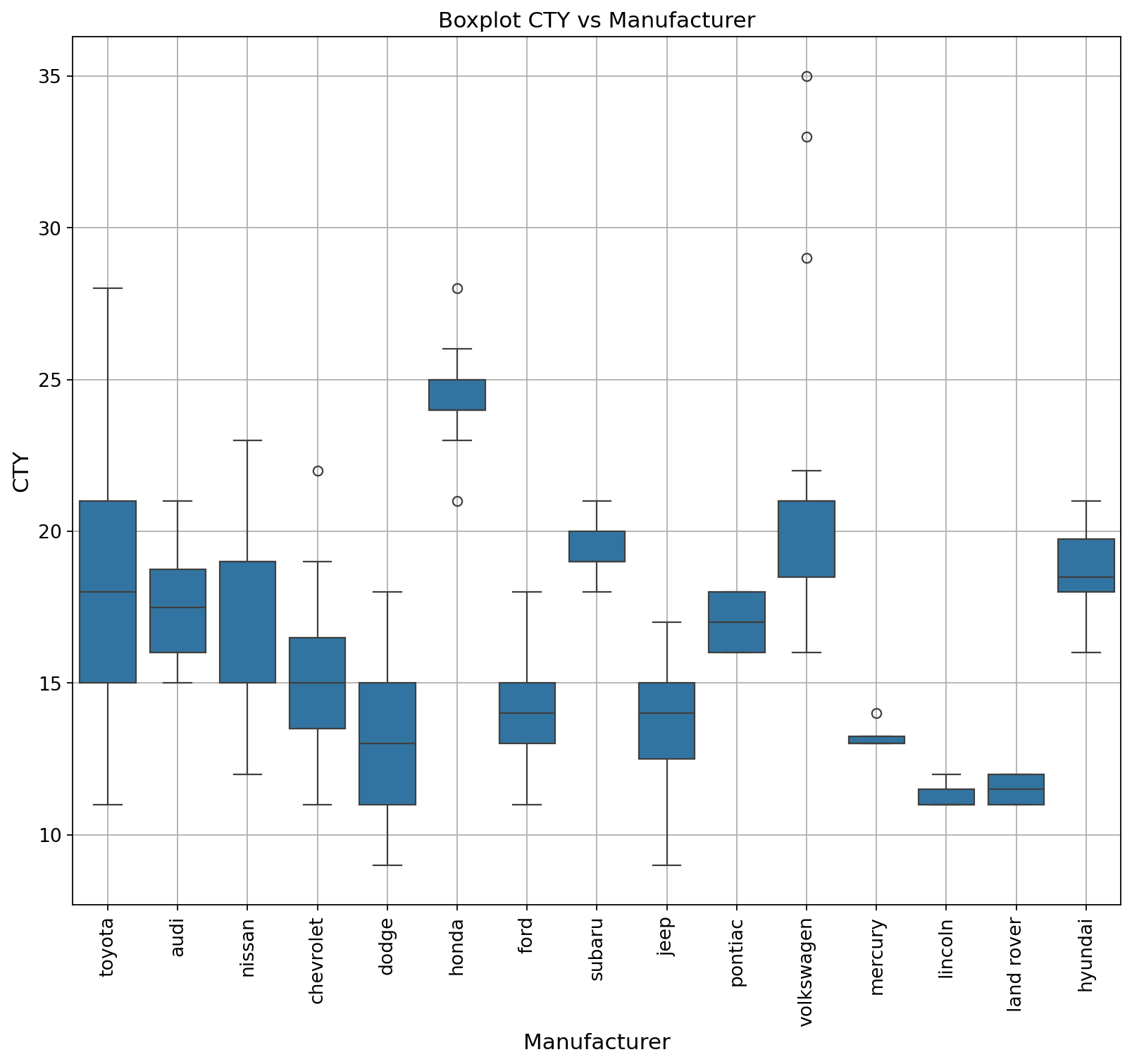
Dot & Box plot conveys similar information as a boxplot split in groups.
df = pd.DataFrame({ "A":np.random.normal(0.8,0.2,20),
                      "B":np.random.normal(0.8,0.1,20),
                      "C":np.random.normal(0.9,0.1,20)} )

process_csv_from_data_folder("Made Up Data", dataframe=df)| Random Sample of 10 Records from 'Made Up Data' | ||
|---|---|---|
| Exploring Data | ||
| A | B | C |
| 0.95 | 0.94 | 1.00 |
| 0.95 | 0.80 | 1.05 |
| 0.99 | 0.95 | 1.09 |
| 0.85 | 0.93 | 0.98 |
| 0.81 | 0.85 | 0.84 |
| 0.84 | 0.76 | 0.94 |
| 0.40 | 0.65 | 0.85 |
| 0.88 | 0.81 | 1.00 |
| 0.83 | 0.77 | 0.76 |
| 0.62 | 0.72 | 0.92 |
| 🔍 Data Exploration: Made Up Data | Sample Size: 10 Records | ||
# Create a boxplot
df.boxplot()

# Overlay points on the boxplot
for i, d in enumerate(df):
    y = df[d]
    x = np.random.normal(i + 1, 0.04, len(y))
    plt.plot(x, y, mfc=["orange", "blue", "yellow"][i], mec='k', ms=7, marker="o", linestyle="None")

# Add a horizontal line at y=1
plt.hlines(1, 0, 4, linestyle="--")

# Show the plot
plt.show()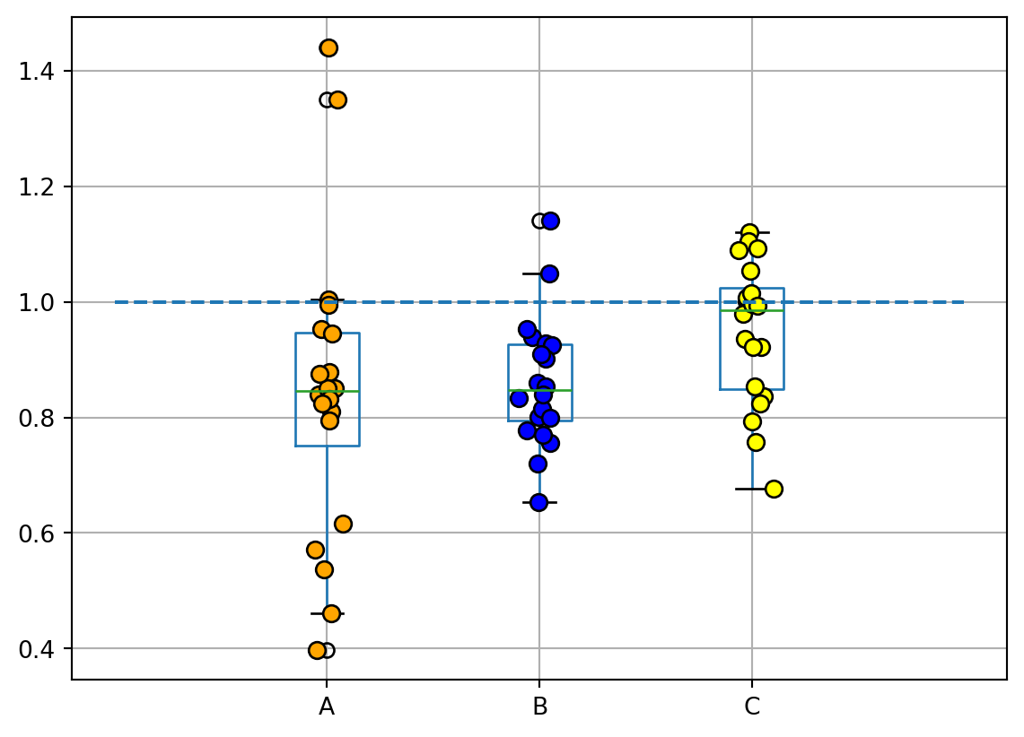
Another example using data we have used before: mpg_ggplot2
df = pd.read_csv('data\mpg_ggplot2.csv')
process_csv_from_data_folder("mpg_ggplot2.csv", dataframe=df)| Random Sample of 10 Records from 'mpg_ggplot2.csv' | |||||||||
|---|---|---|---|---|---|---|---|---|---|
| Exploring Data | |||||||||
| Manufacturer | Model | Displ | Year | Cyl | Trans | Drv | Cty | Hwy | Fl |
| dodge | ram 1500 pickup 4wd | 4.70 | 2,008.00 | 8.00 | manual(m6) | 4 | 9.00 | 12.00 | e |
| toyota | toyota tacoma 4wd | 4.00 | 2,008.00 | 6.00 | auto(l5) | 4 | 16.00 | 20.00 | r |
| toyota | camry | 2.20 | 1,999.00 | 4.00 | auto(l4) | f | 21.00 | 27.00 | r |
| audi | a4 quattro | 2.00 | 2,008.00 | 4.00 | manual(m6) | 4 | 20.00 | 28.00 | p |
| jeep | grand cherokee 4wd | 4.70 | 2,008.00 | 8.00 | auto(l5) | 4 | 14.00 | 19.00 | r |
| hyundai | sonata | 2.40 | 1,999.00 | 4.00 | manual(m5) | f | 18.00 | 27.00 | r |
| toyota | corolla | 1.80 | 2,008.00 | 4.00 | manual(m5) | f | 28.00 | 37.00 | r |
| ford | mustang | 4.00 | 2,008.00 | 6.00 | auto(l5) | r | 16.00 | 24.00 | r |
| volkswagen | jetta | 2.00 | 1,999.00 | 4.00 | manual(m5) | f | 21.00 | 29.00 | r |
| audi | a6 quattro | 2.80 | 1,999.00 | 6.00 | auto(l5) | 4 | 15.00 | 24.00 | p |
| 💡 Additional columns not displayed: class | |||||||||
| 🔍 Data Exploration: mpg_ggplot2.csv | Sample Size: 10 Records | |||||||||
plt.figure(figsize = (12, 8), dpi= 80)
# plot the data using seaborn
# since we don't create a specific separete plot
# everything will be rendered on the same axes
sns.boxplot(x = "class", y = "cty", data = df, hue = "cyl")
sns.stripplot(x = 'class', y = 'cty', data = df, color = 'black', size = 3, jitter = 1)

ax = plt.gca()
# get the xticks to iterate over
xticks = ax.get_xticks()

for tick in xticks:
    ax.vlines(tick + 0.5, 0, np.max(df["cty"]), color = "grey", alpha = .1)

# rotate the x and y ticks
ax.tick_params(axis = 'x', labelrotation = 45, labelsize = 12)
ax.tick_params(axis = 'y', labelsize = 12)

# add x and y label
ax.set_xlabel("Class", fontsize = 14)
ax.set_ylabel("CTY", fontsize = 14)

# add a title and put the legend on a specific location
ax.set_title("Boxplot and stripplot on the same figure", fontsize = 14)
ax.legend(loc = "lower left", fontsize = 14);
plt.grid()

# More info:
# https://en.wikipedia.org/wiki/Box_plot
# https://en.wikipedia.org/wiki/Dot_plot_(statistics)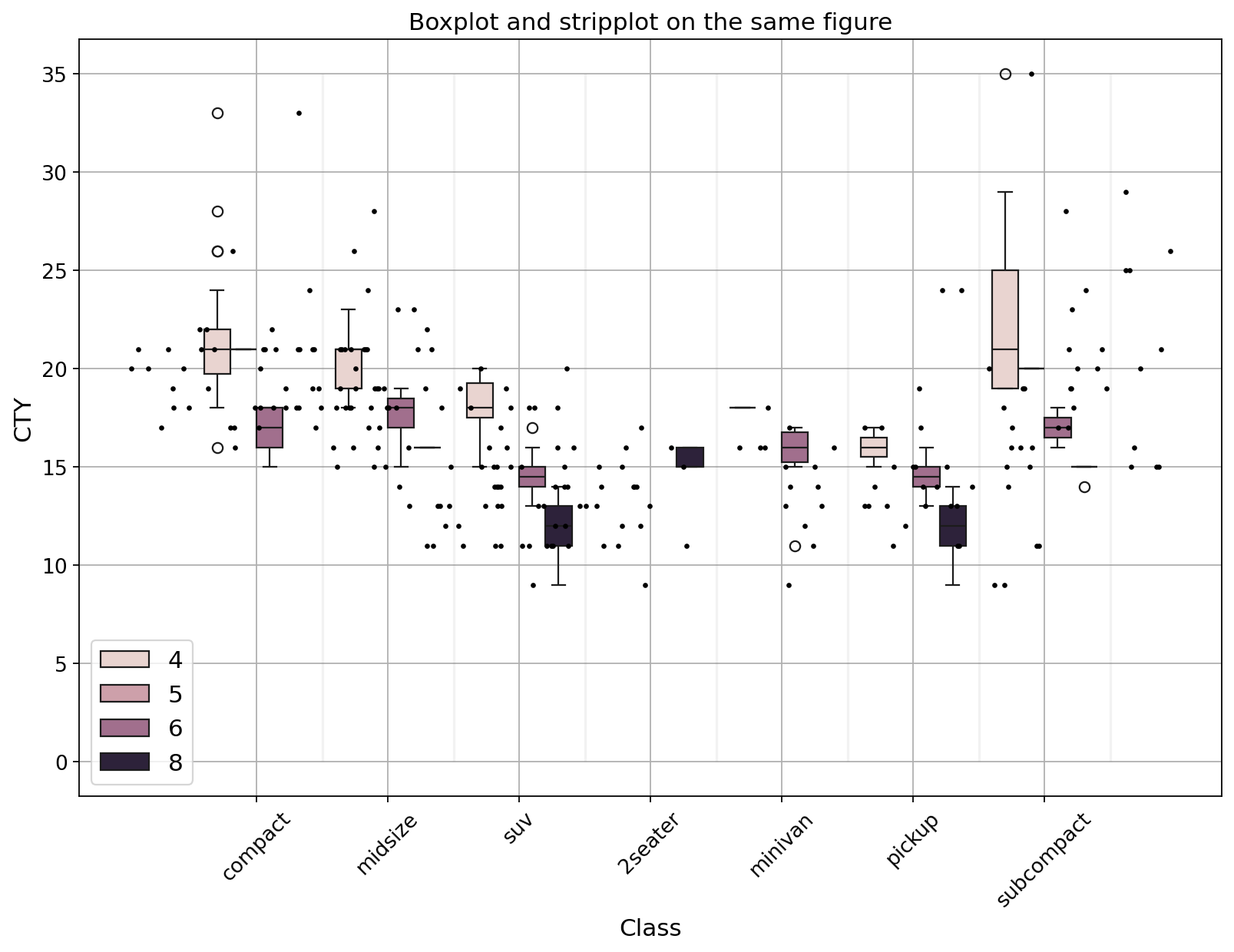
A violin plot depicts distributions of numeric data for one or more groups using density curves. The width of each curve corresponds with the approximate frequency of data points in each region.
Using the same data as the plot above.
plt.figure(figsize = (12, 8), dpi= 80)
sns.violinplot(x = "manufacturer",
               y = "hwy",
               data = df,
               density_norm = 'width',
               inner = 'quartile'
              )

ax = plt.gca()
# get the xticks to iterate over
xticks = ax.get_xticks()

for tick in xticks:
    ax.vlines(tick + 0.5, 0, np.max(df["hwy"]), color = "grey", alpha = .1)

# rotate the x and y ticks
ax.tick_params(axis = 'x', labelrotation = 45, labelsize = 14)
ax.tick_params(axis = 'y', labelsize = 14)

# add x and y label
ax.set_xlabel("manufacturer", fontsize = 14)
ax.set_ylabel("HWY", fontsize = 14)

# set title
ax.set_title("Violin plot HWY vs manufacturer", fontsize = 18);
plt.grid()

# More info:
# https://en.wikipedia.org/wiki/Violin_plot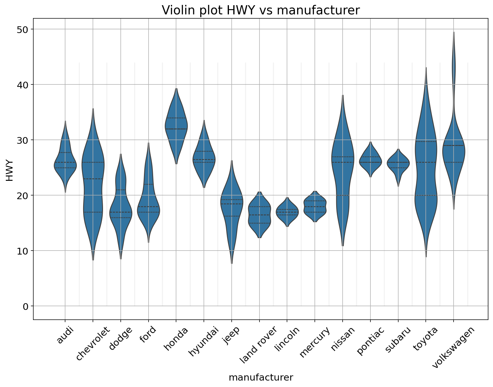
Population pyramids are graphical representation of the age-sex structure of a country or an area.
df = pd.DataFrame({'Age': ['0-4','5-9','10-14','15-19','20-24','25-29','30-34','35-39','40-44','45-49','50-54','55-59','60-64','65-69','70-74','75-79','80-84','85-89','90-94','95-99','100+'],
                    'Male': [-49228000, -61283000, -64391000, -52437000, -42955000, -44667000, -31570000, -23887000, -22390000, -20971000, -17685000, -15450000, -13932000, -11020000, -7611000, -4653000, -1952000, -625000, -116000, -14000, -1000],
                    'Female': [52367000, 64959000, 67161000, 55388000, 45448000, 47129000, 33436000, 26710000, 25627000, 23612000, 20075000, 16368000, 14220000, 10125000, 5984000, 3131000, 1151000, 312000, 49000, 4000, 0]})
process_csv_from_data_folder("Made Up Data", dataframe=df)| Random Sample of 10 Records from 'Made Up Data' | ||
|---|---|---|
| Exploring Data | ||
| Age | Male | Female |
| 0-4 | -49,228,000.00 | 52,367,000.00 |
| 85-89 | -625,000.00 | 312,000.00 |
| 75-79 | -4,653,000.00 | 3,131,000.00 |
| 5-9 | -61,283,000.00 | 64,959,000.00 |
| 40-44 | -22,390,000.00 | 25,627,000.00 |
| 25-29 | -44,667,000.00 | 47,129,000.00 |
| 55-59 | -15,450,000.00 | 16,368,000.00 |
| 15-19 | -52,437,000.00 | 55,388,000.00 |
| 90-94 | -116,000.00 | 49,000.00 |
| 80-84 | -1,952,000.00 | 1,151,000.00 |
| 🔍 Data Exploration: Made Up Data | Sample Size: 10 Records | ||
AgeClass = ['100+','95-99','90-94','85-89','80-84','75-79','70-74','65-69','60-64','55-59','50-54','45-49','40-44','35-39','30-34','25-29','20-24','15-19','10-14','5-9','0-4']

bar_plot = sns.barplot(x='Male', y='Age', data=df, order=AgeClass)

bar_plot = sns.barplot(x='Female', y='Age', data=df, order=AgeClass)

bar_plot.set(xlabel="Population (hundreds of millions)", ylabel="Age-Group", title = "Population Pyramid")
plt.grid()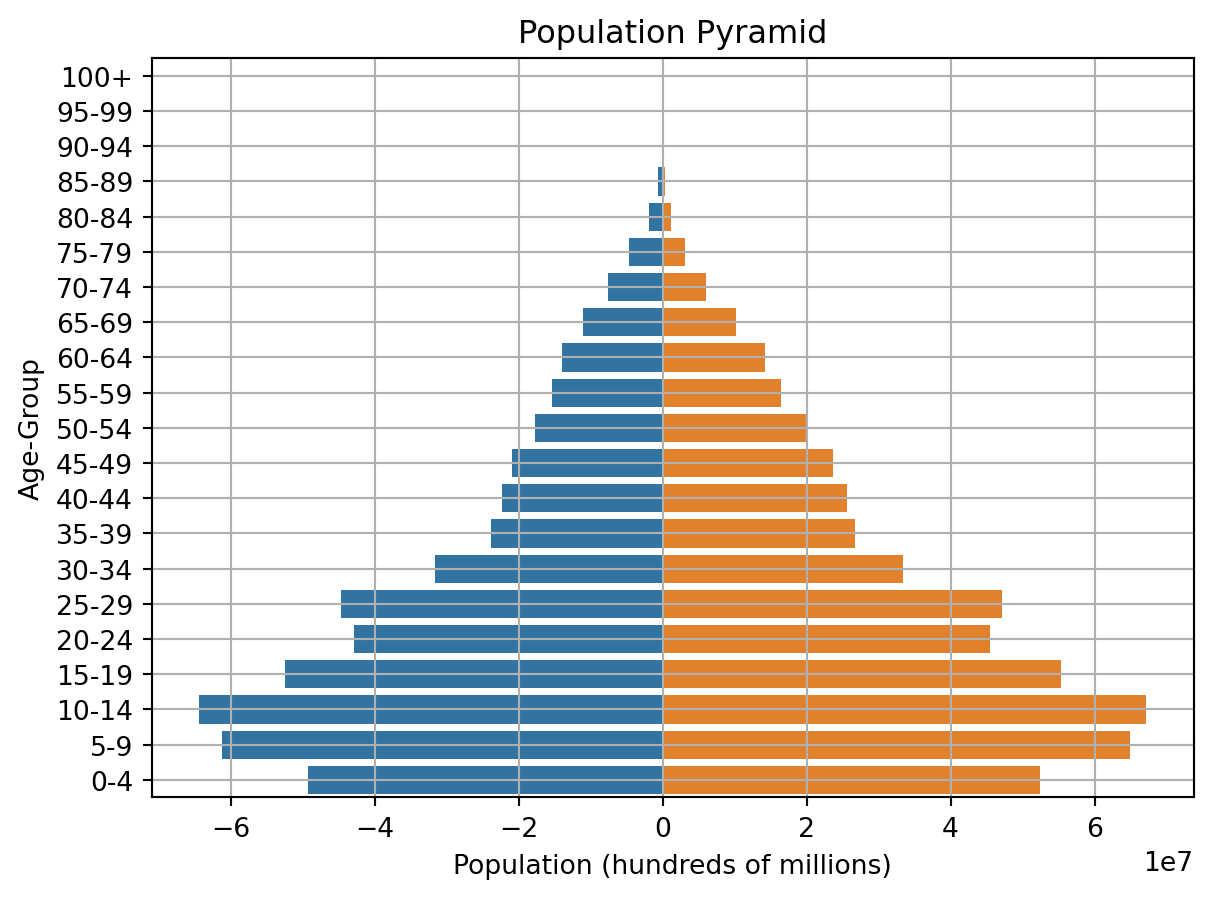
If one of the main variables is categorical (divided into discrete groups) it may be helpful to use a more specialized approach to visualization. In seaborn, catplot() gives unified higher-level access to a number of axes-level functions for plotting categorical data in different ways.
df = pd.read_csv('data/train.csv')
process_csv_from_data_folder("train.csv", dataframe=df)| Random Sample of 10 Records from 'train.csv' | |||||||||
|---|---|---|---|---|---|---|---|---|---|
| Exploring Data | |||||||||
| Passengerid | Survived | Pclass | Name | Sex | Age | Sibsp | Parch | Ticket | Fare |
| 710.00 | 1.00 | 3.00 | Moubarek, Master. Halim Gonios ("William George") | male | nan | 1.00 | 1.00 | 2661 | 15.25 |
| 440.00 | 0.00 | 2.00 | Kvillner, Mr. Johan Henrik Johannesson | male | 31.00 | 0.00 | 0.00 | C.A. 18723 | 10.50 |
| 841.00 | 0.00 | 3.00 | Alhomaki, Mr. Ilmari Rudolf | male | 20.00 | 0.00 | 0.00 | SOTON/O2 3101287 | 7.92 |
| 721.00 | 1.00 | 2.00 | Harper, Miss. Annie Jessie "Nina" | female | 6.00 | 0.00 | 1.00 | 248727 | 33.00 |
| 40.00 | 1.00 | 3.00 | Nicola-Yarred, Miss. Jamila | female | 14.00 | 1.00 | 0.00 | 2651 | 11.24 |
| 291.00 | 1.00 | 1.00 | Barber, Miss. Ellen "Nellie" | female | 26.00 | 0.00 | 0.00 | 19877 | 78.85 |
| 301.00 | 1.00 | 3.00 | Kelly, Miss. Anna Katherine "Annie Kate" | female | nan | 0.00 | 0.00 | 9234 | 7.75 |
| 334.00 | 0.00 | 3.00 | Vander Planke, Mr. Leo Edmondus | male | 16.00 | 2.00 | 0.00 | 345764 | 18.00 |
| 209.00 | 1.00 | 3.00 | Carr, Miss. Helen "Ellen" | female | 16.00 | 0.00 | 0.00 | 367231 | 7.75 |
| 137.00 | 1.00 | 1.00 | Newsom, Miss. Helen Monypeny | female | 19.00 | 0.00 | 2.00 | 11752 | 26.28 |
| 💡 Additional columns not displayed: Cabin, Embarked | |||||||||
| 🔍 Data Exploration: train.csv | Sample Size: 10 Records | |||||||||
#https://www.geeksforgeeks.org/python-seaborn-catplot/
fig = plt.figure(figsize = (12, 6))

ax = sns.catplot(x="Sex", y="Age",
                data=df)
plt.grid()

# More info:
# https://seaborn.pydata.org/tutorial/categorical.html
<Figure size 1152x576 with 0 Axes>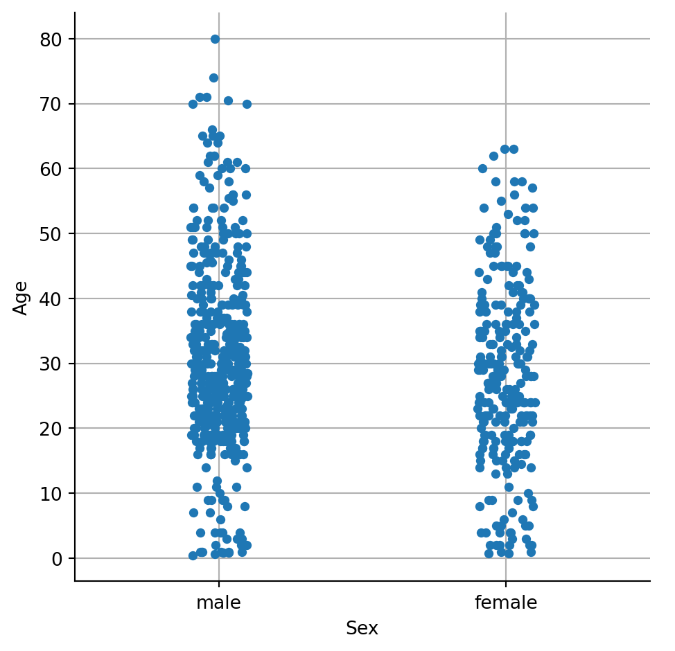
A Waffle Chart is a gripping visualization technique that is normally created to display progress towards goals.
Using data we have used before.
df = pd.read_csv('data/mpg_ggplot2.csv')
process_csv_from_data_folder("mpg_ggplot2.csv", dataframe=df)| Random Sample of 10 Records from 'mpg_ggplot2.csv' | |||||||||
|---|---|---|---|---|---|---|---|---|---|
| Exploring Data | |||||||||
| Manufacturer | Model | Displ | Year | Cyl | Trans | Drv | Cty | Hwy | Fl |
| dodge | ram 1500 pickup 4wd | 4.70 | 2,008.00 | 8.00 | manual(m6) | 4 | 9.00 | 12.00 | e |
| toyota | toyota tacoma 4wd | 4.00 | 2,008.00 | 6.00 | auto(l5) | 4 | 16.00 | 20.00 | r |
| toyota | camry | 2.20 | 1,999.00 | 4.00 | auto(l4) | f | 21.00 | 27.00 | r |
| audi | a4 quattro | 2.00 | 2,008.00 | 4.00 | manual(m6) | 4 | 20.00 | 28.00 | p |
| jeep | grand cherokee 4wd | 4.70 | 2,008.00 | 8.00 | auto(l5) | 4 | 14.00 | 19.00 | r |
| hyundai | sonata | 2.40 | 1,999.00 | 4.00 | manual(m5) | f | 18.00 | 27.00 | r |
| toyota | corolla | 1.80 | 2,008.00 | 4.00 | manual(m5) | f | 28.00 | 37.00 | r |
| ford | mustang | 4.00 | 2,008.00 | 6.00 | auto(l5) | r | 16.00 | 24.00 | r |
| volkswagen | jetta | 2.00 | 1,999.00 | 4.00 | manual(m5) | f | 21.00 | 29.00 | r |
| audi | a6 quattro | 2.80 | 1,999.00 | 6.00 | auto(l5) | 4 | 15.00 | 24.00 | p |
| 💡 Additional columns not displayed: class | |||||||||
| 🔍 Data Exploration: mpg_ggplot2.csv | Sample Size: 10 Records | |||||||||
A Pie Chart is a circular statistical plot that can display only one series of data. The area of the chart is the total percentage of the given data.
Pie charts are typically to be avoided.
Using dthe same data as the plot above.
d = df["manufacturer"].value_counts().to_dict()

fig = plt.figure(figsize = (18, 6))
ax = fig.add_subplot()

ax.pie(d.values(), # pass the values from our dictionary
       labels = d.keys(), # pass the labels from our dictonary
       autopct = '%1.1f%%', # specify the format to be plotted
       textprops = {'fontsize': 10, 'color' : "white"} # change the font size and the color of the numbers inside the pie
      )

# set the title
ax.set_title("Pie chart")

# set the legend and add a title to the legend
ax.legend(loc = "upper left", bbox_to_anchor = (1, 0, 0.5, 1), fontsize = 10, title = "Manufacturer");

# More info:
# https://en.wikipedia.org/wiki/Pie_chart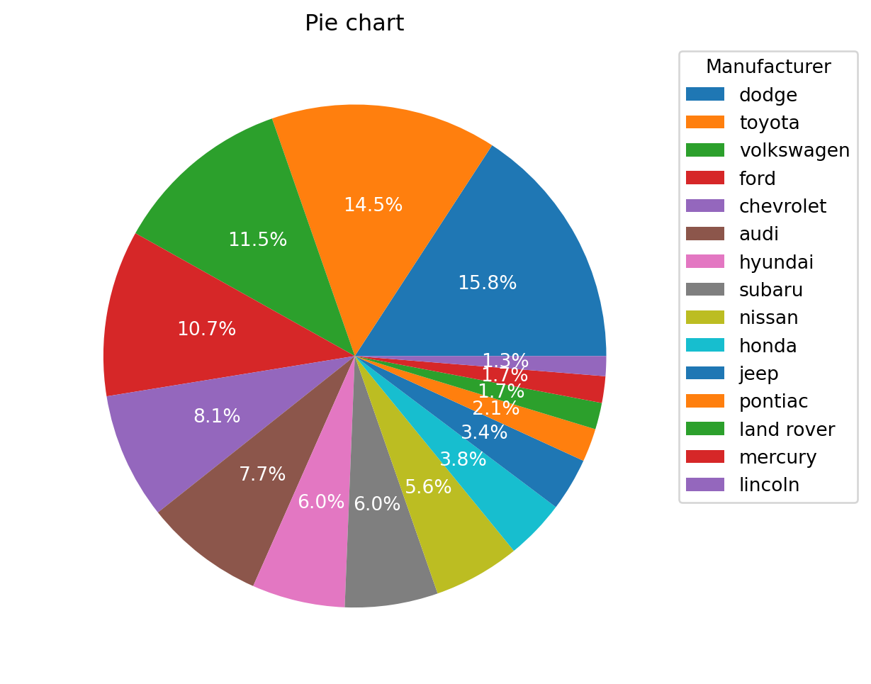
A Treemap diagram is an appropriate type of visualization when the data set is structured in hierarchical order with a tree layout with roots, branches, and nodes. It allows us to show information about an important amount of data in a very efficient way in a limited space.
Resuing the data as the plot above.
label_value = df["manufacturer"].value_counts().to_dict()

labels = ["{} has {} obs".format(class_, obs) for class_, obs in label_value.items()]

colors = [plt.cm.Spectral(i/float(len(labels))) for i in range(len(labels))]

plt.figure(figsize = (12, 10))

squarify.plot(sizes = label_value.values(), label = labels,  color = colors, alpha = 0.8)

# add a title to the plot
plt.title("Treemap using external libraries");

# More info:
# https://en.wikipedia.org/wiki/Treemapping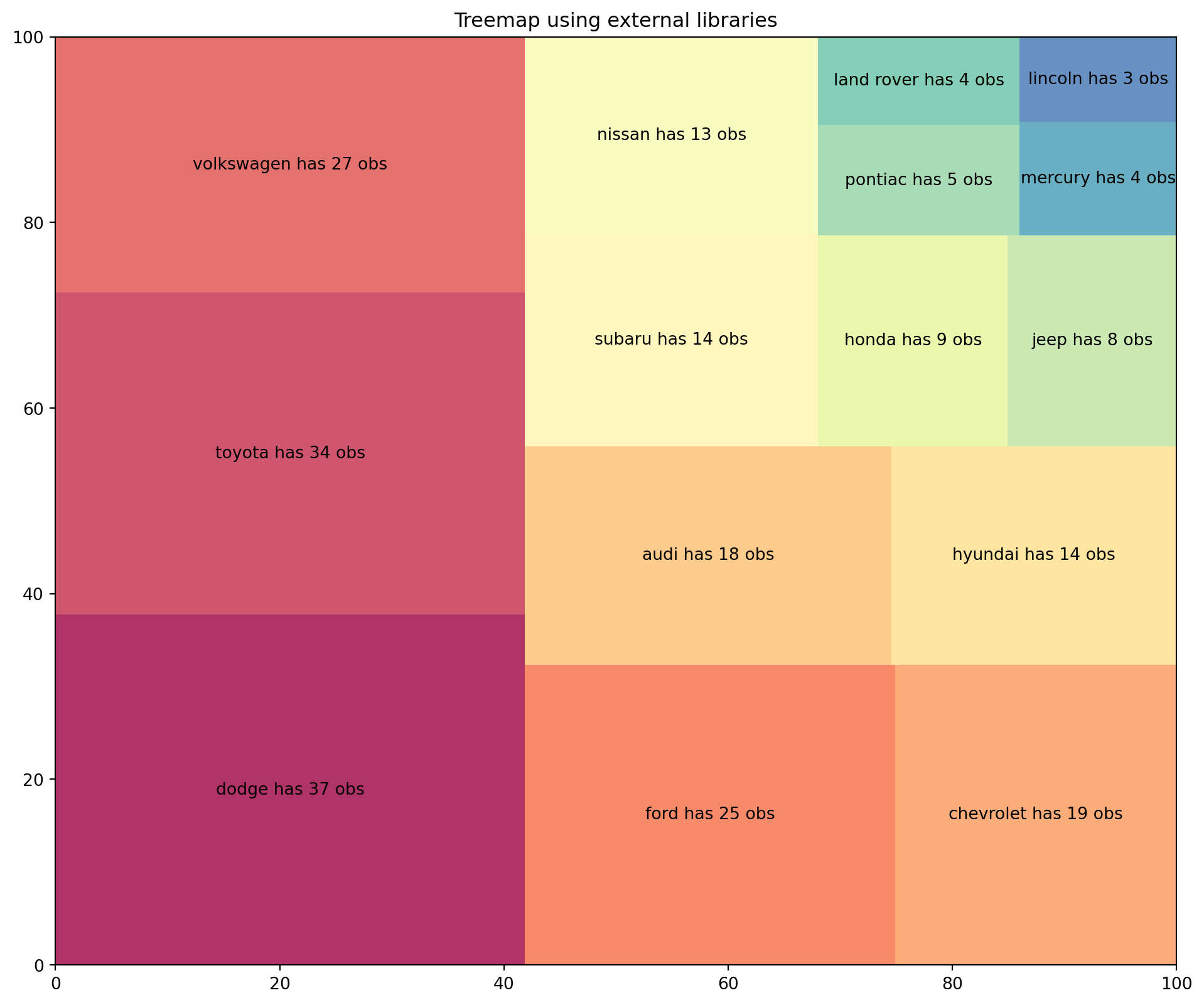
A bar plot or bar chart is a graph that represents the category of data with rectangular bars with lengths and heights that is proportional to the values which they represent. The bar plots can be plotted horizontally or vertically. A bar chart describes the comparisons between the discrete categories. One of the axis of the plot represents the specific categories being compared, while the other axis represents the measured values corresponding to those categories.
Reusing the same data as the plot above.
d = df["class"].value_counts().to_dict()

# create n colors based on the number of labels we have
colors = [plt.cm.Spectral(i/float(len(d.keys()))) for i in range(len(d.keys()))]

fig = plt.figure(figsize = (12, 8))
ax = fig.add_subplot()

ax.bar(d.keys(), d.values(), color = colors)

# iterate over every x and y
for i, (k, v) in enumerate(d.items()):
    ax.text(k, # where to put the text on the x coordinates
            v + 1, # where to put the text on the y coordinates
            v, # value to text
            color = colors[i], # color corresponding to the bar
            fontsize = 10, # fontsize
            horizontalalignment = 'center', # center the text to be more pleasant
            verticalalignment = 'center'
           )

ax.tick_params(axis = 'x', labelrotation = 45, labelsize = 12)
ax.tick_params(axis = 'y', labelsize = 12)

# set a title for the plot
ax.set_title("", fontsize = 14);
plt.grid()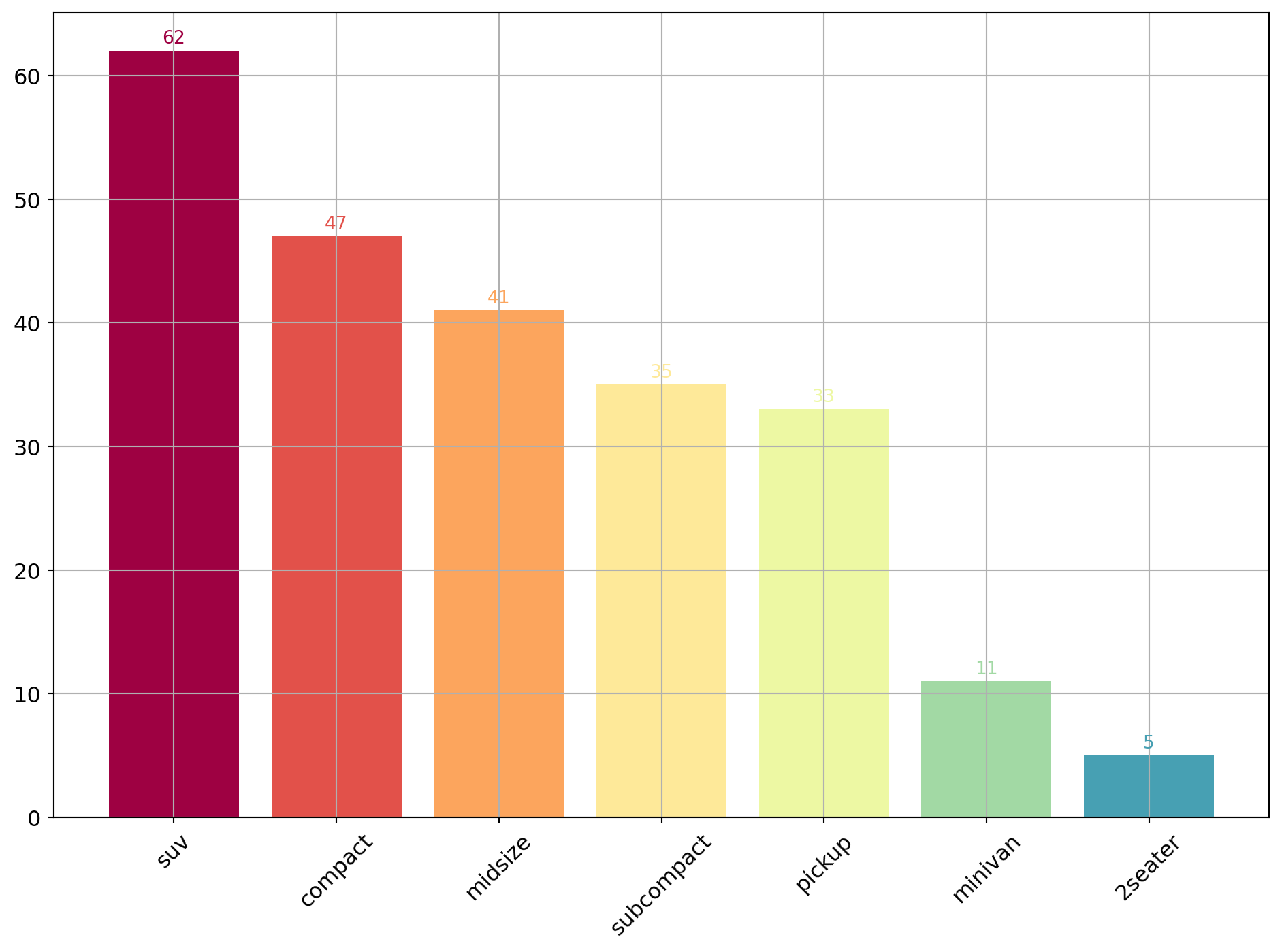
Time series data is the data marked by some time. Each point on the graph represents a measurement of both time and quantity. A time-series chart (aka a fever chart) when the data are connected in chronological order by a straight line that forms a succession of peaks and troughs. x-axis of the chart is used to represent time intervals. y-line locates values of the parameter getting monitored.
df = pd.read_csv('data/AirPassengers.csv')
process_csv_from_data_folder("AirPassengers.csv", dataframe=df)| Random Sample of 10 Records from 'AirPassengers.csv' | |
|---|---|
| Exploring Data | |
| Date | Value |
| 1958-10-01 | 359.00 |
| 1950-08-01 | 170.00 |
| 1955-11-01 | 237.00 |
| 1957-02-01 | 301.00 |
| 1953-09-01 | 237.00 |
| 1950-01-01 | 115.00 |
| 1960-01-01 | 417.00 |
| 1954-06-01 | 264.00 |
| 1954-07-01 | 302.00 |
| 1950-07-01 | 170.00 |
| 🔍 Data Exploration: AirPassengers.csv | Sample Size: 10 Records | |
def create_date_tick(df):
    '''
    Converts dates from this format: Timestamp('1949-01-01 00:00:00')
    To this format: 'Jan-1949'
    '''
    df["date"] = pd.to_datetime(df["date"]) # convert to datetime
    df["month_name"] = df["date"].dt.month_name() # extracts month_name
    df["month_name"] = df["month_name"].apply(lambda x: x[:3]) # passes from January to Jan
    df["year"] = df["date"].dt.year # extracts year
    df["new_date"] = df["month_name"].astype(str) + "-" + df["year"].astype(str) # Concatenaes Jan and year --> Jan-1949

# create the time column and the xtickslabels column
create_date_tick(df)

# get the y values (the x is the index of the series)
y = df["value"]

# find local maximum INDEX using scipy library
max_peaks_index, _ = find_peaks(y, height=0)

# find local minimum INDEX using numpy library
doublediff2 = np.diff(np.sign(np.diff(-1*y)))
min_peaks_index = np.where(doublediff2 == -2)[0] + 1


fig = plt.figure(figsize = (12, 8))
ax = fig.add_subplot()

# plot the data using matplotlib
ax.plot(y, color = "blue", alpha = .5, label = "Air traffic")

# we have the index of max and min, so we must index the values in order to plot them
ax.scatter(x = y[max_peaks_index].index, y = y[max_peaks_index].values, marker = "^", s = 90, color = "green", alpha = .5, label = "Peaks")
ax.scatter(x = y[min_peaks_index].index, y = y[min_peaks_index].values, marker = "v", s = 90, color = "red", alpha = .5, label = "Troughs")

# iterate over some max and min in order to annotate the values
for max_annot, min_annot in zip(max_peaks_index[::3], min_peaks_index[1::5]):

    # extract the date to be plotted for max and min
    max_text = df.iloc[max_annot]["new_date"]
    min_text = df.iloc[min_annot]["new_date"]

    # add the text
    ax.text(df.index[max_annot], y[max_annot] + 50, s = max_text, fontsize = 8, horizontalalignment = 'center', verticalalignment = 'center')
    ax.text(df.index[min_annot], y[min_annot] - 50, s = min_text, fontsize = 8, horizontalalignment = 'center', verticalalignment = 'center')


# change the ylim
ax.set_ylim(0, 700)

# get the xticks and the xticks labels
xtick_location = df.index.tolist()[::6]
xtick_labels = df["new_date"].tolist()[::6]

# set the xticks to be every 6'th entry
# every 6 months
ax.set_xticks(xtick_location)

ax.grid(alpha = .5)

# chage the label from '1949-01-01 00:00:00' to this 'Jan-1949'
ax.set_xticklabels(xtick_labels, rotation=45, fontdict={'horizontalalignment': 'center', 'verticalalignment': 'center_baseline'})

# change the size of the font of the x and y axis
ax.tick_params(axis = 'x', labelrotation = 45, labelsize = 12)
ax.tick_params(axis = 'y', labelsize = 12)

# set the title and the legend of the plot
ax.set_title("Air Passsengers Traffic (1949 - 1969)", fontsize = 16)
ax.legend(loc = "upper left", fontsize = 10);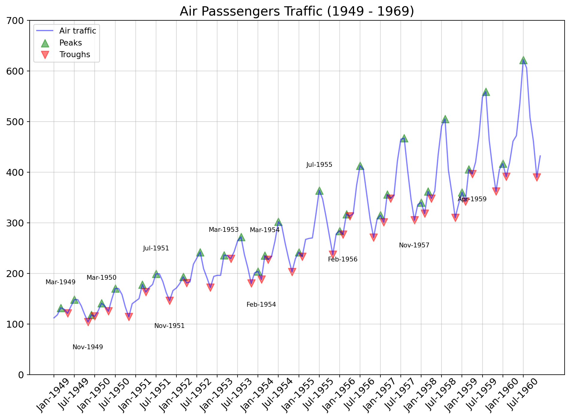
Time series decomposition can be thought of as a statistical technique used to break down a time series dataset into its individual components such as trend, seasonality, cyclic, and residuals.
Using the same data as the plot above.
def create_date_tick(df):
    '''
    Converts dates from this format: Timestamp('1949-01-01 00:00:00')
    To this format: 'Jan-1949'
    '''
    df["date"] = pd.to_datetime(df["date"]) # convert to datetime
    df.set_index("date", inplace = True)
    df["date"] = df.index
    df["month_name"] = df["date"].dt.month_name() # extracts month_name
    df["month_name"] = df["month_name"].apply(lambda x: x[:3]) # passes from January to Jan
    df["year"] = df["date"].dt.year # extracts year
    df["new_date"] = df["month_name"].astype(str) + "-" +df["year"].astype(str) # Concatenaes Jan and year --> Jan-1949

create_date_tick(df)

result = seasonal_decompose(df["value"])

fig, axes = plt.subplots(ncols = 1, nrows = 4, sharex = True, figsize = (12,10))

# https://stackoverflow.com/questions/45184055/how-to-plot-multiple-seasonal-decompose-plots-in-one-figure

# plot the original data
result.observed.plot(ax = axes[0], legend = False)
axes[0].set_ylabel('Observed')
axes[0].set_title("Decomposition of a series")

# plot the trend
result.trend.plot(ax = axes[1], legend = False)
axes[1].set_ylabel('Trend')

# plot the seasonal part
result.seasonal.plot(ax = axes[2], legend = False)
axes[2].set_ylabel('Seasonal')

# plot the residual
result.resid.plot(ax = axes[3], legend = False)
axes[3].set_ylabel('Residual')


xtick_location = df.index.tolist()[::6]
xtick_labels = df["new_date"].tolist()[::6]

# set the xticks to be every 6'th entry
# every 6 months
ax.set_xticks(xtick_location)

# chage the label from '1949-01-01 00:00:00' to this 'Jan-1949'
ax.set_xticklabels(xtick_labels, rotation=90, fontdict={'horizontalalignment': 'center', 'verticalalignment': 'center_baseline'});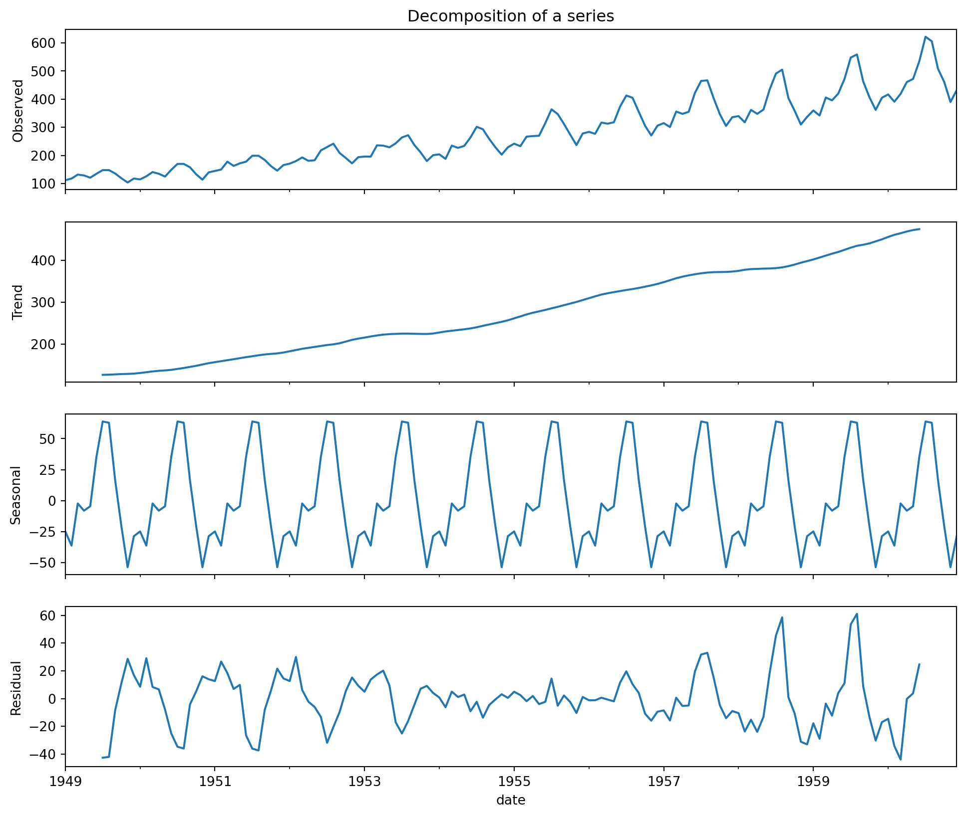
Can use the plot() method to plot a line chart of multiple time series, provided that indexes of all the DataFrames are aligned.
df = pd.read_csv('data/mortality.csv')
process_csv_from_data_folder("mortality.csv", dataframe=df)| Random Sample of 10 Records from 'mortality.csv' | ||
|---|---|---|
| Exploring Data | ||
| Date | Mdeaths | Fdeaths |
| May 1974 | 1,492.00 | 522.00 |
| Mar 1979 | 1,846.00 | 727.00 |
| Jul 1975 | 1,186.00 | 421.00 |
| Jan 1974 | 2,134.00 | 901.00 |
| May 1976 | 1,189.00 | 447.00 |
| Mar 1978 | 1,942.00 | 737.00 |
| Nov 1974 | 1,621.00 | 578.00 |
| Nov 1976 | 1,467.00 | 546.00 |
| Jan 1975 | 2,103.00 | 830.00 |
| Jul 1978 | 1,098.00 | 431.00 |
| 🔍 Data Exploration: mortality.csv | Sample Size: 10 Records | ||
# set the date column to be the index
df.set_index("date", inplace = True)

fig = plt.figure(figsize = (10, 5))
ax = fig.add_subplot()

ax.plot(df["mdeaths"], color = "red", alpha = .5, label = "mdeaths")
ax.plot(df["fdeaths"], color = "blue", alpha = .5, label = "fdeaths")

# get the xticks and the xticks labels
xtick_location = df.index.tolist()[::6]
xtick_labels = df.index.tolist()[::6]

# set the xticks to be every 6'th entry
# every 6 months
ax.set_xticks(xtick_location)
ax.set_xticklabels(xtick_labels, rotation=45, fontdict={'horizontalalignment': 'center', 'verticalalignment': 'center_baseline'});

# change the x and y ticks to be smaller
ax.tick_params(axis = 'x', labelrotation = 45, labelsize = 12)
ax.tick_params(axis = 'y', labelsize = 12)

# add legend, a title and grid to make it look nicer
ax.legend(loc = "upper left", fontsize = 10)
ax.set_title("Mdeaths and fdeaths over time", fontsize = 14)
ax.grid(axis = "y", alpha = .3)

# More info:
# https://study.com/academy/lesson/time-series-plots-definition-features.html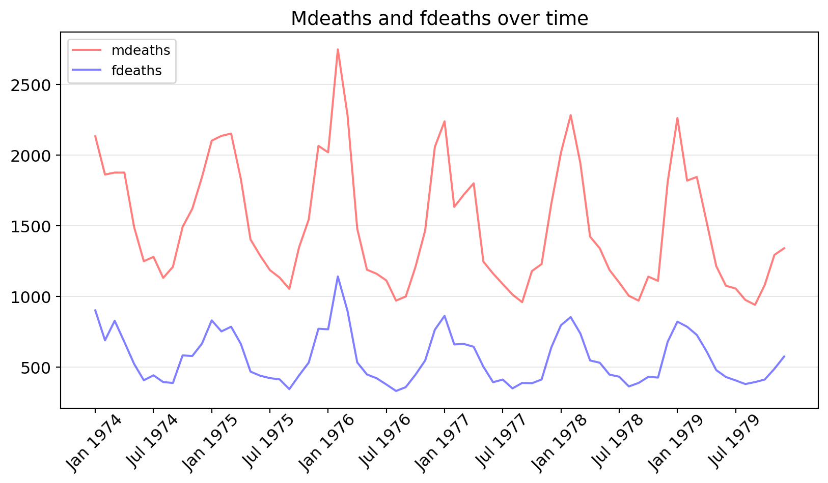
Dual axis time series charts makes it possible to choose two vertical scales so the drawing on the page is equivalent to drawing two indexed series, but retaining the meaningful mapping to the scale of the original variables.
Using data that we have seen before.
df = pd.read_csv('data/economics.csv')
process_csv_from_data_folder("economics.csv", dataframe=df)| Random Sample of 10 Records from 'economics.csv' | |||||
|---|---|---|---|---|---|
| Exploring Data | |||||
| Date | Pce | Pop | Psavert | Uempmed | Unemploy |
| 2010-05-01 | 10,140.20 | 309,376.00 | 6.00 | 22.30 | 14,849.00 |
| 1973-05-01 | 843.10 | 211,577.00 | 12.80 | 4.90 | 4,329.00 |
| 1978-06-01 | 1,429.80 | 222,379.00 | 9.50 | 6.00 | 6,028.00 |
| 2002-09-01 | 7,426.10 | 288,618.00 | 4.90 | 9.50 | 8,251.00 |
| 2012-12-01 | 11,245.20 | 315,532.00 | 10.50 | 17.60 | 12,272.00 |
| 1994-04-01 | 4,690.70 | 262,631.00 | 5.80 | 9.10 | 8,331.00 |
| 1983-03-01 | 2,208.60 | 233,613.00 | 10.00 | 10.40 | 11,408.00 |
| 1969-12-01 | 623.70 | 203,675.00 | 11.70 | 4.60 | 2,884.00 |
| 1974-04-01 | 912.70 | 213,361.00 | 12.70 | 5.00 | 4,618.00 |
| 1993-05-01 | 4,441.30 | 259,680.00 | 7.70 | 8.10 | 9,149.00 |
| 🔍 Data Exploration: economics.csv | Sample Size: 10 Records | |||||
# set the date column to be the index
df.set_index("date", inplace = True)

x_1 = df["psavert"]
x_2 = df["unemploy"]

fig = plt.figure(figsize = (14, 8))
ax = fig.add_subplot()

ax.plot(x_1, color = "red", alpha = .3, label = "Personal savings rate")

plt.legend(loc="lower right")

ax2 = ax.twinx()

ax2.plot(x_2, color = "blue", alpha = .3, label = "Unemployment rate")

plt.legend(loc="lower left")

xtick_location = df.index.tolist()[::12]
xtick_labels = df.index.tolist()[::12]

ax.set_xticks(xtick_location)
ax.set_xticklabels(xtick_labels, rotation = 90, fontdict={'horizontalalignment': 'center', 'verticalalignment': 'center_baseline'});

# change the x and y ticks to be smaller for the main axis and for the secondary axis
ax.tick_params(axis = 'x', labelrotation = 90, labelsize = 10)
ax.tick_params(axis = 'y', labelsize = 12,colors='r')
ax2.tick_params(axis = 'y', labelsize = 12,colors='b')

# set a title and a grid
ax.set_title("Personal savings rate vs Unemployed rate: 2 axis", fontsize = 16)
ax.grid(axis = "y", alpha = .3)
plt.grid()

# More info:
# https://study.com/academy/lesson/time-series-plots-definition-features.html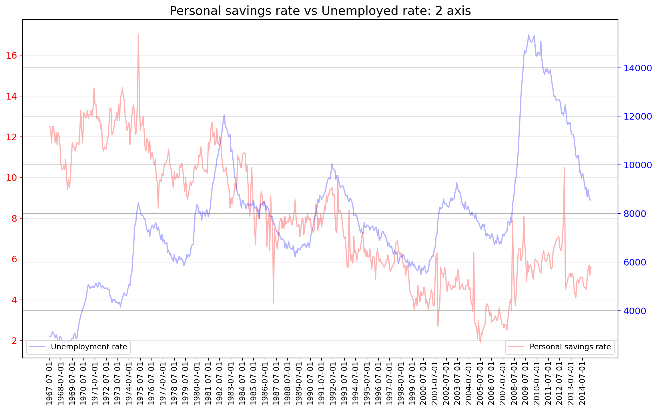
Continuous error bands are a graphical representation of error or uncertainty as a shaded region around a main trace, rather than as discrete whisker-like error bars.
df = pd.read_csv('data/user_orders_hourofday.csv')
process_csv_from_data_folder("user_orders_hourofday.csv", dataframe=df)| Random Sample of 10 Records from 'user_orders_hourofday.csv' | ||
|---|---|---|
| Exploring Data | ||
| User Id | Order Hour Of Day | Quantity |
| 110,283.00 | 17.00 | 4.00 |
| 186,203.00 | 23.00 | 1.00 |
| 176,972.00 | 18.00 | 6.00 |
| 189,725.00 | 16.00 | 12.00 |
| 27,310.00 | 6.00 | 4.00 |
| 186,783.00 | 16.00 | 3.00 |
| 79,861.00 | 14.00 | 24.00 |
| 180,139.00 | 15.00 | 19.00 |
| 8,815.00 | 14.00 | 11.00 |
| 34,197.00 | 20.00 | 12.00 |
| 🔍 Data Exploration: user_orders_hourofday.csv | Sample Size: 10 Records | ||
gb_df = df.groupby(["order_hour_of_day"])["quantity"].mean().to_frame()

x = gb_df["quantity"]
x_lower = x*0.95
x_upper = x*1.05

fig = plt.figure(figsize = (12, 8))
ax = fig.add_subplot()

ax.plot(x, color = "white", lw = 3)
ax.plot(x_lower, color = "#bcbddc")
ax.plot(x_upper, color = "#bcbddc")

ax.fill_between(x.index, x, x_lower, where = x > x_lower, facecolor='#bcbddc', interpolate = True)
ax.fill_between(x.index, x, x_upper, where = x_upper > x, facecolor='#bcbddc', interpolate = True)

ax.set_ylim(0, 25)

# set the x and y labels
ax.set_xlabel("Hour of day")
ax.set_ylabel("# Orders")

# get the xticks and the xticks labels
xtick_location = gb_df.index.tolist()[::2]
xtick_labels = gb_df.index.tolist()[::2]

# set the xticks to be every 2'th entry
# every 2 months
ax.set_xticks(xtick_location)
ax.set_xticklabels(xtick_labels, fontdict={'horizontalalignment': 'center', 'verticalalignment': 'center_baseline', "fontsize":"12"})

# change the x and y tick size
ax.tick_params(axis = 'x', labelsize = 12)
ax.tick_params(axis = 'y', labelsize = 12)

# add a title and a gridline
ax.set_title("Mean orders +- 5% interval ", fontsize = 16)
ax.grid(axis = "y", alpha = .5)
ax.grid(axis = "x", alpha = .5)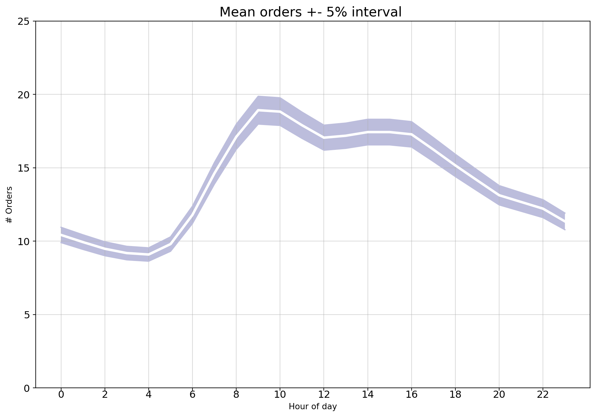
Here is another example that looks nicer brought to you directly by seaborn.
sns.set_theme(style="darkgrid")

# Load an example dataset with long-form data
fmri = sns.load_dataset("fmri")

# Plot the responses for different events and regions
sns.lineplot(x="timepoint", y="signal",
             hue="region", style="event",
             data=fmri)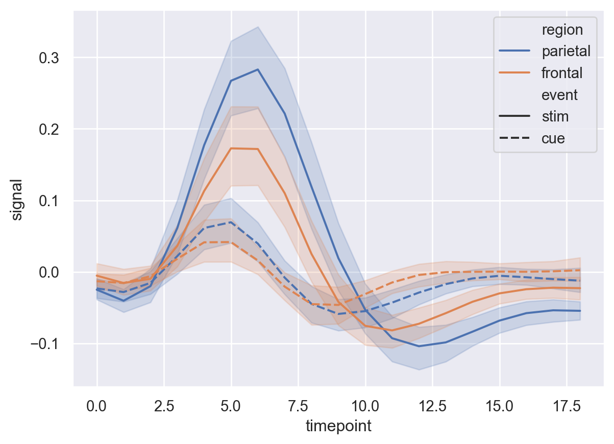
A stacked area chart displays the evolution of a numeric variable for several groups of a dataset.
df = pd.read_csv('data/nightvisitors.csv')
# set the data as index of the df
df.set_index("yearmon", inplace = True)
process_csv_from_data_folder("nightvisitors.csv", dataframe=df)| Random Sample of 10 Records from 'nightvisitors.csv' | |||||||
|---|---|---|---|---|---|---|---|
| Exploring Data | |||||||
| Sydney | Nsw | Melbourne | Vic | Brisbanegc | Qld | Capitals | Other |
| 7,320.00 | 21,782.00 | 4,865.00 | 14,054.00 | 9,055.00 | 8,016.00 | 9,178.00 | 10,232.00 |
| 5,651.00 | 14,775.00 | 3,902.00 | 7,883.00 | 7,351.00 | 9,672.00 | 7,690.00 | 9,948.00 |
| 5,663.00 | 14,433.00 | 5,285.00 | 7,600.00 | 7,077.00 | 9,417.00 | 8,276.00 | 9,769.00 |
| 6,333.00 | 15,152.00 | 4,585.00 | 7,478.00 | 7,017.00 | 9,804.00 | 7,192.00 | 10,412.00 |
| 5,977.00 | 16,748.00 | 5,289.00 | 8,521.00 | 8,964.00 | 9,950.00 | 7,310.00 | 12,892.00 |
| 5,253.00 | 14,023.00 | 4,821.00 | 5,990.00 | 7,717.00 | 13,311.00 | 6,252.00 | 10,167.00 |
| 6,521.00 | 19,774.00 | 4,703.00 | 14,071.00 | 8,705.00 | 11,103.00 | 9,992.00 | 11,372.00 |
| 5,021.00 | 14,590.00 | 4,177.00 | 6,807.00 | 8,756.00 | 15,078.00 | 7,391.00 | 12,017.00 |
| 5,356.00 | 19,148.00 | 4,688.00 | 11,017.00 | 7,830.00 | 8,918.00 | 8,004.00 | 9,417.00 |
| 6,981.00 | 19,960.00 | 5,675.00 | 13,000.00 | 7,706.00 | 9,460.00 | 7,765.00 | 9,842.00 |
| 🔍 Data Exploration: nightvisitors.csv | Sample Size: 10 Records | |||||||
x = df.index
y = [df[col].values for col in df.columns]

labels = df.columns

# prepare some colors for each group to be ploted
colors = [plt.cm.Spectral(i/float(len(labels))) for i in range(len(labels))]

fig = plt.figure(figsize = (12, 10))
ax = fig.add_subplot()

ax.stackplot(x,y, labels = labels, colors = colors)

xtick_location = df.index.tolist()[::3]
xtick_labels = df.index.tolist()[::3]

ax.set_xticks(xtick_location)
ax.set_xticklabels(xtick_labels, fontdict={'horizontalalignment': 'center', 'verticalalignment': 'center_baseline', "fontsize":"12"})

ax.tick_params(axis = 'x', labelsize = 10, rotation = 45)
ax.tick_params(axis = 'y', labelsize = 10)

ax.set_xlabel("Date", fontsize = 12)
ax.set_ylabel("Visitors", fontsize = 12)

# change the ylim
ax.set_ylim(0, 90000)

# set a title and a legend
ax.set_title("Night visitors in Australian Regions", fontsize = 16)
ax.legend(fontsize =12);
ax.grid(axis = "y", alpha = .5)
ax.grid(axis = "x", alpha = .5)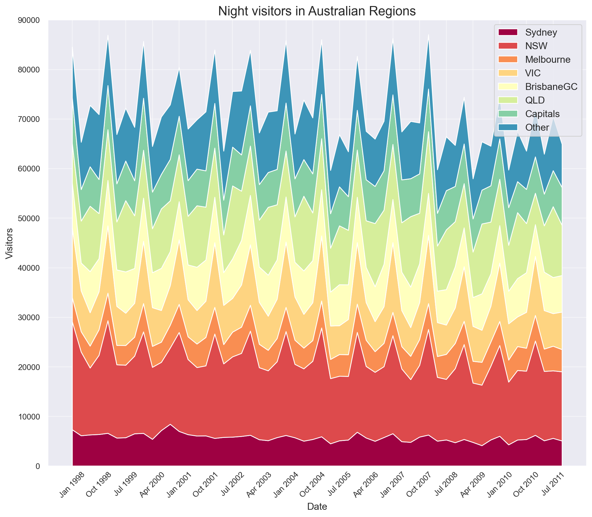
An area plot displays quantitative data visually. Area plots are stacked by default. To produce an unstacked plot, pass stacked=False.
Returning the the econimics data.
df = pd.read_csv('data/economics.csv')
# set the data as index of the df
df.set_index("date", inplace = True)
process_csv_from_data_folder("economics.csv", dataframe=df)| Random Sample of 10 Records from 'economics.csv' | ||||
|---|---|---|---|---|
| Exploring Data | ||||
| Pce | Pop | Psavert | Uempmed | Unemploy |
| 10,140.20 | 309,376.00 | 6.00 | 22.30 | 14,849.00 |
| 843.10 | 211,577.00 | 12.80 | 4.90 | 4,329.00 |
| 1,429.80 | 222,379.00 | 9.50 | 6.00 | 6,028.00 |
| 7,426.10 | 288,618.00 | 4.90 | 9.50 | 8,251.00 |
| 11,245.20 | 315,532.00 | 10.50 | 17.60 | 12,272.00 |
| 4,690.70 | 262,631.00 | 5.80 | 9.10 | 8,331.00 |
| 2,208.60 | 233,613.00 | 10.00 | 10.40 | 11,408.00 |
| 623.70 | 203,675.00 | 11.70 | 4.60 | 2,884.00 |
| 912.70 | 213,361.00 | 12.70 | 5.00 | 4,618.00 |
| 4,441.30 | 259,680.00 | 7.70 | 8.10 | 9,149.00 |
| 🔍 Data Exploration: economics.csv | Sample Size: 10 Records | ||||
x = df["psavert"]
y = df["uempmed"]

fig = plt.figure(figsize = (14, 8))
ax = fig.add_subplot()

ax.plot(x, color = "blue", alpha = .3, label = "Personal savings rate")
ax.plot(y, color = "red", alpha = .3, label = "Unemployment rate")

# fill the areas between the plots and the x axis
# this can create overlapping areas between lines
ax.fill_between(x.index, 0, x, color = "blue", alpha = .2)
ax.fill_between(x.index, 0, y, color = "red", alpha = .2)

# set the title
ax.set_title("Personal savings rate vs Unemployed rate", fontsize = 16)

xtick_location = df.index.tolist()[::12]
xtick_labels = df.index.tolist()[::12]

ax.set_xticks(xtick_location)
ax.set_xticklabels(xtick_labels, rotation = 90, fontdict = {'horizontalalignment': 'center', 'verticalalignment': 'center_baseline'})

ax.tick_params(axis = 'x', labelrotation = 90, labelsize = 12)
ax.tick_params(axis = 'y', labelsize = 12)

ax.spines["right"].set_color("None")
ax.spines["top"].set_color("None")

ax.legend(fontsize = 10)
ax.grid(axis = "y", alpha = .3);
ax.grid(axis = "x", alpha = .3);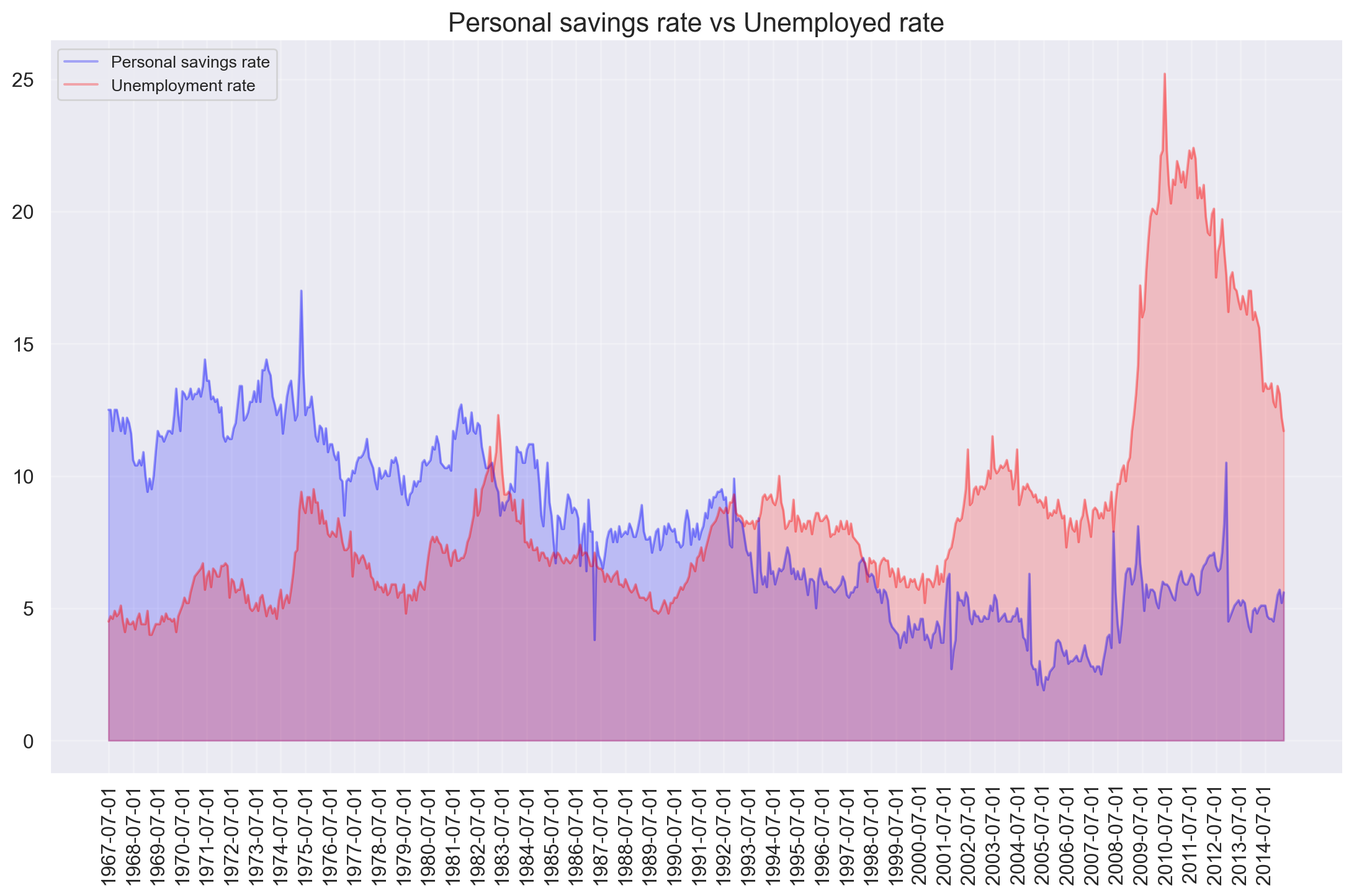
Import calmap to create calendar heatmaps from Pandas time series data. For illustration purposes, create 500 events as random float values assigned to random days over a 700-day period.
all_days = pd.date_range('1/15/2022', periods=700, freq='D')
days = np.random.choice(all_days, 500)
events = pd.Series(np.random.randn(len(days)), index=days)
print(events)
2022-06-06 0.601210
2023-08-25 0.284106
2022-10-27 0.713959
2022-07-04 0.471265
2023-08-02 1.000837
...
2023-11-07 0.854588
2022-05-09 -0.522025
2023-01-04 -0.059316
2023-06-30 1.464429
2022-04-28 1.543473
Length: 500, dtype: float64plt.figure(figsize=(10,8))
calmap.yearplot(events, year=2023)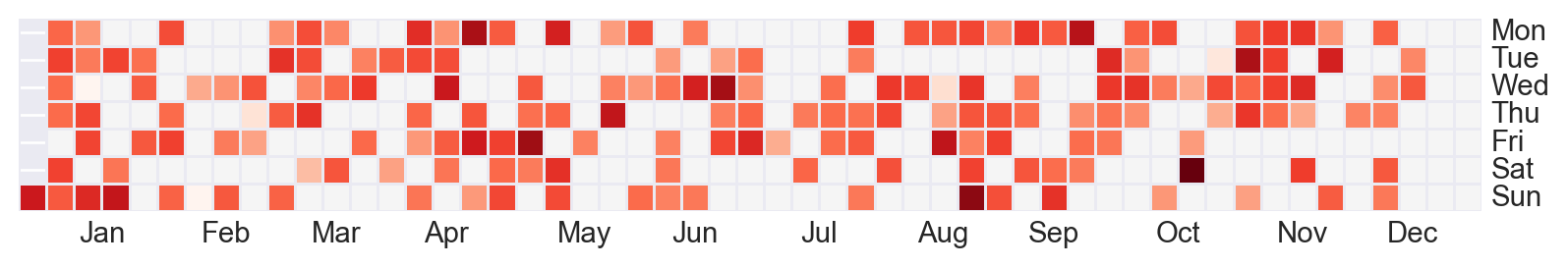
calmap.calendarplot(events, monthticks=3, daylabels='MTWTFSS',
                    dayticks=[0, 2, 4, 6], cmap='YlGn',
                    fillcolor='grey', linewidth=0,
                    fig_kws=dict(figsize=(8, 4)))
(<Figure size 768x384 with 2 Axes>,
array([<Axes: ylabel='2022'>, <Axes: ylabel='2023'>], dtype=object))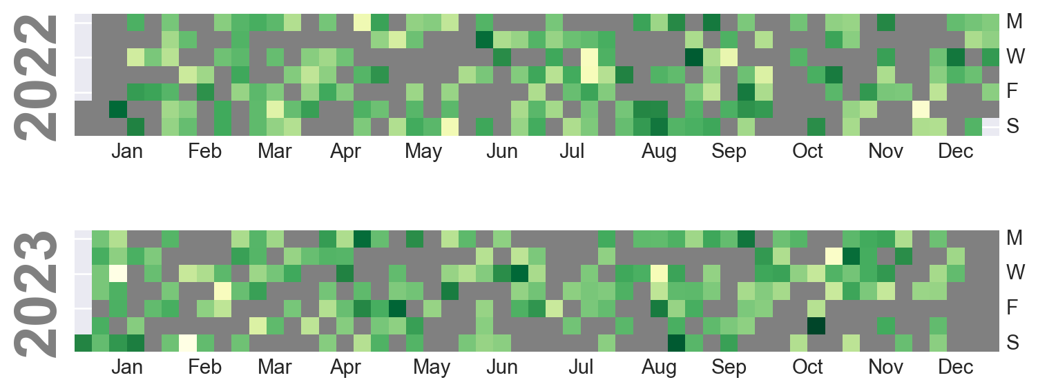
The seasonal plot can be used to compare how the time series performed at same day in the previous season (year / month / week etc).
df = pd.read_csv('data/AirPassengers.csv')
process_csv_from_data_folder("AirPassengers.csv", dataframe=df)| Random Sample of 10 Records from 'AirPassengers.csv' | |
|---|---|
| Exploring Data | |
| Date | Value |
| 1958-10-01 | 359.00 |
| 1950-08-01 | 170.00 |
| 1955-11-01 | 237.00 |
| 1957-02-01 | 301.00 |
| 1953-09-01 | 237.00 |
| 1950-01-01 | 115.00 |
| 1960-01-01 | 417.00 |
| 1954-06-01 | 264.00 |
| 1954-07-01 | 302.00 |
| 1950-07-01 | 170.00 |
| 🔍 Data Exploration: AirPassengers.csv | Sample Size: 10 Records | |
index_ = [i for i in range(1, 13)]*12

# set the index into the dataframe
df["index_"] = index_

# create a dictionary with the months name
months_ = ["Jan", "Feb", "Mar", "Apr", "May", "Jun", "Jul", "Aug", "Sep", "Oct", "Nov", "Dec"]
d = {k:v for k,v in zip(index_[:12], months_)}

# convert to datetime the date column
df["date"] = pd.to_datetime(df["date"])

# extract the year using pandas datatime (dt)
df["year"] = df["date"].dt.year

# drop the date
df.drop("date", inplace = True, axis = 1)

# create a pivot table
# traspose the rows into columns, where the columns name are the year to plot
df = df.pivot(values = "value", columns = "year", index = "index_")

# create n colors for each season
colors = [plt.cm.gist_earth(i/float(len(df.columns))) for i in range(len(df.columns))]

x = df.index

fig = plt.figure(figsize = (12, 6))
ax = fig.add_subplot()

for col, color in zip(df.columns, colors):
    # get the y to plot
    y = df[col]

    # plot the data using seaborn
    ax.plot(x, y, label = col, c = color)

    # get the x and y to annotate
    x_annotate = x[-1]
    y_annotate = df.iloc[11][col]

    ax.text(x_annotate + 0.3, y_annotate, col, fontsize = 8, c = color)

ax.set_xlabel("Months", fontsize = 13)
ax.set_ylabel("Air traffic", fontsize = 13)

# extract the x ticks location
xtick_location = df.index.tolist()

months = [d[tick] for tick in xtick_location]

ax.set_xticks(xtick_location)
ax.set_xticklabels(months, rotation = 45, fontdict = {'horizontalalignment': 'center', 'verticalalignment': 'center_baseline', "fontsize":"12"})

ax.tick_params(axis = 'y', labelsize = 12)

ax.set_ylim(0, 700)

ax.spines["right"].set_color("None")
ax.spines["top"].set_color("None")

ax.grid(axis = "y", alpha = .7)
ax.grid(axis = "x", alpha = .7)
# set the title for the plot
ax.set_title("Monthly seasonal plot of air traffic (1949 - 1969)", fontsize = 15);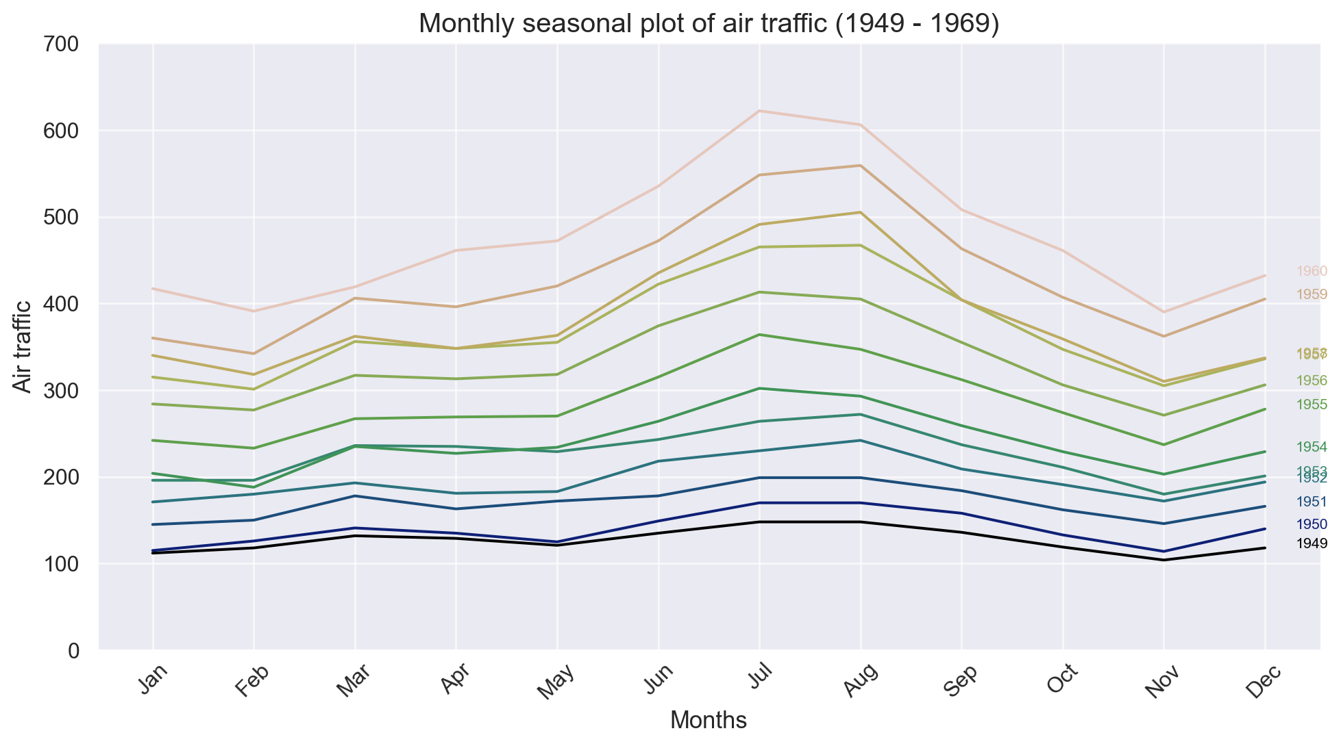
The dendrogram illustrates how each cluster is composed by drawing a U-shaped link between a non-singleton cluster and its children. The top of the U-link indicates a cluster merge. The two legs of the U-link indicate which clusters were merged. The length of the two legs of the U-link represents the distance between the child clusters.
df = pd.read_csv('data/USArrests.csv')
process_csv_from_data_folder("USArrests.csv", dataframe=df)| Random Sample of 10 Records from 'USArrests.csv' | ||||
|---|---|---|---|---|
| Exploring Data | ||||
| Murder | Assault | Urbanpop | Rape | State |
| 7.20 | 113.00 | 65.00 | 21.00 | Indiana |
| 14.40 | 279.00 | 48.00 | 22.50 | South Carolina |
| 11.40 | 285.00 | 70.00 | 32.10 | New Mexico |
| 8.50 | 156.00 | 63.00 | 20.70 | Virginia |
| 15.40 | 249.00 | 66.00 | 22.20 | Louisiana |
| 2.60 | 53.00 | 66.00 | 10.80 | Wisconsin |
| 4.30 | 102.00 | 62.00 | 16.50 | Nebraska |
| 6.00 | 109.00 | 53.00 | 16.40 | Montana |
| 13.00 | 337.00 | 45.00 | 16.10 | North Carolina |
| 11.30 | 300.00 | 67.00 | 27.80 | Maryland |
| 🔍 Data Exploration: USArrests.csv | Sample Size: 10 Records | ||||
fig = plt.figure(figsize = (14, 7))

# plot the data using the scipy package
dend = shc.dendrogram(shc.linkage(df[['Murder', 'Assault', 'UrbanPop', 'Rape']], method = 'ward'),
                      labels = df["State"].values,
                      color_threshold = 100)

ax = plt.gca()

ax.set_xlabel("County level")
ax.set_ylabel("# of incidents")

ax.tick_params("x", labelsize = 10)
ax.tick_params("y", labelsize = 10)

ax.grid(axis = "y", alpha = .7)
ax.grid(axis = "x", alpha = .7)

# set a title
ax.set_title("US Arrests dendograms");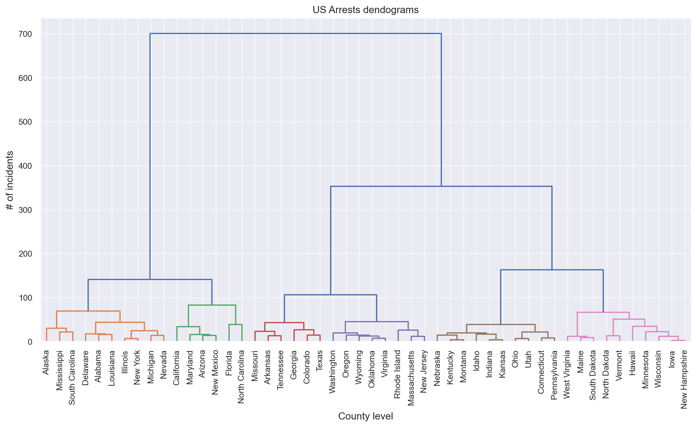
There are different ways to label a scatter plot with different groups (or clusters) of data points using the Python packages matplotlib and seaborn. These labeling methods are useful to represent the results of clustering algorithms, such as K-means clustering.
from sklearn.datasets import load_iris
from sklearn import preprocessing
from sklearn.cluster import KMeans
from sklearn.decomposition import PCA
import itertools

iris = load_iris()
X = iris['data']
print(X[:6])
[[5.1 3.5 1.4 0.2]
[4.9 3. 1.4 0.2]
[4.7 3.2 1.3 0.2]
[4.6 3.1 1.5 0.2]
[5. 3.6 1.4 0.2]
[5.4 3.9 1.7 0.4]]# get flower families
labels = iris['target']
nclusters = np.unique(labels).size
# scale flower data
scaler = preprocessing.MinMaxScaler()
scaler.fit(X)
X_scaled = scaler.transform(X)
# instantiate k-means
seed = 0
km = KMeans(n_clusters=nclusters, random_state=seed)
km.fit(X_scaled)
# predict the cluster for each data point
y_cluster_kmeans = km.predict(X_scaled)
# Compute PCA of data set
pca = PCA(n_components=X.shape[1], random_state=seed)
pca.fit(X_scaled)
X_pca_array = pca.transform(X_scaled)
X_pca = pd.DataFrame(X_pca_array, columns=['PC%i' % (ii + 1) for ii in range(X_pca_array.shape[1])]) # PC=principal component
# decide which prediction labels to associate with observed labels
# - search each possible way of transforming observed labels
# - identify approach with maximum agreement
MAX = 0
for ii in itertools.permutations([kk for kk in range(np.unique(y_cluster_kmeans).size)]):
change = {jj: ii[jj] for jj in range(len(ii))}
changedPredictions = np.ones(y_cluster_kmeans.size) * -99
for jj in range(len(ii)):
changedPredictions[y_cluster_kmeans == jj] = change[jj]
successful = np.sum(labels == changedPredictions)
if successful > MAX:
MAX = successful
bestChange = change
# transform predictions to match observations
changedPredictions = np.ones(y_cluster_kmeans.size) * -99
for jj in range(len(ii)):
changedPredictions[y_cluster_kmeans == jj] = bestChange[jj]
# plot clusters for observations and predictions
fig, ax = plt.subplots(1, 2, figsize=(10, 6))
ax[0].scatter(X_pca['PC1'], X_pca['PC2'], c=changedPredictions)
ax[1].scatter(X_pca['PC1'], X_pca['PC2'], c=labels)
ax[0].set_title('Prediction')
ax[1].set_title('Truth')
ax[0].set_facecolor("green")
ax[1].set_facecolor("blue")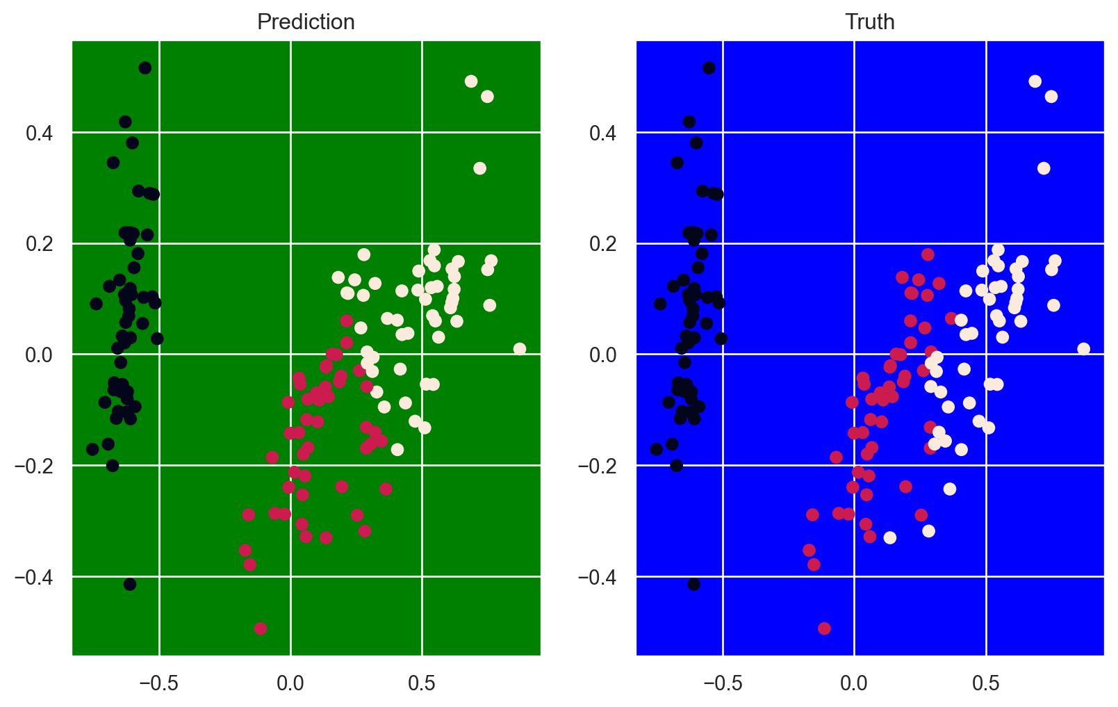
Another example given the complexity of this visualization using data we have seen before.
df = pd.read_csv('data/USArrests.csv')
process_csv_from_data_folder("USArrests.csv", dataframe=df)| Random Sample of 10 Records from 'USArrests.csv' | ||||
|---|---|---|---|---|
| Exploring Data | ||||
| Murder | Assault | Urbanpop | Rape | State |
| 7.20 | 113.00 | 65.00 | 21.00 | Indiana |
| 14.40 | 279.00 | 48.00 | 22.50 | South Carolina |
| 11.40 | 285.00 | 70.00 | 32.10 | New Mexico |
| 8.50 | 156.00 | 63.00 | 20.70 | Virginia |
| 15.40 | 249.00 | 66.00 | 22.20 | Louisiana |
| 2.60 | 53.00 | 66.00 | 10.80 | Wisconsin |
| 4.30 | 102.00 | 62.00 | 16.50 | Nebraska |
| 6.00 | 109.00 | 53.00 | 16.40 | Montana |
| 13.00 | 337.00 | 45.00 | 16.10 | North Carolina |
| 11.30 | 300.00 | 67.00 | 27.80 | Maryland |
| 🔍 Data Exploration: USArrests.csv | Sample Size: 10 Records | ||||
x = df["Murder"]
y = df["Assault"]

# Create out cluster using the AgglomerativeClustering from sklearn
#https://scikit-learn.org/dev/modules/generated/sklearn.cluster.AgglomerativeClustering.html
cluster = AgglomerativeClustering(n_clusters = 5, # notice that we specify the number of "optimal" clusters
                                  metric='euclidean', # use the euclidean distance to compute similarity. The closer the better.
                                  linkage = 'ward'
                                 )

# fit and predict the clusters based on this data
cluster.fit_predict(df[['Murder', 'Assault', 'UrbanPop', 'Rape']])

fig = plt.figure(figsize = (12, 10))
ax = fig.add_subplot()

ax.scatter(x, y)

# Encircle
def encircle(x,y, ax = None, **kw):
    '''
    Takes an axes and the x and y and draws a polygon on the axes.
    This code separates the differents clusters
    '''
    # get the axis if not passed
    if not ax: ax=plt.gca()

    # concatenate the x and y arrays
    p = np.c_[x,y]

    # to calculate the limits of the polygon
    hull = ConvexHull(p)

    # create a polygon from the hull vertices
    poly = plt.Polygon(p[hull.vertices,:], **kw)

    # add the patch to the axes
    ax.add_patch(poly)

# use our cluster fitted before to draw the clusters borders like we did at the beginning of the kernel
# basically go over each cluster and add a patch to the axes
encircle(df.loc[cluster.labels_ == 0, 'Murder'], df.loc[cluster.labels_ == 0, 'Assault'], ec = "k", fc = "gold", alpha = 0.2, linewidth = 0)
encircle(df.loc[cluster.labels_ == 1, 'Murder'], df.loc[cluster.labels_ == 1, 'Assault'], ec = "k", fc = "tab:blue", alpha = 0.2, linewidth = 0)
encircle(df.loc[cluster.labels_ == 2, 'Murder'], df.loc[cluster.labels_ == 2, 'Assault'], ec = "k", fc = "tab:red", alpha = 0.2, linewidth = 0)
encircle(df.loc[cluster.labels_ == 3, 'Murder'], df.loc[cluster.labels_ == 3, 'Assault'], ec = "k", fc = "tab:green", alpha = 0.2, linewidth = 0)
encircle(df.loc[cluster.labels_ == 4, 'Murder'], df.loc[cluster.labels_ == 4, 'Assault'], ec = "k", fc = "tab:orange", alpha = 0.2, linewidth = 0)

ax.tick_params("x", labelsize = 10)
ax.tick_params("y", labelsize = 10)

ax.set_xlabel("Murder", fontsize = 12)
ax.set_ylabel("Assault", fontsize = 12)

ax.grid(axis = "y", alpha = .7)
ax.grid(axis = "x", alpha = .7)

# set a title for the plot
ax.set_title("Agglomerative clustering of US arrests (5 Groups)", fontsize = 14);

# More info:
# https://en.wikipedia.org/wiki/Cluster_analysis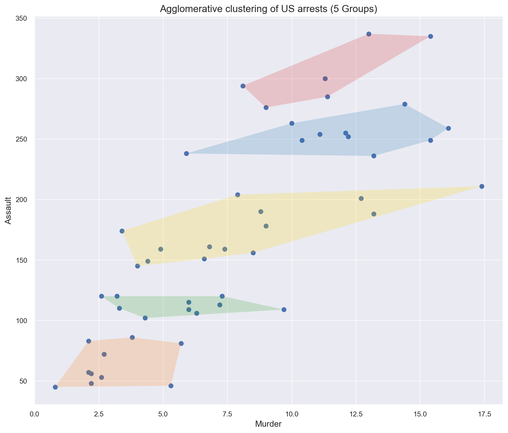
Andrews curves are used for visualizing high-dimensional data by mapping each observation onto a function. It preserves means, distance, and variances. Plotting Andrews curves on a graph can be done using the andrews_curves() method of the plotting module.
df = pd.read_csv('data/iris2.csv')
process_csv_from_data_folder("Iris.csv", dataframe=df)| Random Sample of 10 Records from 'Iris.csv' | ||||
|---|---|---|---|---|
| Exploring Data | ||||
| Sepallength | Sepalwidth | Petallength | Petalwidth | Name |
| 6.10 | 2.80 | 4.70 | 1.20 | Iris-versicolor |
| 5.70 | 3.80 | 1.70 | 0.30 | Iris-setosa |
| 7.70 | 2.60 | 6.90 | 2.30 | Iris-virginica |
| 6.00 | 2.90 | 4.50 | 1.50 | Iris-versicolor |
| 6.80 | 2.80 | 4.80 | 1.40 | Iris-versicolor |
| 5.40 | 3.40 | 1.50 | 0.40 | Iris-setosa |
| 5.60 | 2.90 | 3.60 | 1.30 | Iris-versicolor |
| 6.90 | 3.10 | 5.10 | 2.30 | Iris-virginica |
| 6.20 | 2.20 | 4.50 | 1.50 | Iris-versicolor |
| 5.80 | 2.70 | 3.90 | 1.20 | Iris-versicolor |
| 🔍 Data Exploration: Iris.csv | Sample Size: 10 Records | ||||
# Creating Andrews curves
x = pd.plotting.andrews_curves(df, 'Name')

# plotting the Curve
x.plot()

# Display
plt.grid()
plt.show()
1–3D data can be viewed relatively straight-forwardly using traditional plot types. Dimensions above 4, though, become increasingly difficult to display. Fortunately, parallel coordinates plots provide a mechanism for viewing results with higher dimensions.
Reusing the same data as the previous plot.
pd.plotting.parallel_coordinates(df, 'Name', color=('#556270', '#4ECDC4', '#C7F464')) 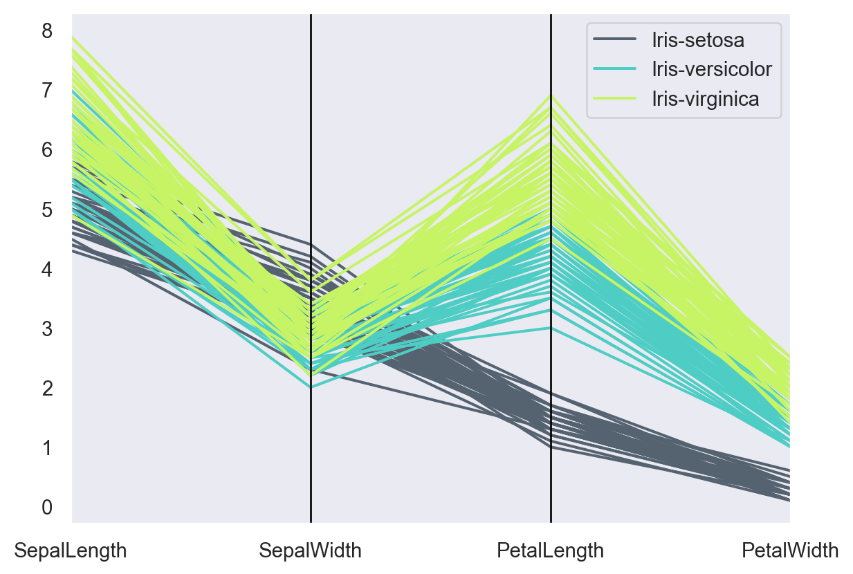
#import all necessary modules
from wordcloud import WordCloud, STOPWORDS

df = pd.read_csv(r'data\youtube.csv', encoding ='latin-1')
process_csv_from_data_folder("Data from Kaggle", dataframe=df)| Random Sample of 10 Records from 'Data from Kaggle' | |||
|---|---|---|---|
| Exploring Data | |||
| Link | Title | Description | Category |
| 174YLL | Amazing Indian food at Namaste in Miami!! Indian food reaction!! | Follow Me, I'm a Foodie - India 13K subscribers SUBSCRIBE In this episode, we vi... | food |
| KJQkleg0QTQ | Greatest Indian Food Videos Compilation | Indian Food Preparations | Cooking Vid... | Crazy For Indian Food 500K subscribers SUBSCRIBE Indian food is colorful, intere... | food |
| 7iY3I6e5zNI | Pop Music 2021(2021 New Song) - Pop Hits 2021 New Popular Songs - Best English S... | Top Hits Music 408K subscribers SUBSCRIBE Pop Music 2021(2021 New Song) - Pop Hi... | art_music |
| NGq3jj_bZy4 | New Hindi Song 2021 April 💖 Top Bollywood Romantic Love Songs 2021 💖 Best ... | Bollywood Hits Songs SUBSCRIBE New Hindi Song 2021 April 💖 Top Bollywood Roma... | art_music |
| Md8e0VvU | Travel Blog से $400 महीना कमाने का Plan | Micro Nich... | Become Blogger 15.3K subscribers SUBSCRIBE Hello Bloggers, In this super energet... | travel |
| xFH8DLqTQEA | AP European History Unit 4: Scientific, Philosophical, and Political Development... | Marco Learning 20.9K subscribers SUBSCRIBE Download our free AP European History... | history |
| gdZLi9oWNZg | BTS (방탄소년단) 'Dynamite' Official MV | HYBE LABELS 57.1M subscribers SUBSCRIBE BTS (방탄소년단) 'Dynamite' Officia... | art_music |
| S3Fz6bPu11 | Top things to do in Kerala! India Travel Vlog | Alex Outhwaite 152K subscribers SUBSCRIBE Top things to do in Kerala! If you w... | travel |
| JFcgOboQZ08 | DILBAR Lyrical | Satyameva Jayate |John Abraham, Nora Fatehi,Tanishk B, Neha Kak... | T-Series 184M subscribers SUBSCRIBE Gulshan Kumar and T-Series in association wi... | art_music |
| zFHPC4x8wk0 | Maroon 5, Ed Sheeran, Adele, Taylor Swift, Lady Gaga - english songs | Best Pop ... | Top Hits Music 1.56K subscribers SUBSCRIBE Maroon 5, Ed Sheeran, Adele, Taylor S... | art_music |
| 🔍 Data Exploration: Data from Kaggle | Sample Size: 10 Records | |||
#set STOPWORDS
comment_words = ""
stopwords = set(STOPWORDS)

# Let’s iterate through the csv file

for val in df.description:
    val = str(val)
    # split the value
    tokens = val.split()

# Converts each token into lowercase
for i in range(len(tokens)):
    tokens[i] = tokens[i].lower()

comment_words += " ".join(tokens)+" "

wordcloud = WordCloud(width = 800, height = 800, background_color ='white', stopwords = stopwords,
                      min_font_size = 10).generate(comment_words)

#and plot the WordCloud image

plt.figure(figsize = (8, 8), facecolor = None)
plt.imshow(wordcloud)
plt.axis('off')
plt.tight_layout(pad = 0)

#plt.savefig('youtubewordcloudsongs.png')
# Create a grid of x and y values
x = np.linspace(-5, 5, 200)
y = np.linspace(-5, 5, 200)
X, Y = np.meshgrid(x, y)

# Define a custom function that combines several Gaussian peaks
def multi_gaussian(X, Y):
    # Centers and heights of Gaussian peaks
    peaks = [
        {'x0': -2, 'y0':  1, 'amp': 2,   'sigma': 1.0},
        {'x0':  1, 'y0': -1, 'amp': 1.5, 'sigma': 1.2},
        {'x0':  0, 'y0':  0, 'amp': 2.5, 'sigma': 0.5},
        {'x0':  3, 'y0':  2, 'amp': 1,   'sigma': 1.5}
    ]
    Z = np.zeros_like(X)
    for peak in peaks:
        Z += peak['amp'] * np.exp(-((X - peak['x0'])**2 + (Y - peak['y0'])**2) / (2 * peak['sigma']**2))
    return Z

Z = multi_gaussian(X, Y)

# Create the contour plot
fig, ax = plt.subplots(figsize=(8, 6))

# Filled contour for a smooth color gradient
contourf = ax.contourf(X, Y, Z, levels=20, cmap='viridis')
# Line contours for more definition
contour = ax.contour(X, Y, Z, levels=10, colors='black', linewidths=0.5)

# Add a colorbar to show the "height" values
cbar = plt.colorbar(contourf, ax=ax)
cbar.set_label('Function Value')

# Add labels and title
ax.set_title('2D Contour Map of Multiple Gaussian Peaks')
ax.set_xlabel('X-axis')
ax.set_ylabel('Y-axis')

plt.show()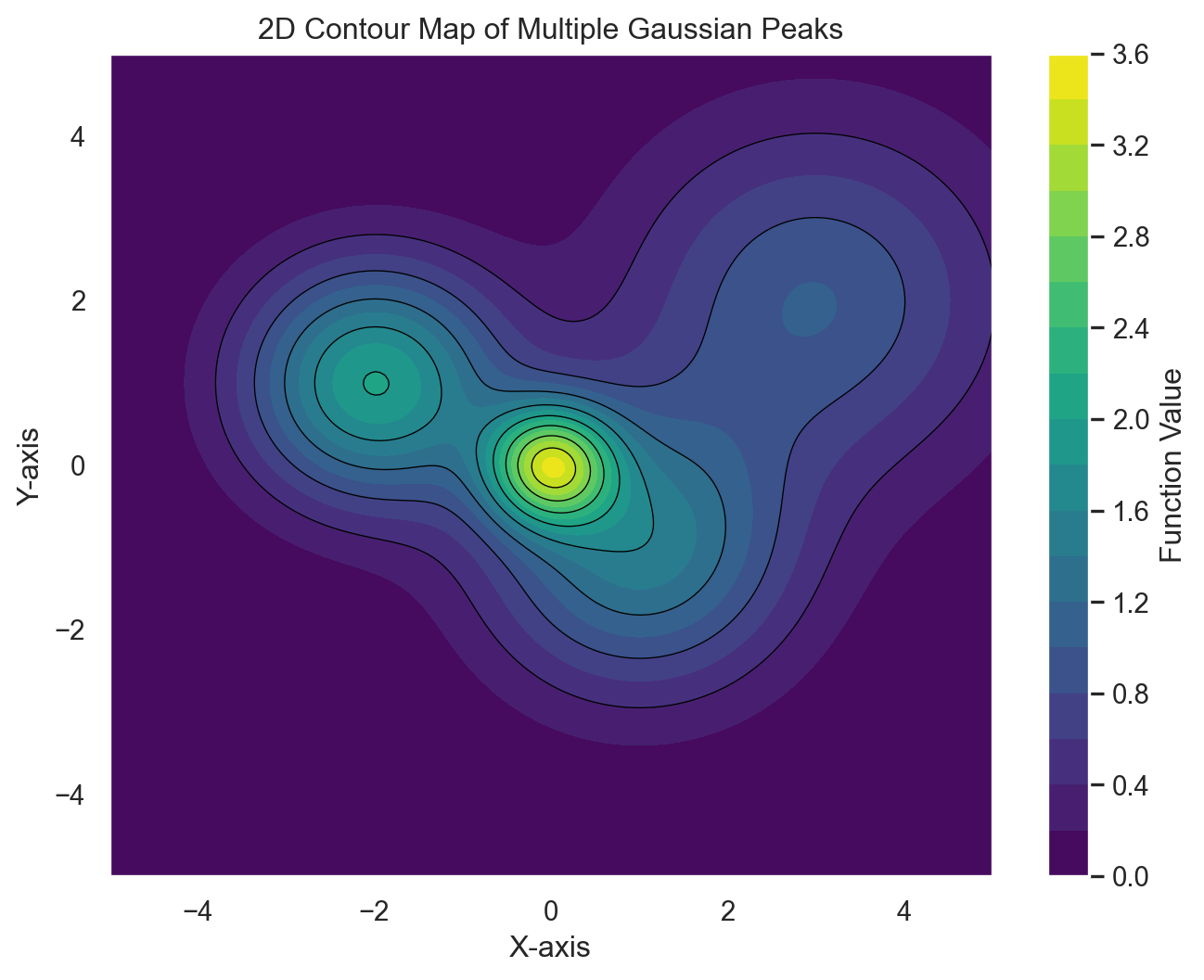
Sunburst charts can be used to display any kind of hierarchical or multi-level data.
import plotly.express as px
df = px.data.tips()

process_csv_from_data_folder("Tips Data from Plotly Express", dataframe=df)| Random Sample of 10 Records from 'Tips Data from Plotly Express' | ||||||
|---|---|---|---|---|---|---|
| Exploring Data | ||||||
| Total Bill | Tip | Sex | Smoker | Day | Time | Size |
| 19.82 | 3.18 | Male | No | Sat | Dinner | 2.00 |
| 8.77 | 2.00 | Male | No | Sun | Dinner | 2.00 |
| 24.55 | 2.00 | Male | No | Sun | Dinner | 4.00 |
| 25.89 | 5.16 | Male | Yes | Sat | Dinner | 4.00 |
| 13.00 | 2.00 | Female | Yes | Thur | Lunch | 2.00 |
| 17.89 | 2.00 | Male | Yes | Sun | Dinner | 2.00 |
| 28.44 | 2.56 | Male | Yes | Thur | Lunch | 2.00 |
| 12.48 | 2.52 | Female | No | Thur | Lunch | 2.00 |
| 14.78 | 3.23 | Male | No | Sun | Dinner | 2.00 |
| 15.38 | 3.00 | Female | Yes | Fri | Dinner | 2.00 |
| 🔍 Data Exploration: Tips Data from Plotly Express | Sample Size: 10 Records | ||||||
df = px.data.tips()
fig = px.sunburst(df, path=['sex', 'day', 'time'], values='total_bill', color='day')
fig.show()df = px.data.gapminder().query("year == 2007")
process_csv_from_data_folder("Gapminder Data from Plotly Express", dataframe=df)| Random Sample of 10 Records from 'Gapminder Data from Plotly Express' | |||||||
|---|---|---|---|---|---|---|---|
| Exploring Data | |||||||
| Country | Continent | Year | Lifeexp | Pop | Gdppercap | Iso Alpha | Iso Num |
| Turkey | Europe | 2,007.00 | 71.78 | 71,158,647.00 | 8,458.28 | TUR | 792.00 |
| Cameroon | Africa | 2,007.00 | 50.43 | 17,696,293.00 | 2,042.10 | CMR | 120.00 |
| Mauritius | Africa | 2,007.00 | 72.80 | 1,250,882.00 | 10,956.99 | MUS | 480.00 |
| Oman | Asia | 2,007.00 | 75.64 | 3,204,897.00 | 22,316.19 | OMN | 512.00 |
| Hungary | Europe | 2,007.00 | 73.34 | 9,956,108.00 | 18,008.94 | HUN | 348.00 |
| Bosnia and Herzegovina | Europe | 2,007.00 | 74.85 | 4,552,198.00 | 7,446.30 | BIH | 70.00 |
| Panama | Americas | 2,007.00 | 75.54 | 3,242,173.00 | 9,809.19 | PAN | 591.00 |
| Jamaica | Americas | 2,007.00 | 72.57 | 2,780,132.00 | 7,320.88 | JAM | 388.00 |
| Japan | Asia | 2,007.00 | 82.60 | 127,467,972.00 | 31,656.07 | JPN | 392.00 |
| Cambodia | Asia | 2,007.00 | 59.72 | 14,131,858.00 | 1,713.78 | KHM | 116.00 |
| 🔍 Data Exploration: Gapminder Data from Plotly Express | Sample Size: 10 Records | |||||||
fig = px.sunburst(df, path=['continent', 'country'], values='pop',
                  color='lifeExp', hover_data=['iso_alpha'],
                  color_continuous_scale='RdBu',
                  color_continuous_midpoint=np.average(df['lifeExp'], weights=df['pop']))
fig.show()
Rose diagrams, also known as rose charts or wind roses, are circular statistical representations used primarily to display directional data. They consist of radiating spokes that represent different directions, typically based on compass points (North, East, South, West, and their intermediates).
df = pd.read_csv('data/vgsales.csv')
process_csv_from_data_folder("Video Games Sakes Data from Kaggle", dataframe=df)| Random Sample of 10 Records from 'Video Games Sakes Data from Kaggle' | |||||||||
|---|---|---|---|---|---|---|---|---|---|
| Exploring Data | |||||||||
| Rank | Name | Platform | Year | Genre | Publisher | Na Sales | Eu Sales | Jp Sales | Other Sales |
| 8,930.00 | F1 2012 | PC | 2,012.00 | Racing | Codemasters | 0.01 | 0.11 | 0.00 | 0.03 |
| 4,791.00 | Transformers: The Game (XBox 360, PS2, PS3, Wii & PC Versions) | PS3 | 2,007.00 | Action | Activision | 0.32 | 0.04 | 0.01 | 0.04 |
| 15,495.00 | Commandos 3: Destination Berlin | PC | 2,003.00 | Strategy | Eidos Interactive | 0.00 | 0.02 | 0.00 | 0.00 |
| 14,770.00 | The Sims 2: Bon Voyage | PC | 2,007.00 | Simulation | Electronic Arts | 0.01 | 0.01 | 0.00 | 0.00 |
| 5,213.00 | Guitar Hero: Smash Hits | PS3 | 2,009.00 | Misc | Activision | 0.20 | 0.11 | 0.00 | 0.05 |
| 722.00 | Sonic Advance | GBA | 2,001.00 | Platform | Sega | 1.19 | 0.71 | 0.22 | 0.13 |
| 4,920.00 | Red Faction: Armageddon | X360 | 2,011.00 | Shooter | THQ | 0.18 | 0.17 | 0.01 | 0.04 |
| 3,109.00 | Real Heroes: Firefighter | Wii | 2,009.00 | Action | Rondomedia | 0.56 | 0.04 | 0.00 | 0.05 |
| 7,418.00 | WinBack: Covert Operations | N64 | 1,999.00 | Shooter | Virgin Interactive | 0.17 | 0.04 | 0.00 | 0.00 |
| 4,449.00 | Gundam SEED: Federation vs. Z.A.F.T. | PS2 | 2,005.00 | Shooter | Namco Bandai Games | 0.00 | 0.00 | 0.44 | 0.00 |
| 💡 Additional columns not displayed: Global_Sales | |||||||||
| 🔍 Data Exploration: Video Games Sakes Data from Kaggle | Sample Size: 10 Records | |||||||||
colors = ['#91DCEA', '#64CDCC', '#5FBB68',
          '#F9D23C', '#F9A729', '#FD6F30','grey','red','blue','cyan']

platform_freq = df['Platform'].value_counts()
#print('5 most frequent platforms:\n', platform_freq.iloc[0:5])
plt.figure(figsize=(7, 7))
values = platform_freq.iloc[0:5]
indexes = values.index
handles = [plt.Rectangle((0,0),1,1, color=color, alpha=0.5) for color in colors]

ax = plt.subplot(111, polar=True)
height = values
width = 1.5*np.pi/(len(values))
angles = [(2/1.5)*element*width for element in range(5)]

bars = ax.bar(x=angles, height=height, width=width, bottom=0, linewidth=2,\
              edgecolor='black', color=colors, alpha=0.5)
ax.bar_label(ax.containers[0], padding=5)
ax.set_xticklabels([])
ax.set_yticklabels([])
ax.set_theta_zero_location('N')
ax.set_title('5 most frequent platforms in the dataset')
ax.legend(handles, indexes, loc='best')
#plt.savefig('rosetop5platforms.png')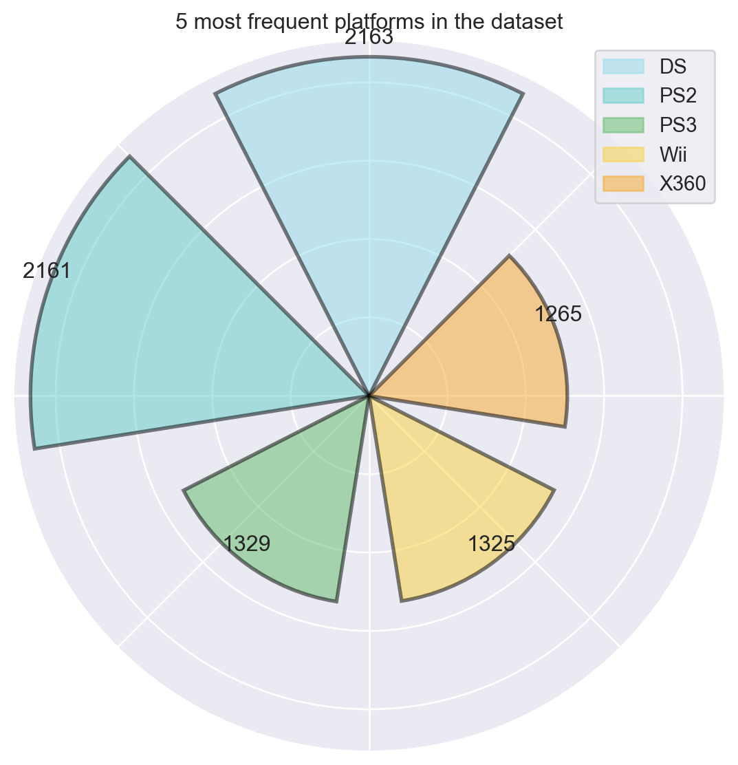
Radar charts, also known as spider charts or web charts, are two-dimensional graphical tools used to display multivariate data across three or more quantitative variables14. They consist of a series of radial axes extending from a central point, with each axis representing a different variable or dimension.
Using fake data.
# Define categories and values
myc1='Business Development & Support'
myc2='Customer Service'
myc3='Data Science & Analytics'
myc4='Design & User Experience'
myc5='Engineering'
myc6='Finance'
myc7='Finance & Legal'
myc8='IT Services'
myc9='Leadership'
myc10='Security & Infrastructure'

# Create data dictionary with example values
mydata = {
    'Category': [myc1, myc2, myc3, myc4, myc5, myc6, myc7, myc8, myc9, myc10],
    'Value': [4, 3, 5, 2, 4, 3, 2, 3, 4, 5]  # Example values
}

# Create a DataFrame
mydf = pd.DataFrame(mydata)

# Plot radar graph
fig = px.line_polar(mydf, r='Value', theta='Category', line_close=True, title="Junior Endpoints Engineer")

# Show the plot
fig.show()
great_tables ExamplesRecall this module was built by Posit and is relatively new. It is based on the great success of the gt package from the R ecosystem. The tables generated fo far have all been developed using great_tables.
Below are just a few examples of the possibilities.
The one below is the same that has been used for all the data presented so far. Nothing new or exceptional.
The ones that follow were copied from https://posit-dev.github.io/great-tables/examples/
#from great_tables import GT, html
from great_tables.data import sza
process_csv_from_data_folder("Solar Zenith Angles great_tables", dataframe=sza)| Random Sample of 10 Records from 'Solar Zenith Angles great_tables' | |||
|---|---|---|---|
| Exploring Data | |||
| Latitude | Month | Tst | Sza |
| 20 | dec | 0830 | 66.10 |
| 30 | jun | 0900 | 41.00 |
| 50 | aug | 1030 | 36.60 |
| 30 | feb | 0700 | 86.20 |
| 40 | aug | 1100 | 25.40 |
| 50 | dec | 0530 | nan |
| 20 | dec | 1000 | 50.90 |
| 30 | aug | 1030 | 23.60 |
| 30 | aug | 1130 | 13.70 |
| 40 | aug | 0500 | 89.30 |
| 🔍 Data Exploration: Solar Zenith Angles great_tables | Sample Size: 10 Records | |||
The plot below was copied from https://posit-dev.github.io/great-tables/examples/
from great_tables import html
from great_tables.data import sza
# Convert 'latitude' and 'tst' columns to a consistent type if necessary
# This step may be needed depending on your data.
# For example, if 'latitude' and 'tst' should be strings:
# sza['latitude'] = sza['latitude'].astype(str)
# sza['tst'] = sza['tst'].astype(str)
sza_pivot = (
sza
.query("latitude == '20' and tst <= '1200'")
.drop(columns=["latitude"])
.dropna()
.pivot(index="month", columns="tst", values="sza")
.sort_index(axis=1) # Sort columns to mimic sort_columns=True in polars
)
# Reset index so 'month' is a column again
sza_pivot = sza_pivot.reset_index()
(
GT(sza_pivot, rowname_col="month")
.data_color(
domain=[90, 0],
palette=["rebeccapurple", "white", "orange"],
na_color="white",
)
.tab_header(
title="Solar Zenith Angles from 05:30 to 12:00",
subtitle=html("Average monthly values at latitude of 20°N.")
)
.sub_missing(missing_text="")
)| Solar Zenith Angles from 05:30 to 12:00 | ||||||||||||||
|---|---|---|---|---|---|---|---|---|---|---|---|---|---|---|
| Average monthly values at latitude of 20°N. | ||||||||||||||
| 0530 | 0600 | 0630 | 0700 | 0730 | 0800 | 0830 | 0900 | 0930 | 1000 | 1030 | 1100 | 1130 | 1200 | |
| apr | 88.5 | 81.5 | 74.4 | 67.4 | 60.3 | 53.4 | 46.5 | 39.7 | 33.2 | 26.9 | 21.3 | 17.2 | 15.5 | |
| aug | 83.8 | 77.1 | 70.2 | 63.3 | 56.4 | 49.4 | 42.4 | 35.4 | 28.3 | 21.3 | 14.3 | 7.3 | 1.9 | |
| dec | 84.3 | 78.0 | 71.8 | 66.1 | 60.5 | 55.6 | 50.9 | 47.2 | 44.2 | 42.4 | 41.8 | |||
| feb | 88.9 | 82.5 | 75.8 | 69.6 | 63.3 | 57.7 | 52.2 | 47.4 | 43.1 | 40.0 | 37.8 | 37.2 | ||
| jan | 84.9 | 78.7 | 72.7 | 66.1 | 61.5 | 56.5 | 52.1 | 48.3 | 45.5 | 43.6 | 43.0 | |||
| jul | 88.8 | 82.3 | 75.7 | 69.1 | 62.3 | 55.5 | 48.7 | 41.8 | 35.0 | 28.1 | 21.2 | 14.3 | 7.7 | 3.1 |
| jun | 89.2 | 82.7 | 76.0 | 69.3 | 62.5 | 55.7 | 48.8 | 41.9 | 35.0 | 28.1 | 21.1 | 14.2 | 7.3 | 2.0 |
| mar | 85.7 | 78.8 | 72.0 | 65.2 | 58.6 | 52.3 | 46.2 | 40.5 | 35.5 | 31.4 | 28.6 | 27.7 | ||
| may | 85.0 | 78.2 | 71.2 | 64.3 | 57.2 | 50.2 | 43.2 | 36.1 | 29.1 | 26.1 | 15.2 | 8.8 | 5.0 | |
| nov | 87.8 | 81.3 | 74.5 | 68.3 | 61.8 | 56.0 | 50.2 | 45.3 | 40.7 | 37.4 | 35.1 | 34.4 | ||
| oct | 84.1 | 77.1 | 70.2 | 63.3 | 56.5 | 49.9 | 43.5 | 37.5 | 32.0 | 27.4 | 24.3 | 23.1 | ||
| sep | 87.2 | 80.2 | 73.2 | 66.1 | 59.1 | 52.1 | 45.1 | 38.1 | 31.3 | 24.7 | 18.6 | 13.7 | 11.6 | |
I decided the best way to sow the power of gt tables is to share visualizations I have alreaded created in R. The same capabilites are availbe in great_tables.
If you want to see a variety of interesting visualizations, see Cliff’s Blog.
The Great American Beer Festival Document is full of creative visualizations.